
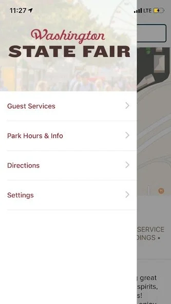
WA State Fair
Revamped web & app for seamless fairgoer fun, boosting engagement by 32%!
My Role
Research
Strategy
Stakeholder meetings & presentations
Design
Handoff with visual design & devs
Duration
4 months
01/ Summary
Services
UX Audit
Market research
User Interviews
User Surveys
Competitor assessment
UX/UI design (low & mid fidelity)
Information architecture
User testing
CMS guidance
Deliverables
Competitive analysis
Interview & S survey findings
Data mapping (IA)
Card sort findings (IA)
Tree test findings (IA)
User & task flows
Empathy map
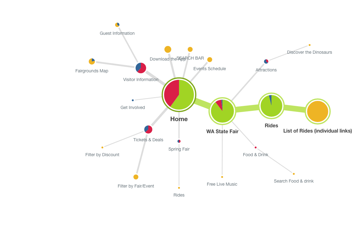
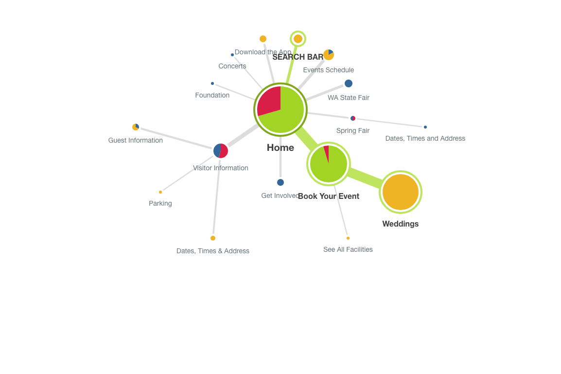
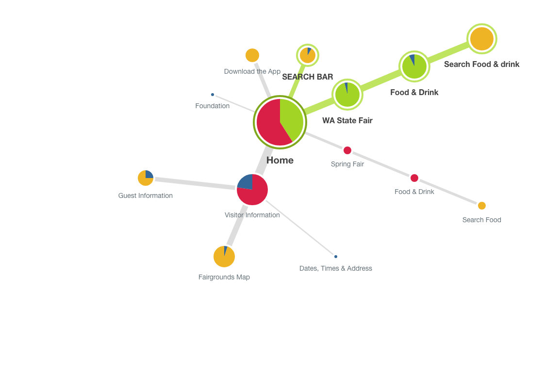
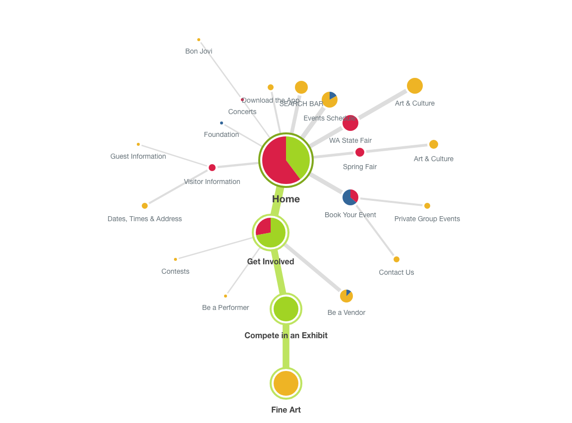
Sitemap
Responsive wireframes
Invision prototype
User test findings & recommendations
Outcomes
Significantly improved app engagement by 32%!
Handoff of designs and prototype of mobile app that was successfully used to redesign a new app experience
Revamped intuitive user experience that contributed to a year with significantly higher attendance.
02/ Opportunity
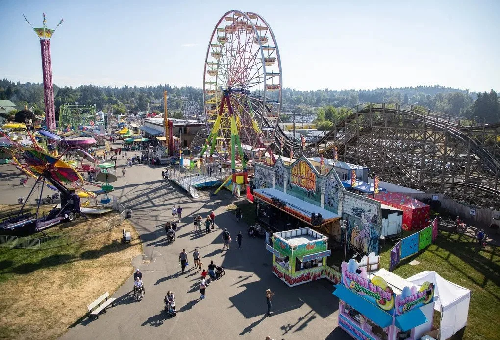
The Washington State Fair is among the largest fairs in the world and the biggest in the PNW. The website and app have undergone several iterations over the past few years, but it was time for a complete redesign. Ply hired a UX specialist (me) to create a better fairgoer experience.
In need of user feedback
In the past, website and app changes were mostly based on analytics, company politics, and a "don't change it if it's working" mindset. While these are important, it became clear that understanding the customer's experience directly was crucial. Also, very few people use the mobile app—why?
This time, we would lift the lid, question assumptions, and, most importantly, talk with the users!
Project goals
-
01/ Discover how people use the website and mobile app, specifically around searching and finding information.
-
02/ Find pain points in the user experience.
-
03/ Create solutions (better website, new app?) to solve those pain points.
03/ Process
Surveys & analytics
We started by tapping the fair’s mailing list and reviewing their analytics to get a good background understanding.
Demographics
The audience skews slightly female (55%) and predominantly Caucasian (65%), with a significant portion (40%) aged between 25 and 44. This suggests a target demographic for marketing and content strategy.
Loyalty and Repeat Attendance
A significant 40-50% of attendees have been consistent visitors over the past five years, indicating a strong base of loyal attendees who might be receptive to loyalty programs or exclusive offers.
Ticket Purchase Habits
The preference for purchasing Fair admission tickets at the gate, contrasted with the trend of buying concert tickets online in advance, highlights differing behaviors that can inform ticket sales strategies.
Attendance Patterns
A notable trend is that the decision to attend is often made impulsively (same day or within a week). The reasons for attending are primarily habitual attendance, children's activities, general entertainment value, exhibits, and animals. This information can guide promotional timing and content.
Group Dynamics and Duration
Most attendees visit in small groups (2-4 people) and stay for a moderate duration (3-6 hours). This could inform the design of group offers or time-based itineraries.
Digital Engagement
While a majority (63%) have visited the fair's website, there is a notable lack of awareness about the Fair's app (70% unaware). However, among app users, the map feature is highly utilized (70%), and the planner is moderately used (35%). This points to an opportunity to increase app awareness and enhance features based on user preferences.
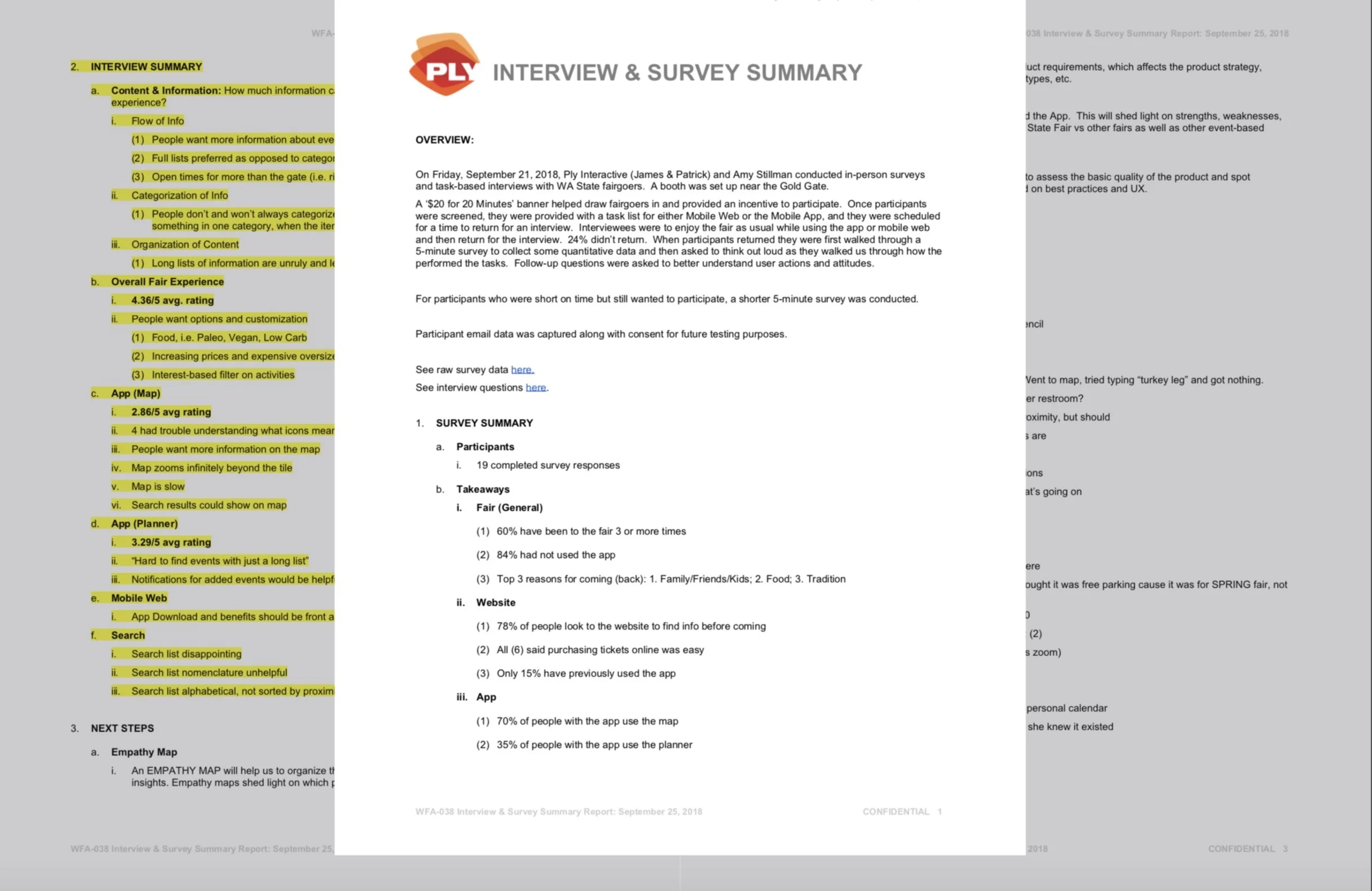
Fairgoer interviews
$20 for 20 Minutes
Location: Fairgrounds
People: myself (UX designer), Patrick (CEO of Ply) & Amy (Fair marketing consultant)
Plan:
Set up a booth near the entrance gate
Recruit participants
Pre-screener used to assess fitness
Assign tasks to perform while at the fair with a return time for an interview
Same tasks, different platforms
50% participants - mobile web
50% participants - mobile app
Interview
Using a separate table for privacy, sit down to ask participants about their experience
Follow-up questions were asked to better understand user actions and attitudes

“It's frustrating trying to find specific info on the app – like ride times and food stall openings. Everything's in the wrong category or buried in long lists, and the map is too zoomed out and slow. I just end up giving up.”
— Fairgoer
Interview findings
Content
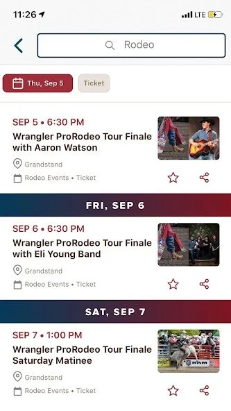
People want more information about events, rides and food.
Open times for more than the gate (i.e. rides, storefronts, etc)
People don’t and won’t always categorize things the way that we do.
People often looked for something in one category, when the item they were looking for was in another.
Long lists of information are unruly and lead to users bouncing.
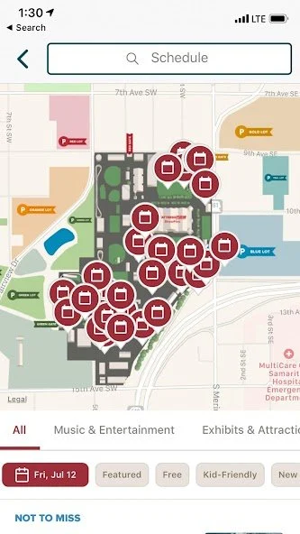
The ‘Planner’ (in-App)
3.2/5 avg rating
Hard to find events with just a long list
Notifications for added events would be helpful
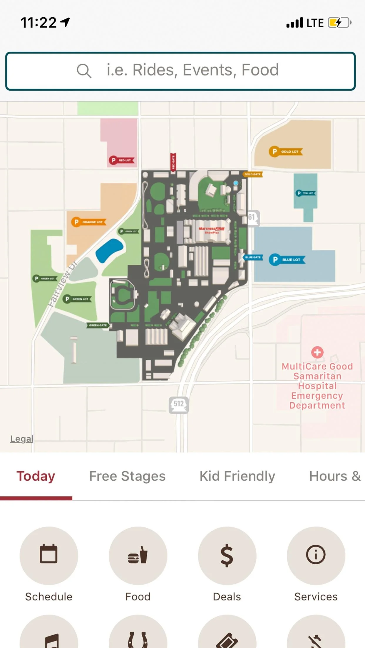
The ‘Map’ (in-app)
2.8/5 avg rating
4 had trouble understanding what icons mean
People want more information on the map
Map zooms infinitely beyond the tile
Map is slow
Search results could show on map
Mobile Web
App Download and benefits should be front and center.
Map doesn’t work well on mobile web.
Search (in-app)
Search list disappointing
Search list nomenclature unhelpful
Search list alphabetical, not sorted by proximity
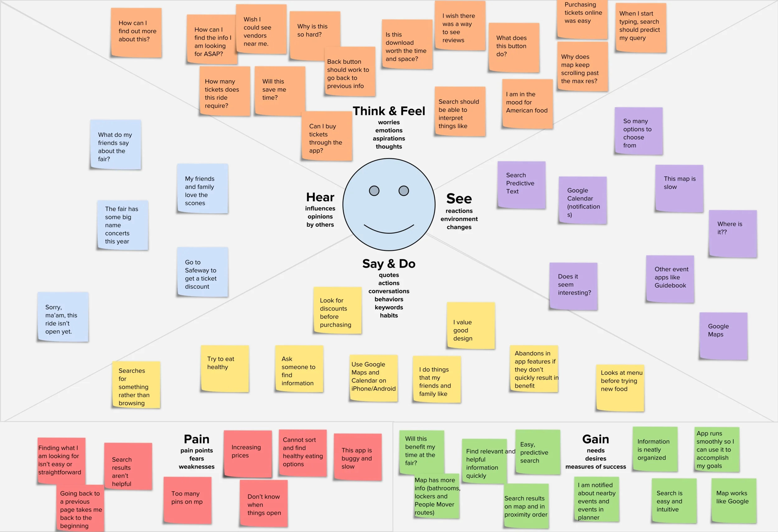
Empathy map
Combining the findings from the surveys, market research, and interviews, I created an Empathy Map
Visualizing user attitudes and behaviors in an empathy map helps teams align on a deep understanding of end users. Personas were already in place so we updated them and focused them to include real-world user goals and concerns.
Content audit
I evaluated The Fair's online content and created a Content Inventory of all published assets, including names, locations, and descriptions.
Later, I’ll use the data from this audit to help build the sitemap!
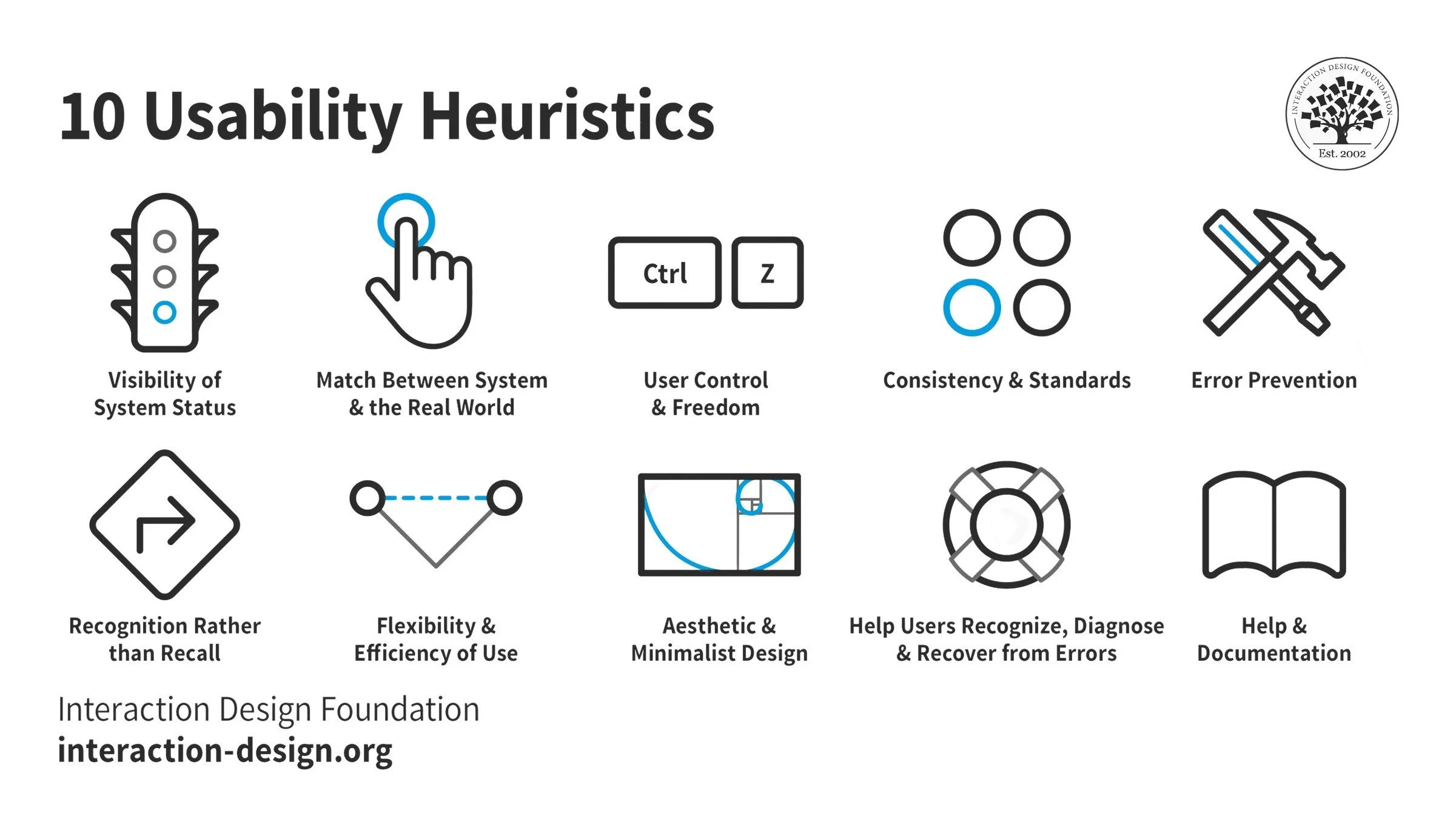
UX best practices (heuristics)
I looked at heuristics to assess the basic quality of the product and spot potential opportunities for improvement.
How does a user experience the product from beginning to end?
How I tested it:
Four participants walked through major pages and screens for website, mobile-web, and app
We flagged and annotated anything that violated usability principles with a flag
Those findings were collected and consolidated
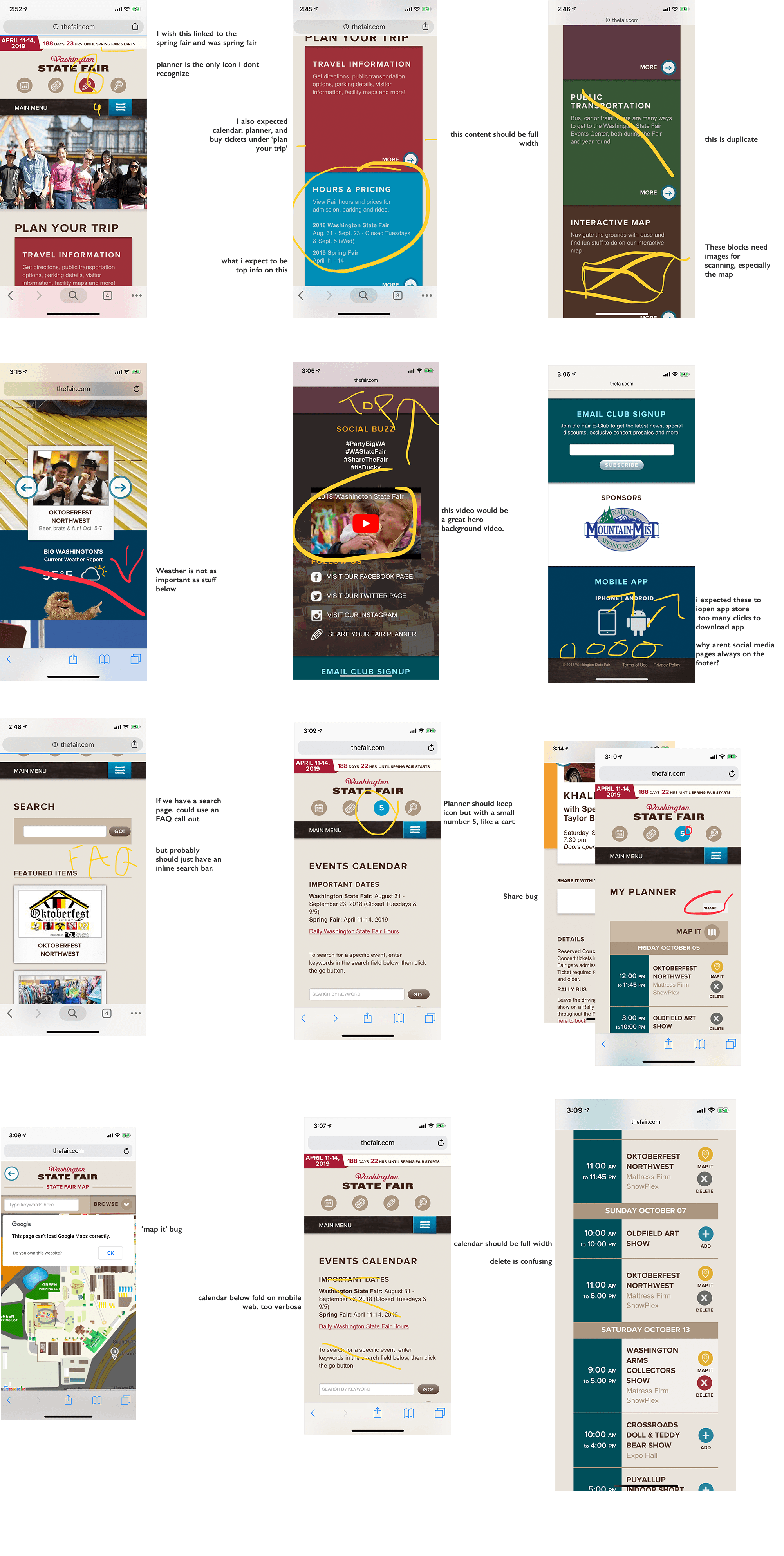
Site UX Audit
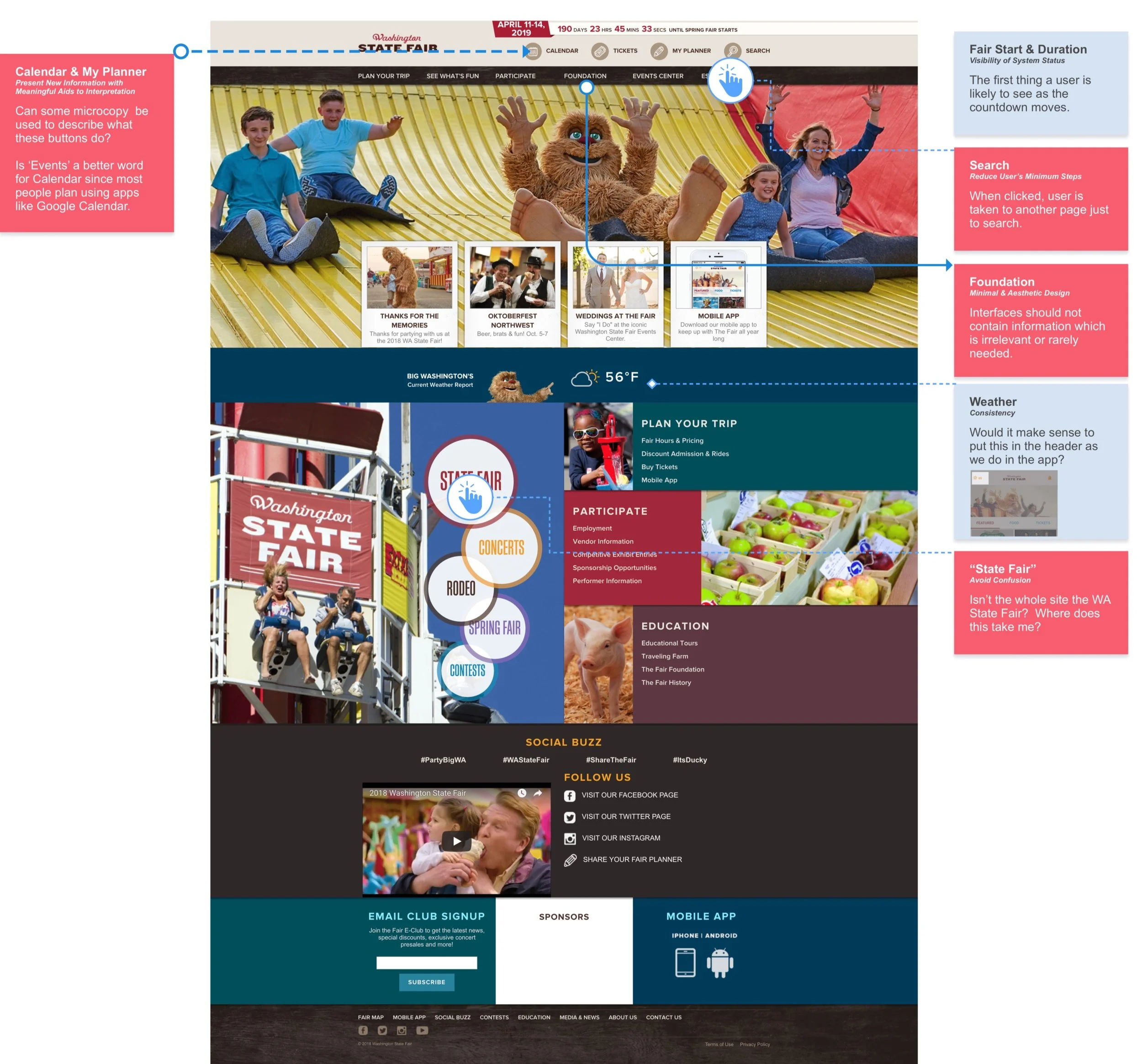
Home
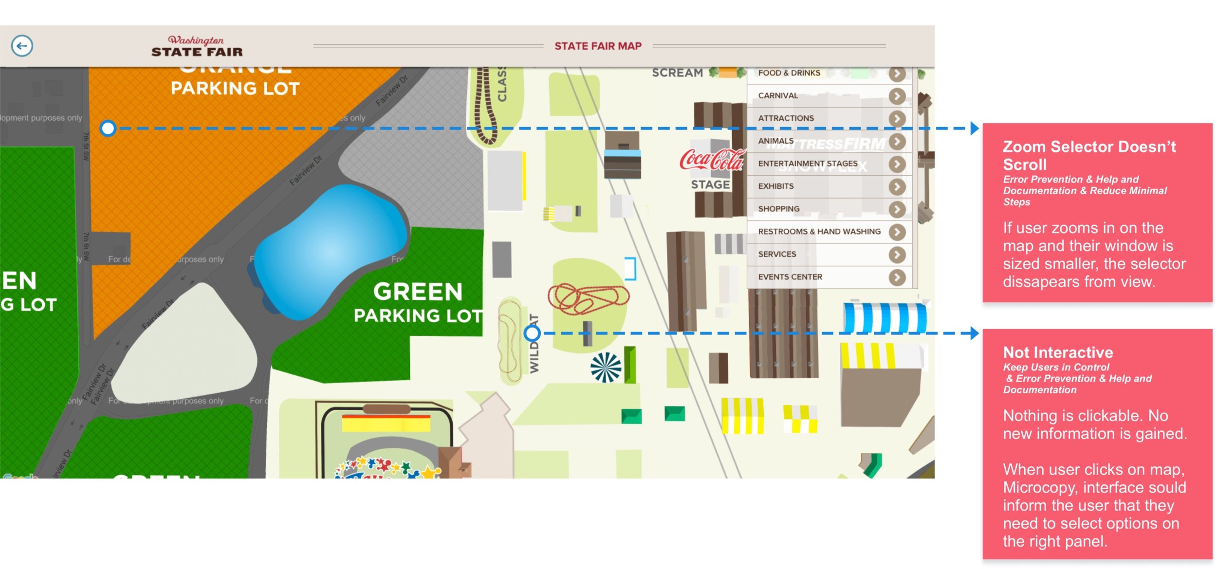
Map
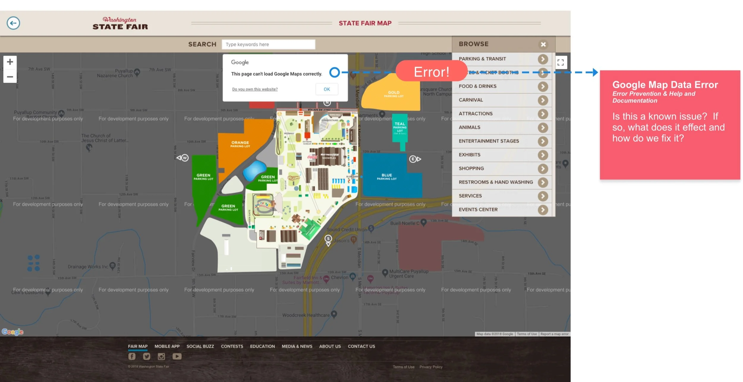
Map 2
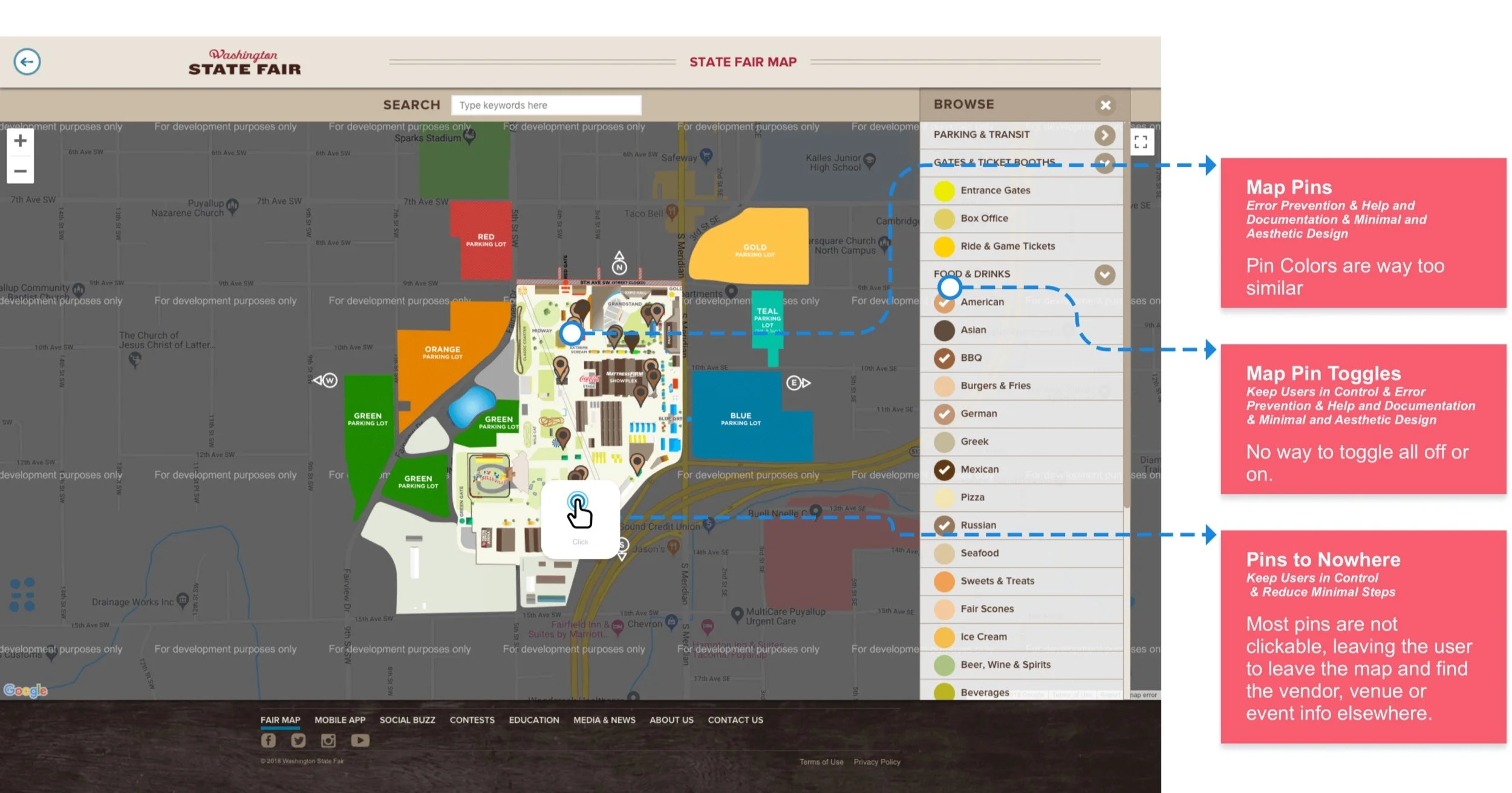
Map 3
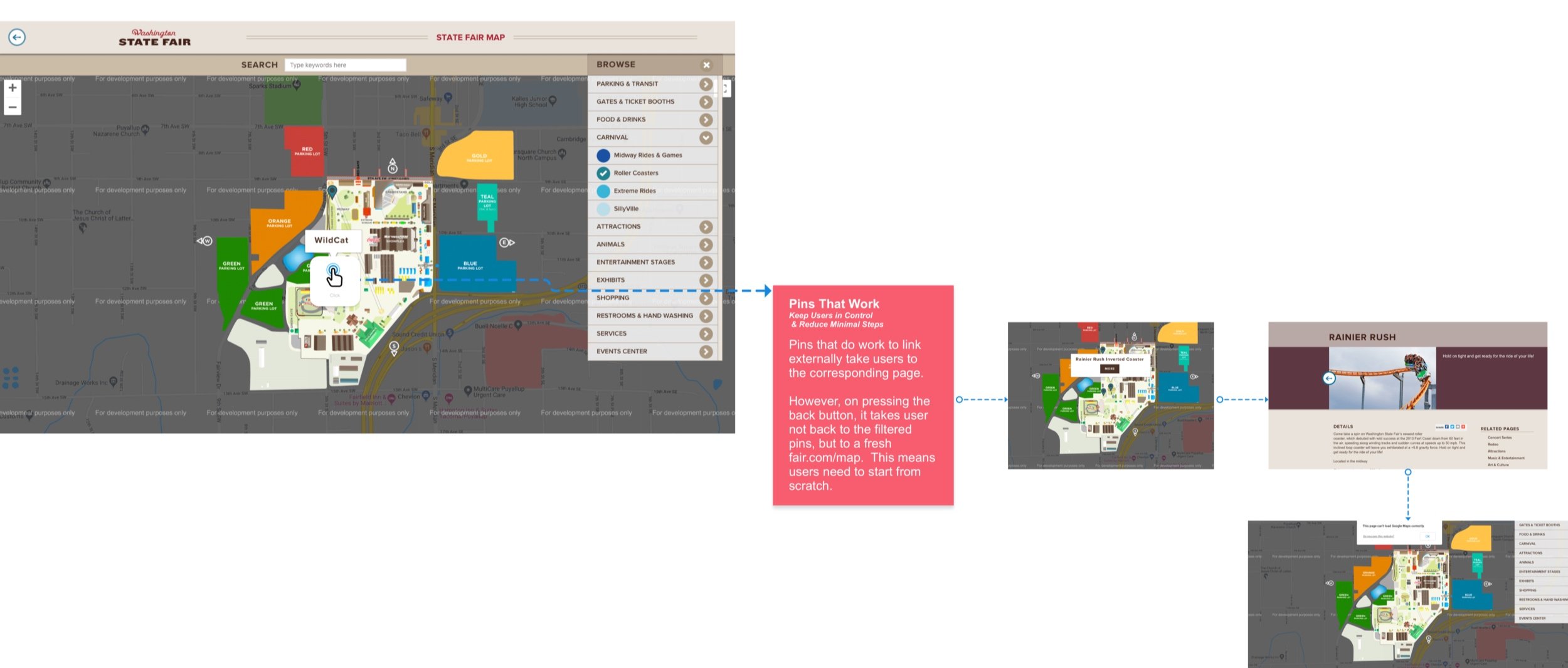
Map 4
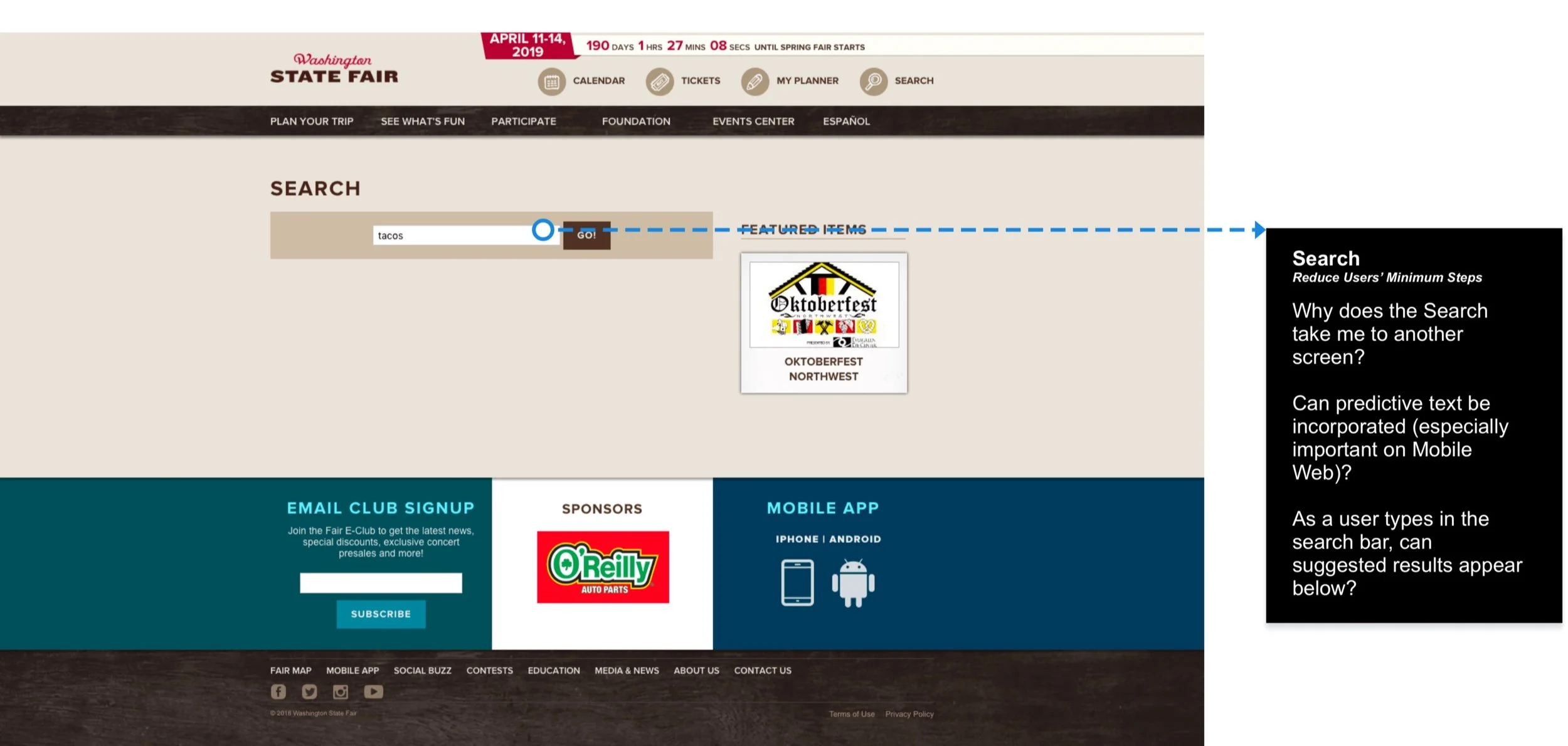
Search
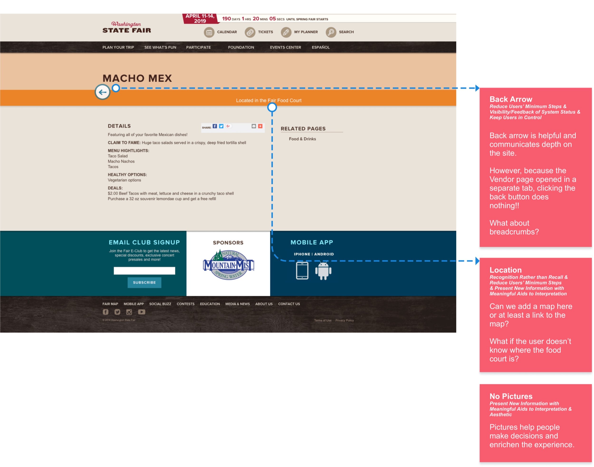
Vendor
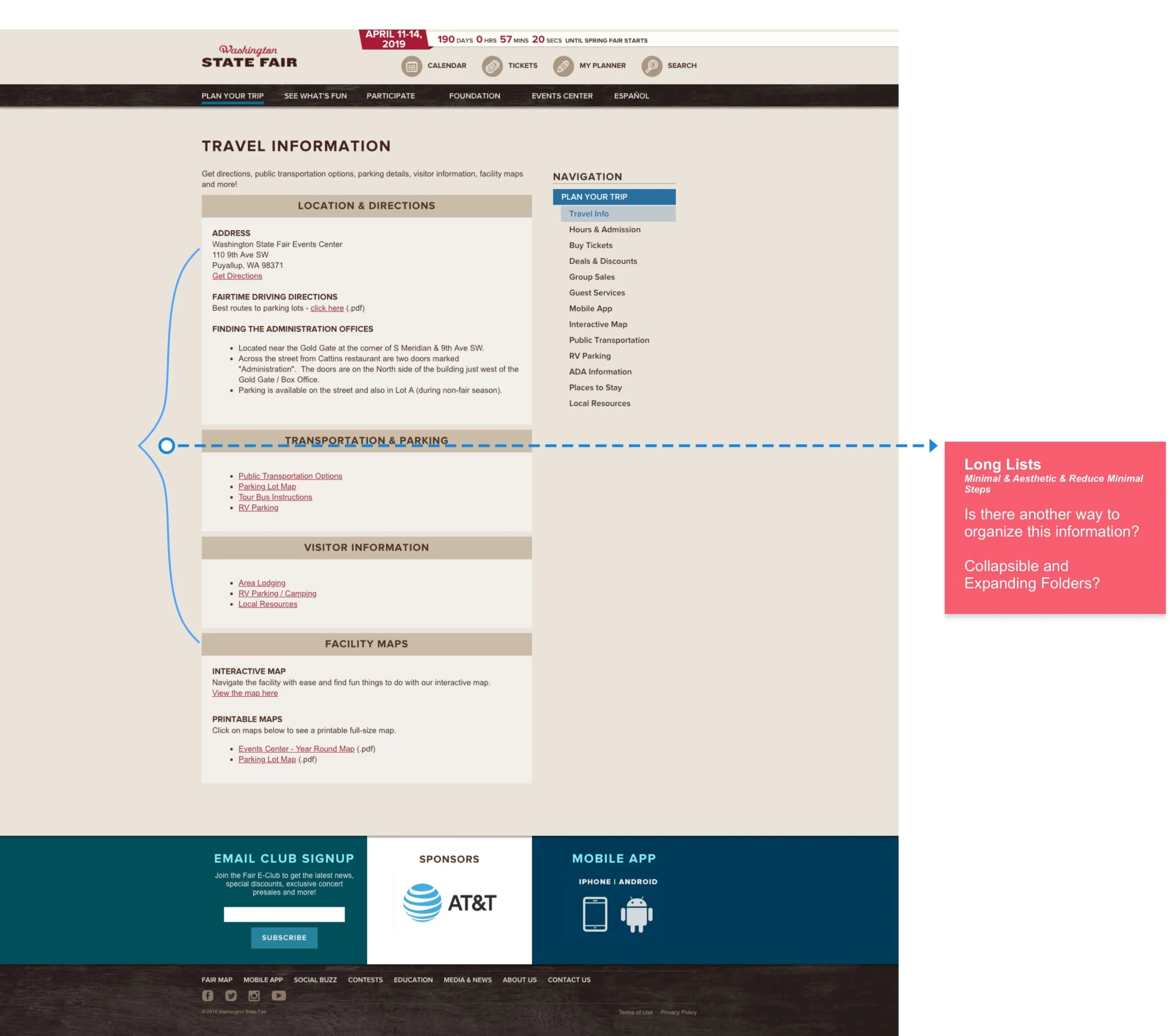
Travel info
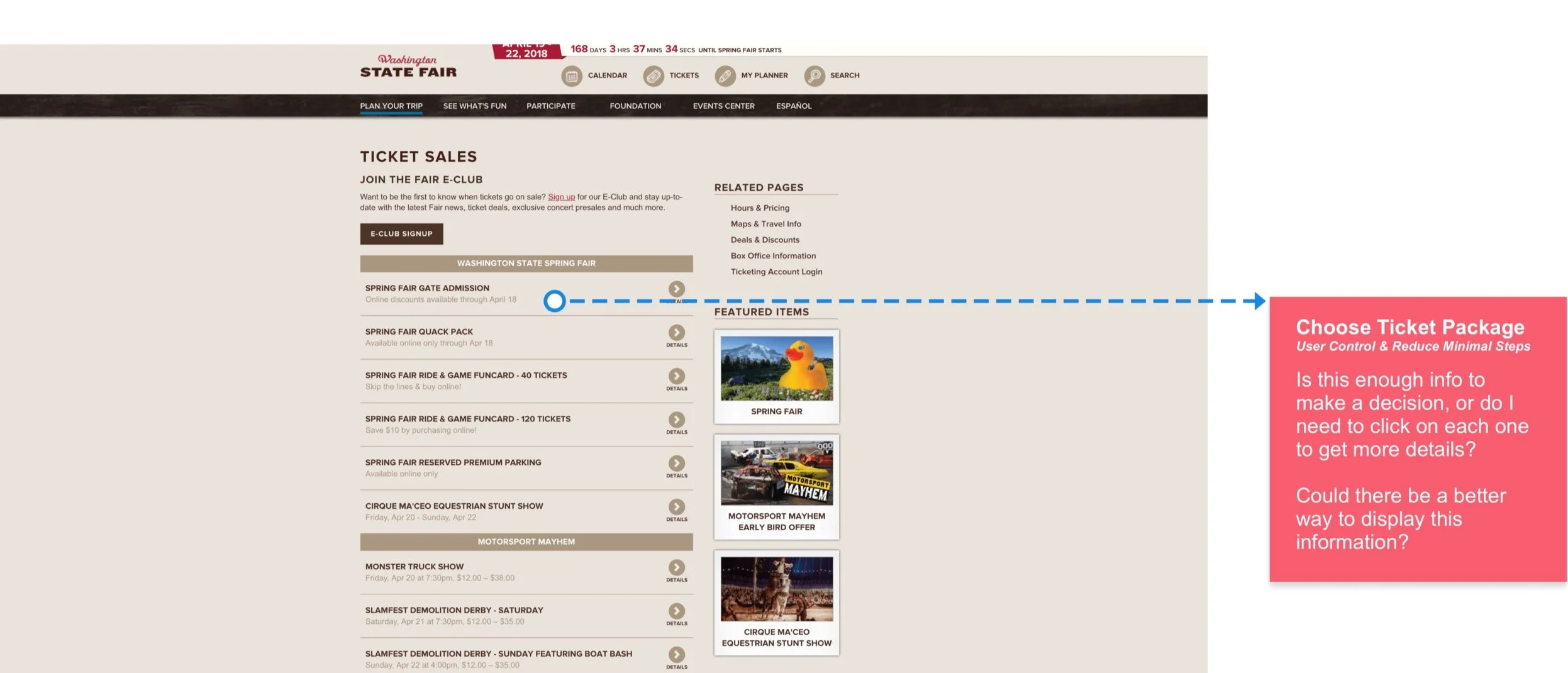
Tickets
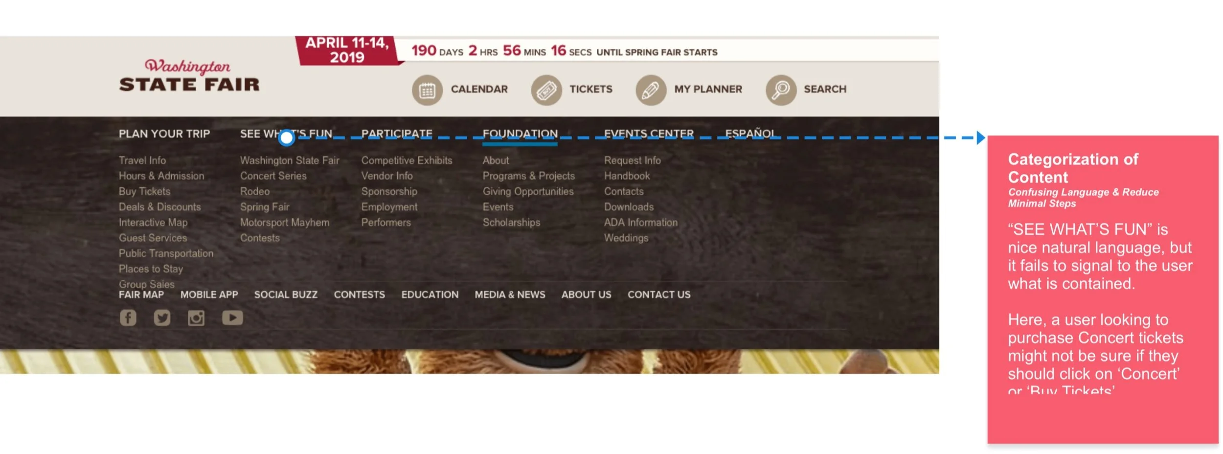
Nav
App UX Audit
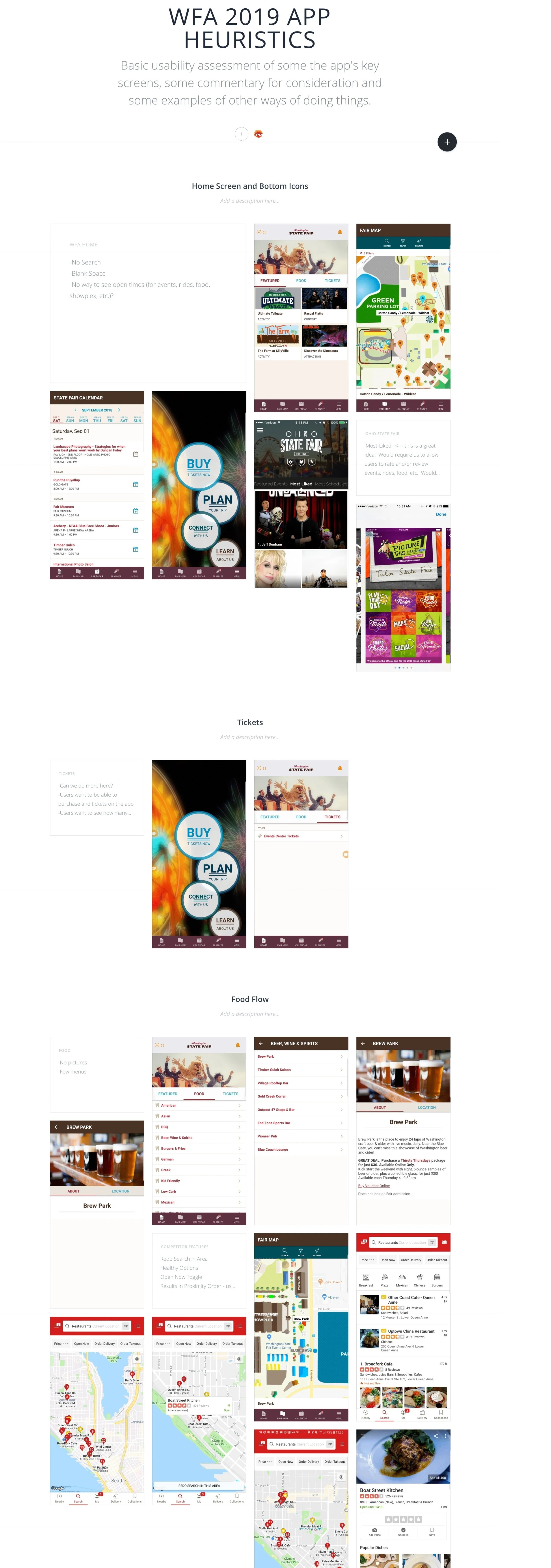
App UX Audit
App UX Audit
Heuristic & audit take-aways
Organization
Menus are confusing and busy.
Long lists of text
Important content should fit within mobile viewport
System feedback
Keep users informed about the status of the view
Visual hierarchy
Reconsider when/where we need a large hero image
Minimize low-quality content that competes for attention
Compact long lists of content for improved scanability
Reduce Steps
Minimize clicks and friction for common user flows
Consistency
Features and functionality should work the same across the platforms
Competitor assessment
I reviewed direct and indirect competitors to understand how they’ve tackled these problems and assess how well their solutions would help our users.
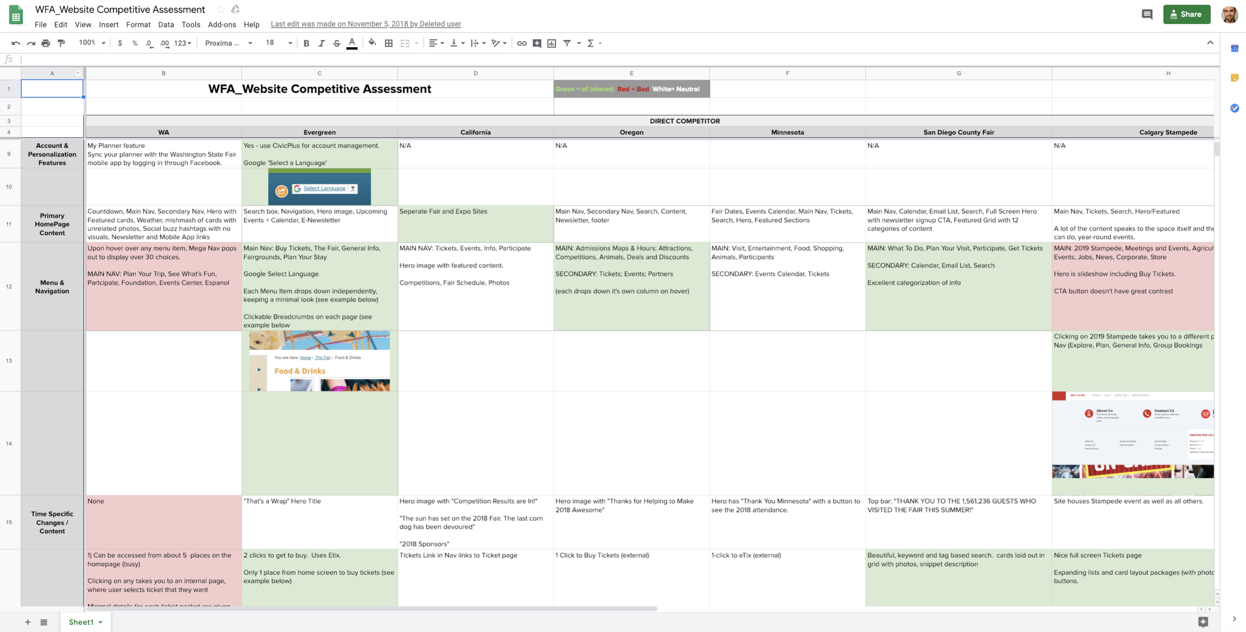
What the competition was doing well
-
Timely
Content that adapts to current/upcoming events. (More research needed)
-
Activity Detail
Hero takes up too much space, often irrelevant and no CTA.
-
Map
Improve filtering and pin color contrast.
Add more info when user clicks on pin.
-
Food
Make it easier to find.
-
Simplify
Provide enough info to make decision w/out clicking in to page
Reduce paths to pages
Add expanding and collapsing lists for long lists of text
-
Navigation
Communicate navigational indentation, provide back arrows that go back to last state, conform to standards for deleting an event (remove it from Planner)
Drop down the menu items independently.
Organize better (card sort/site audit)
-
Calendar
Make it clear that Calendar is different than My Planner
Display events with MORE info and better pictures in a visual concise and interesting way.
Would help to have global events, filter by category and keyword and be searchable.
-
Search
Search bar in Nav.
Auto-complete recommendations.
Tag content or allow search to see more than titles.
Provide relevant info in list of results (not unuseful nomenclature referring to gates and addresses.
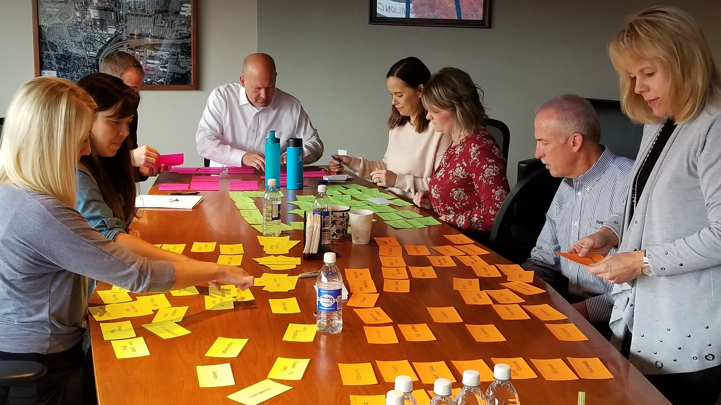
Synthesizing all of the findings
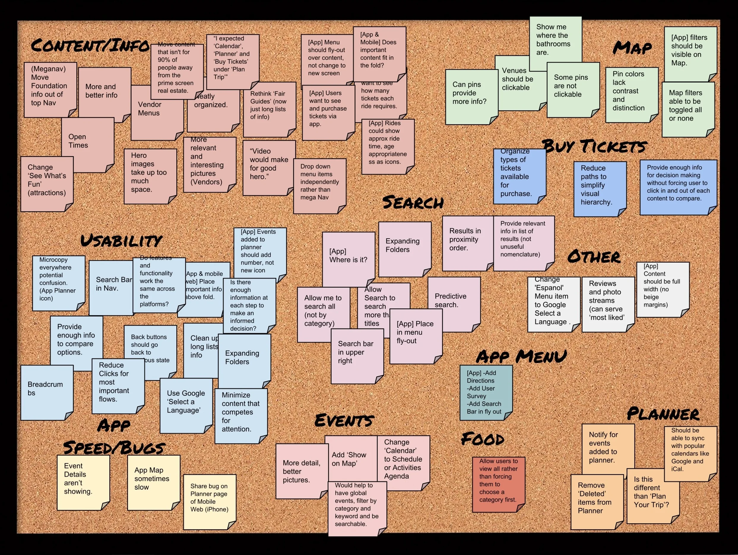
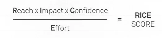
Prioritizing with R.I.C.E.
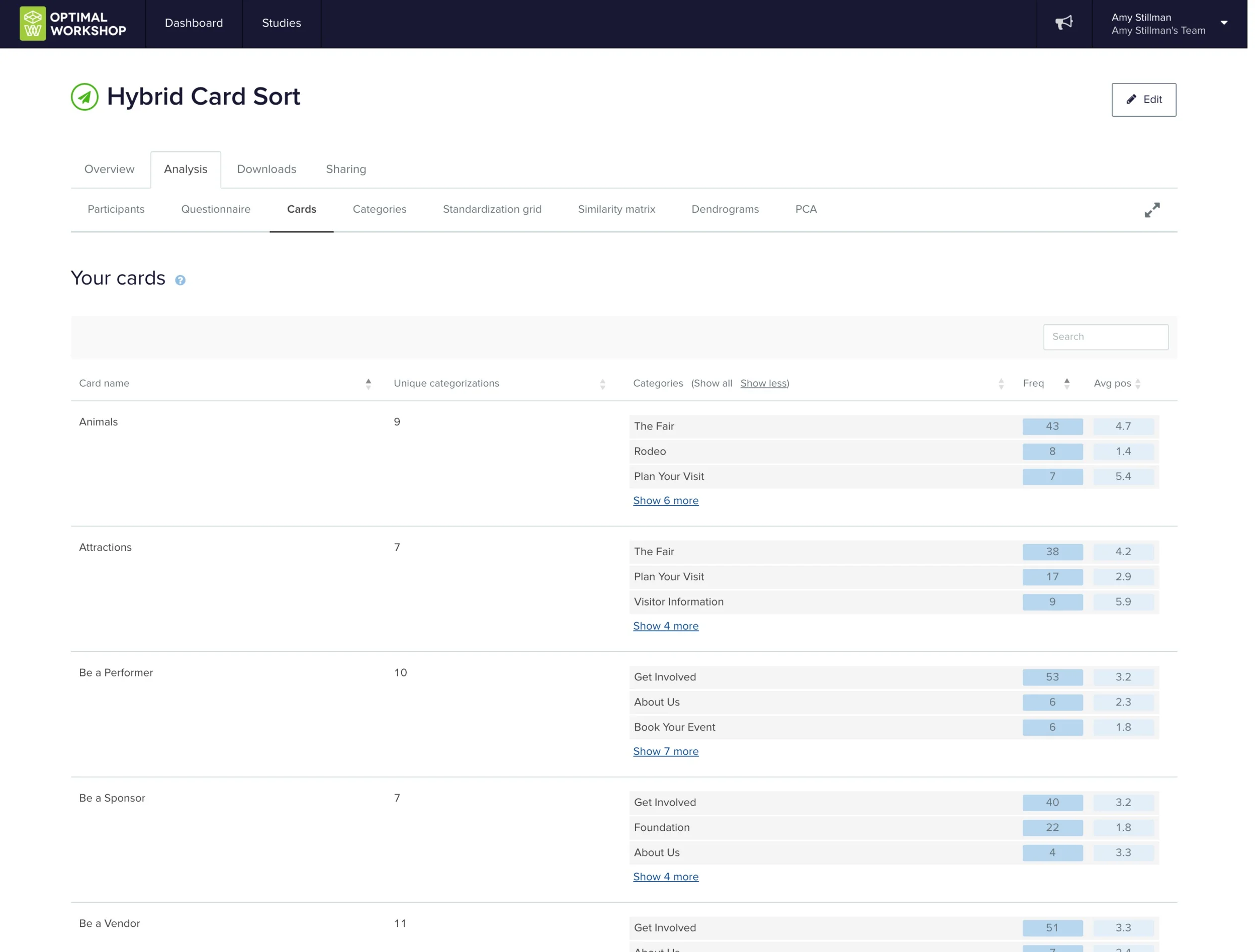
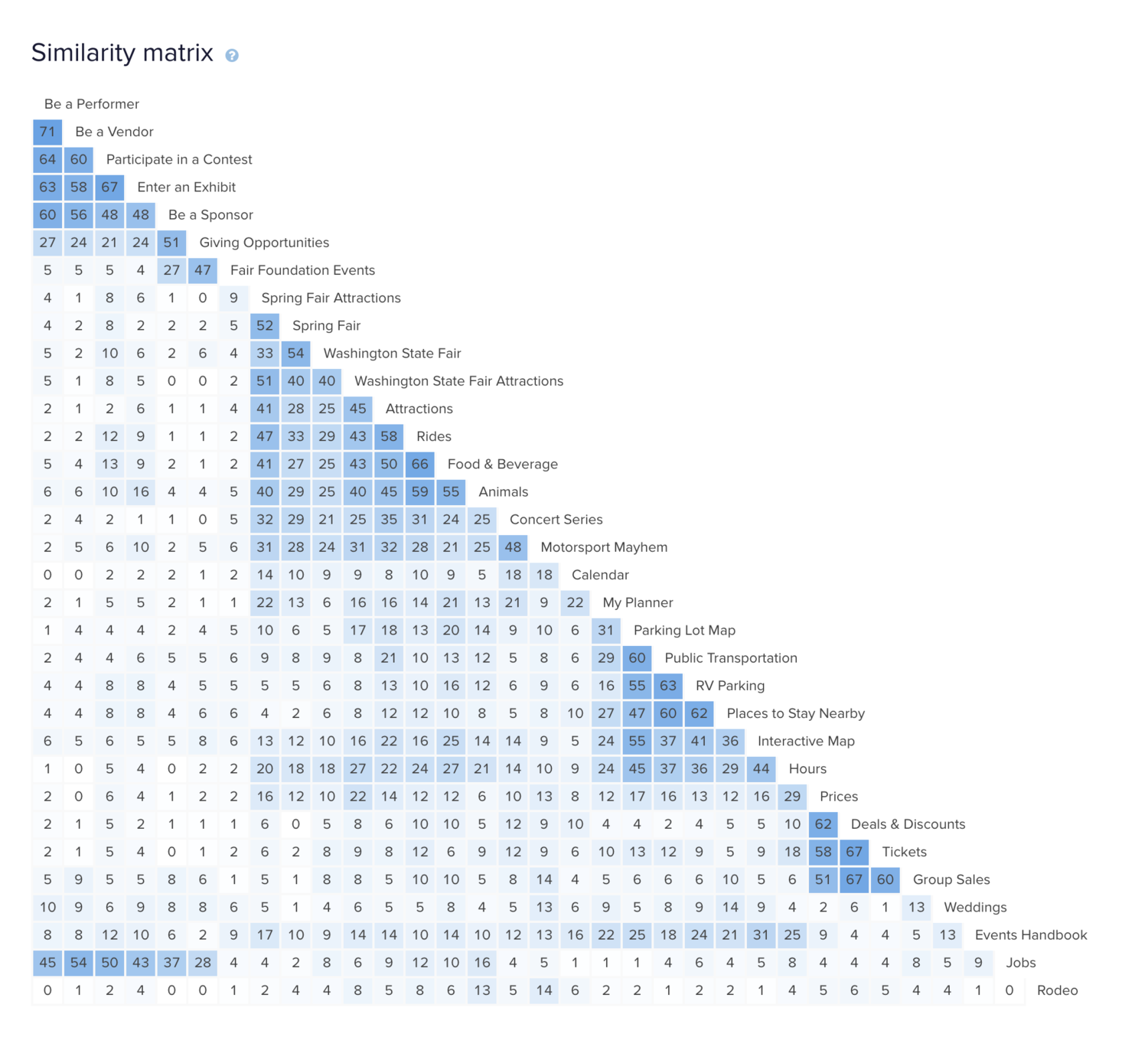
Card Sorts
Card sorting aids in the design and assessment of a website's information architecture, making it easier to locate and access content on the site.
Open card sort
Discover how people understand and categorize information
No predetermined categories
Performed in-person for benefit of group discussions
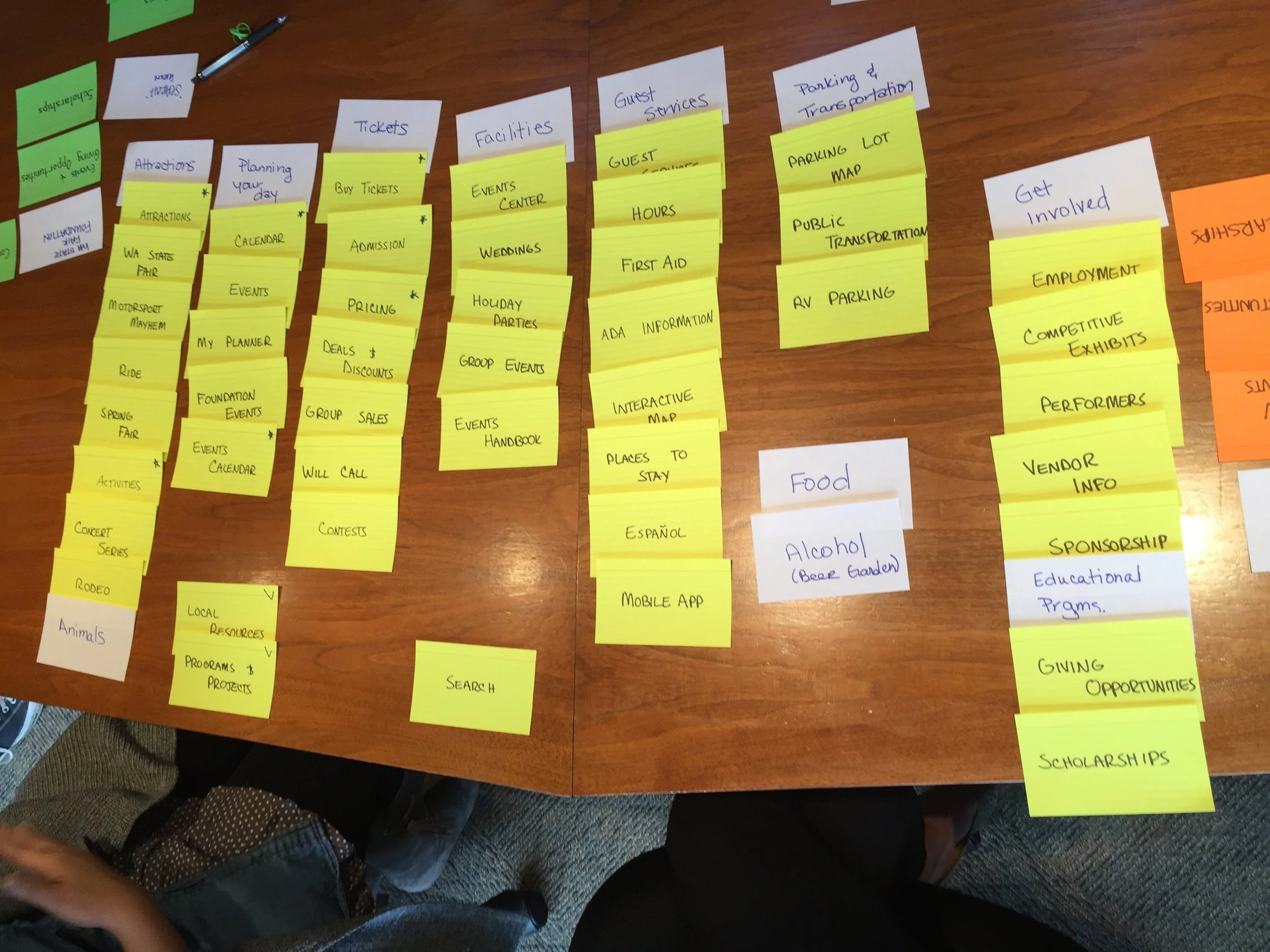
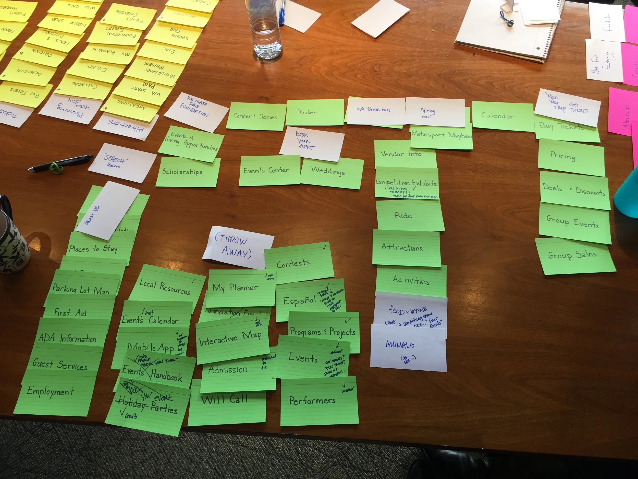
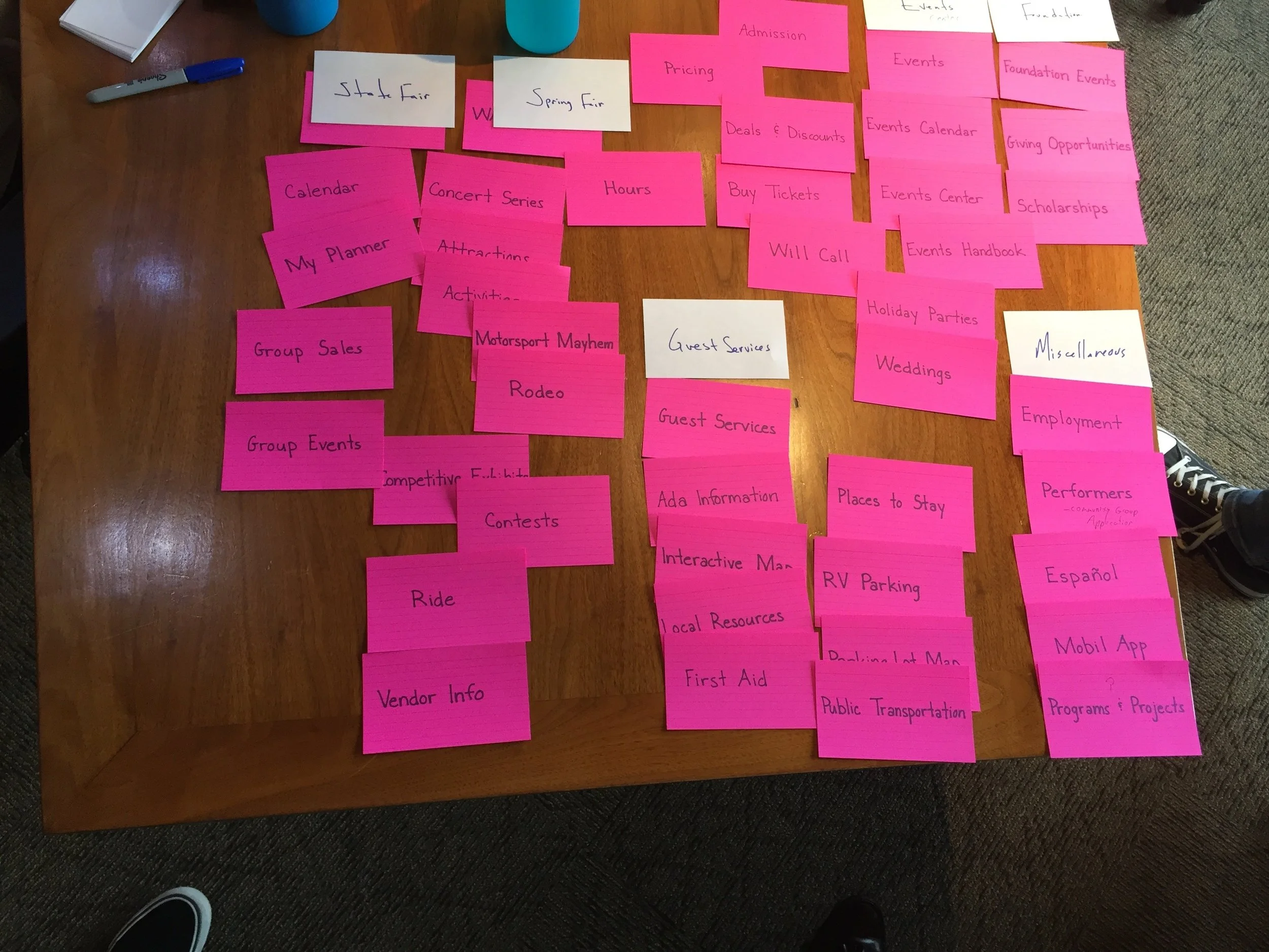
Hybrid card sort
In a hybrid card sort, you create pre-defined categories and allow participants to create their own as well
Used because we have a rough idea of information architecture
Performed online to get a larger data set
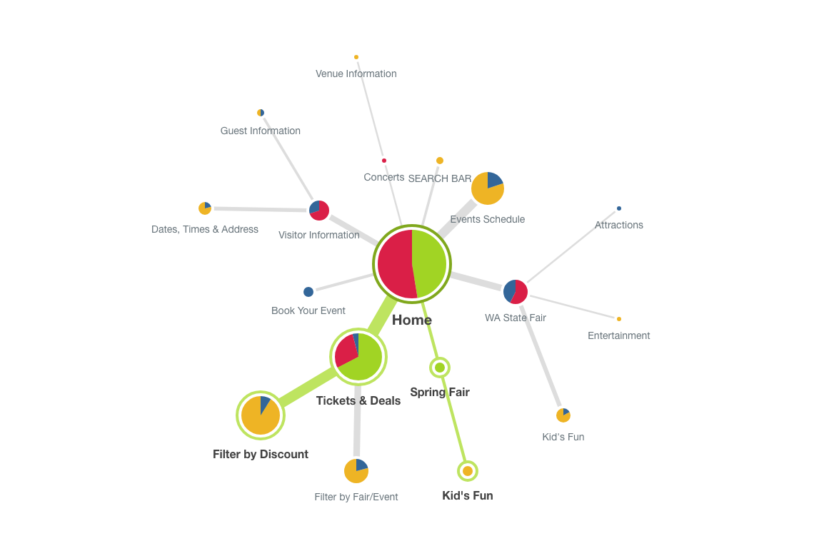
Tree Test (aka TreeJack)
Tree testing tells you how easily people can find information on your website and exactly where people get lost.
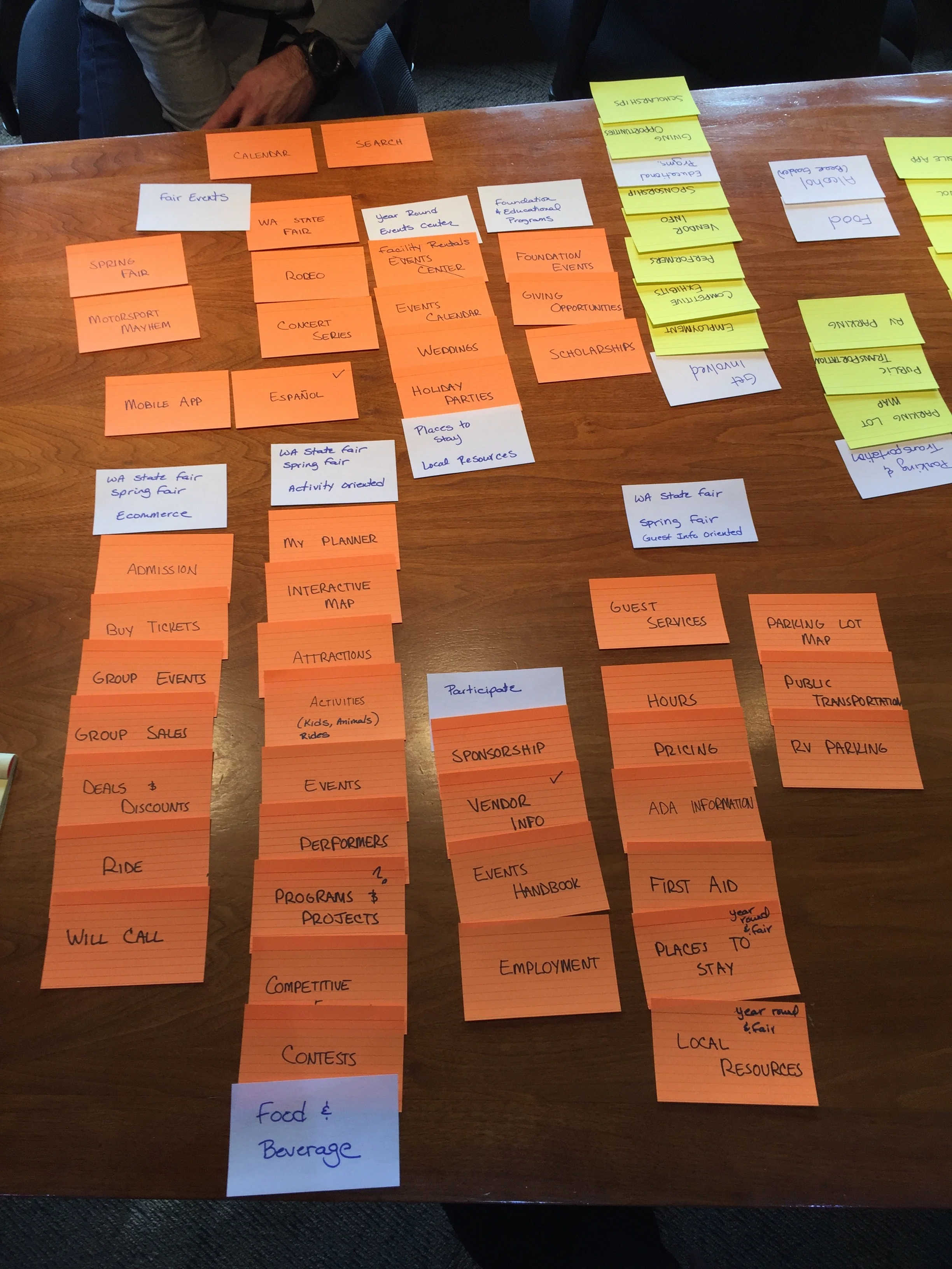
The card sorts told us how people think the content should be grouped and labeled. Based on the card sort results and site requirements, I created a draft sitemap and ran a tree test to see how it performs based on common user tasks.
Tree testing can answer questions like:
Do my labels make sense to people?
Is my content grouped logically to people?
Can people find the information they want easily and quickly? If not, what’s stopping them?
Participants:
I recruited participants by sending an incentivized email to The Fair’s newsletter subscribers. Participants were given tasks and presented with a text-based hierarchy. Upon completion, I reviewed the success rate, error-free rate, and time to completion.
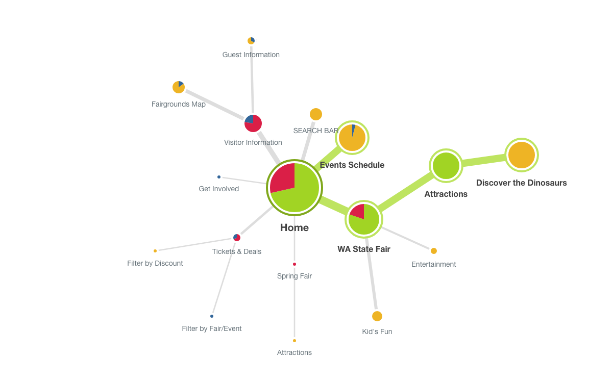
Card Sort & Tree Test Findings
INTEGRATIONS
Most thought Deals & Discounts should live under or be integrated with Tickets.
My Faves as an alternative way to Save more than just scheduled activities (ie. food, rides)
Search results on Map
CLARITY & SIMPLIFICATION
Most are confused by the difference between Events Center, Events Calendar, Planner, and Calendar
Most people prefer General Information to Plan Your Visit or Visitor Info
Most removed cards that they found redundant or trivial
Consider making each title self-explanatory
For instance, is Performers for those performing or those who want to see them perform?
Most people thought Rodeo should be its own category
Features
Interactive Map and Schedule are seen as App features to be downgraded in importance on the web.
Improved Search
People have very different ideas about where to find things.
Adding multiple paths helps, but is messy and overwhelming.
Predictive searches
Tagging and Learn by Doing
Build systems that can be accessed using user’s vocab and teach grouping along the way.
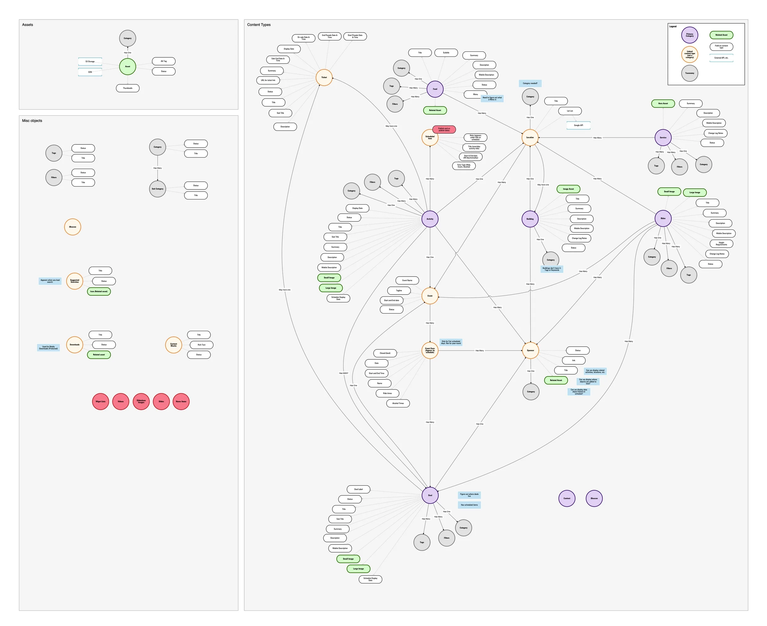
Diagraming the CMS
In addition to a new website and app, we moved all the data from a proprietary CMS over to Dato for a better Fair Admin user experience.
This diagram went through numerous iterations nearly daily as we wrestled with the connections between one thing and the next.
The fair has a tremendous amount of information, and until now, much of that information was duplicated and disconnected.
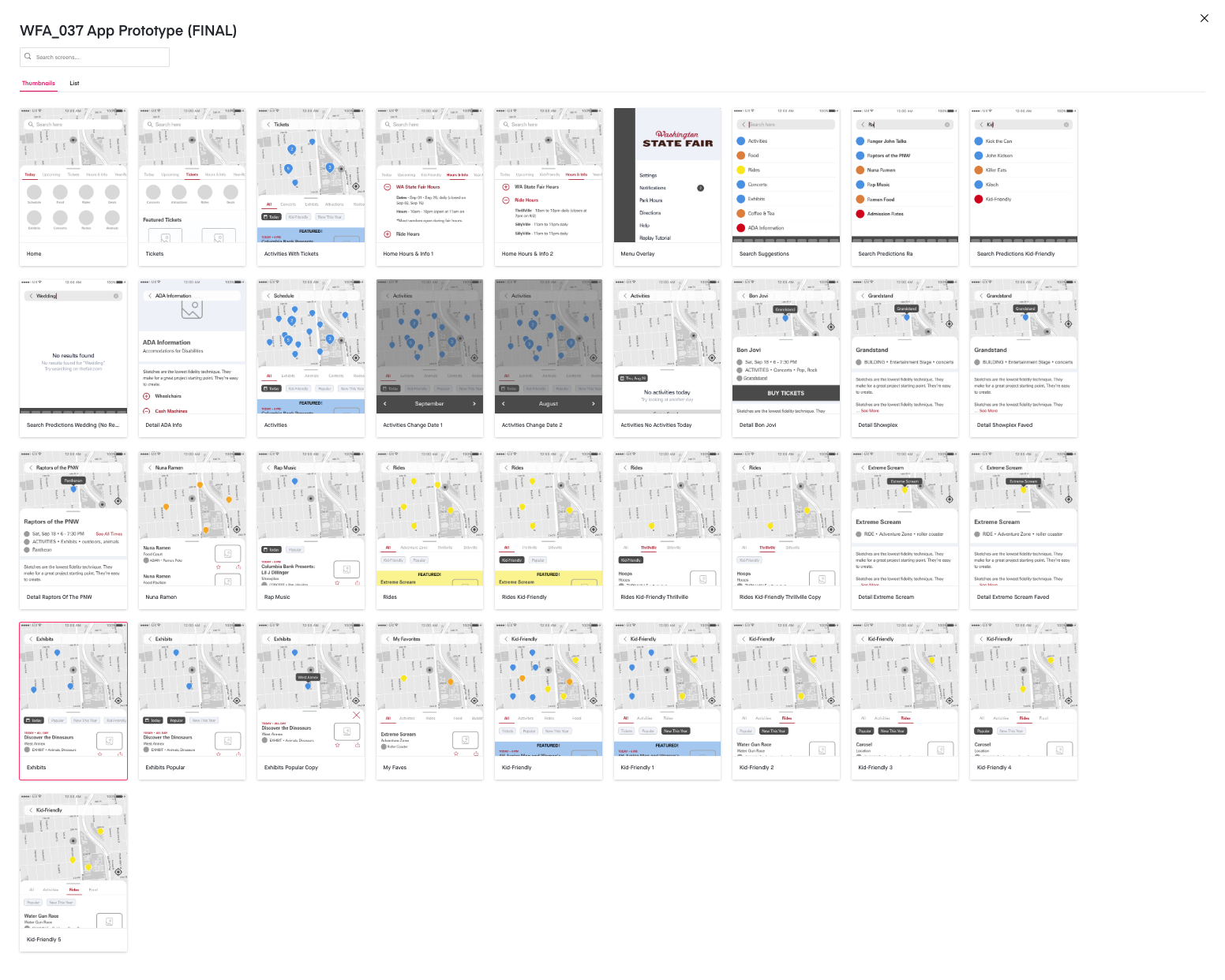
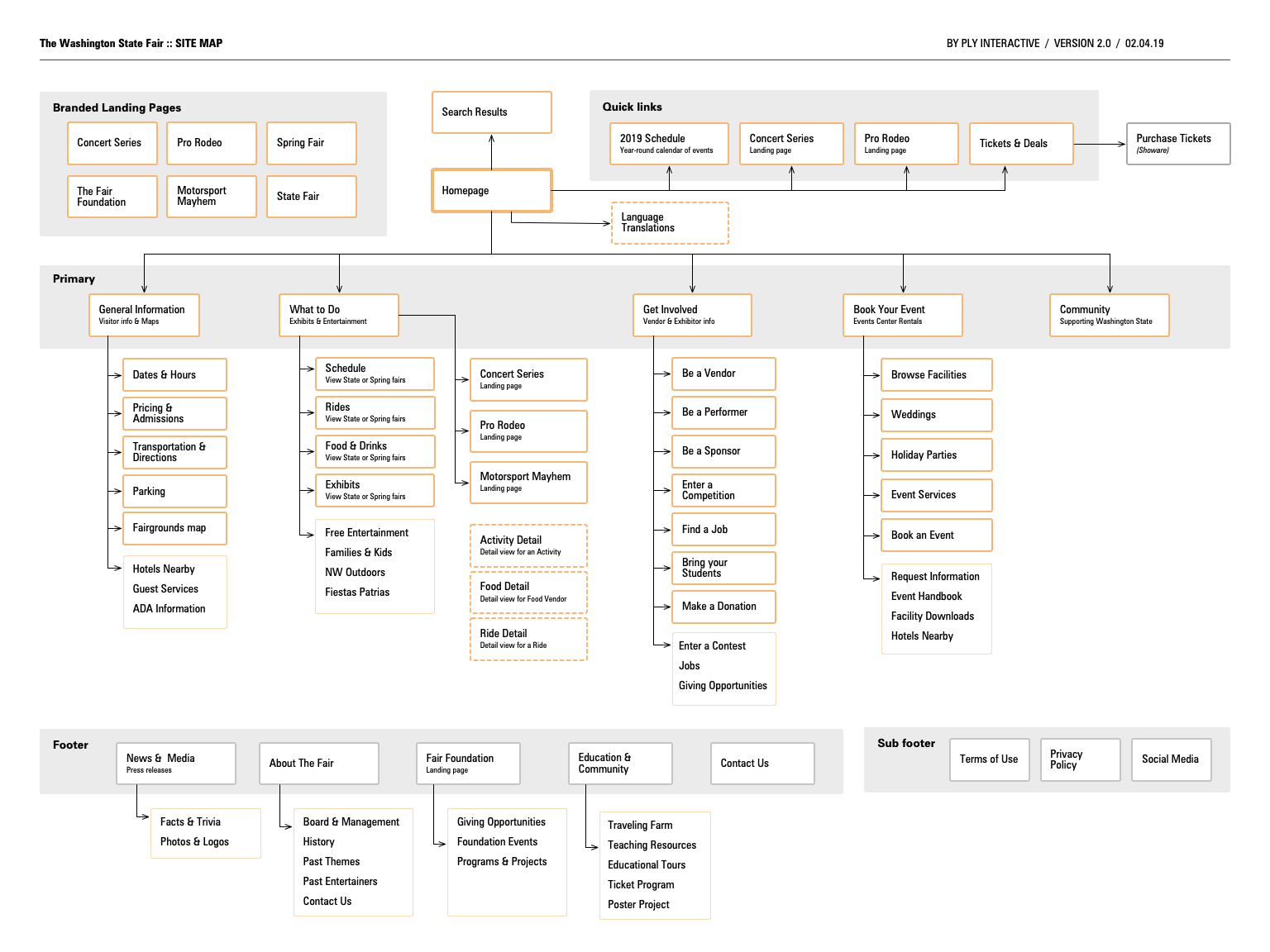
Sitemap
App map
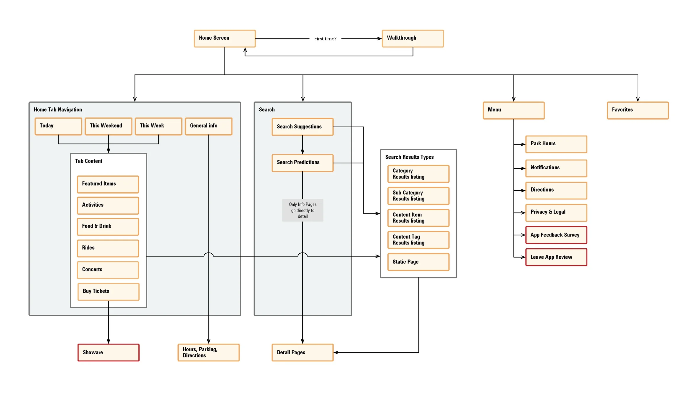
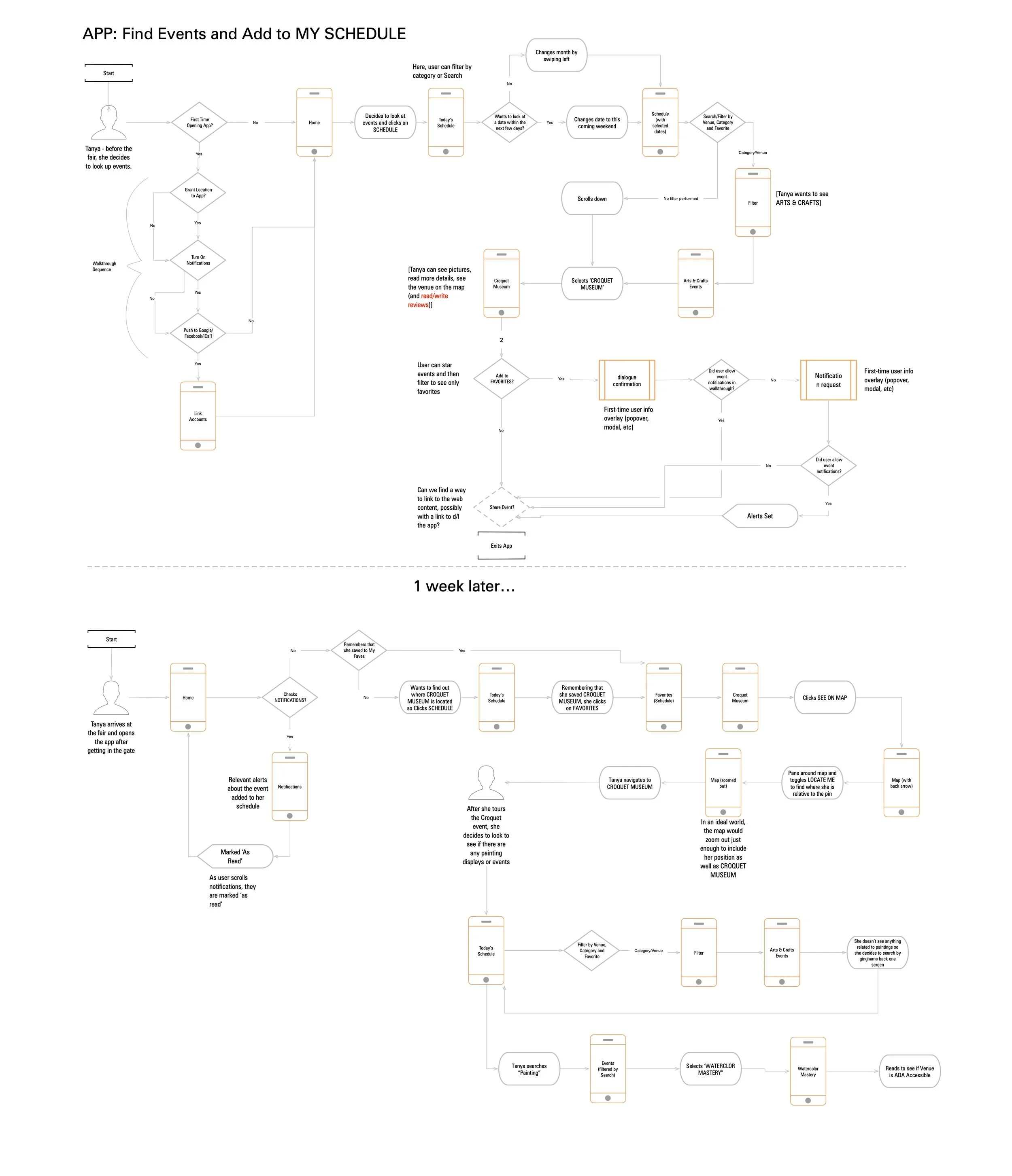
App flows
Sketches, Sketches & More Sketches
I like to start with whiteboard or Invision Freehand before any project.
It allows for quick ideation, exploration and creativity.
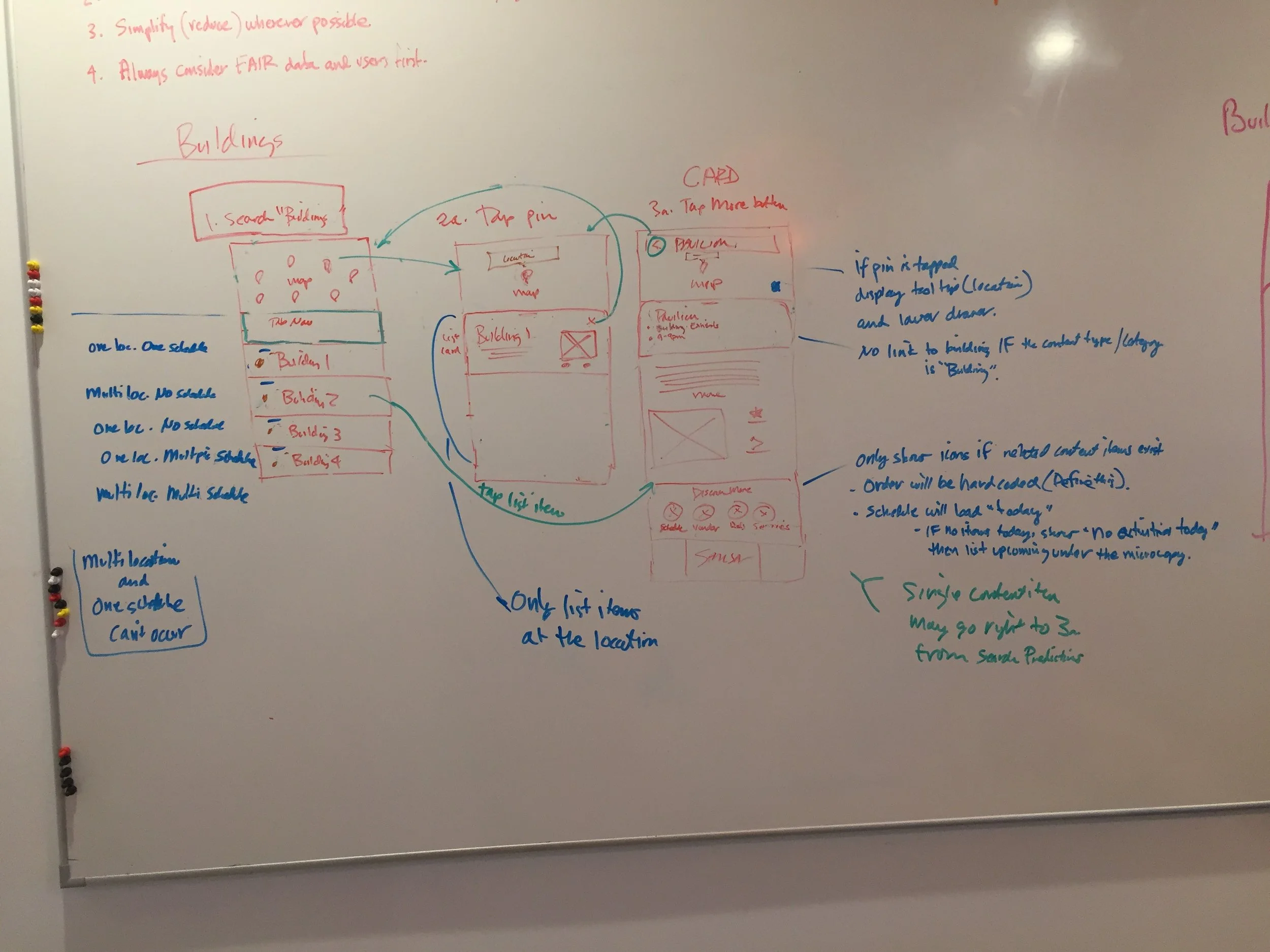
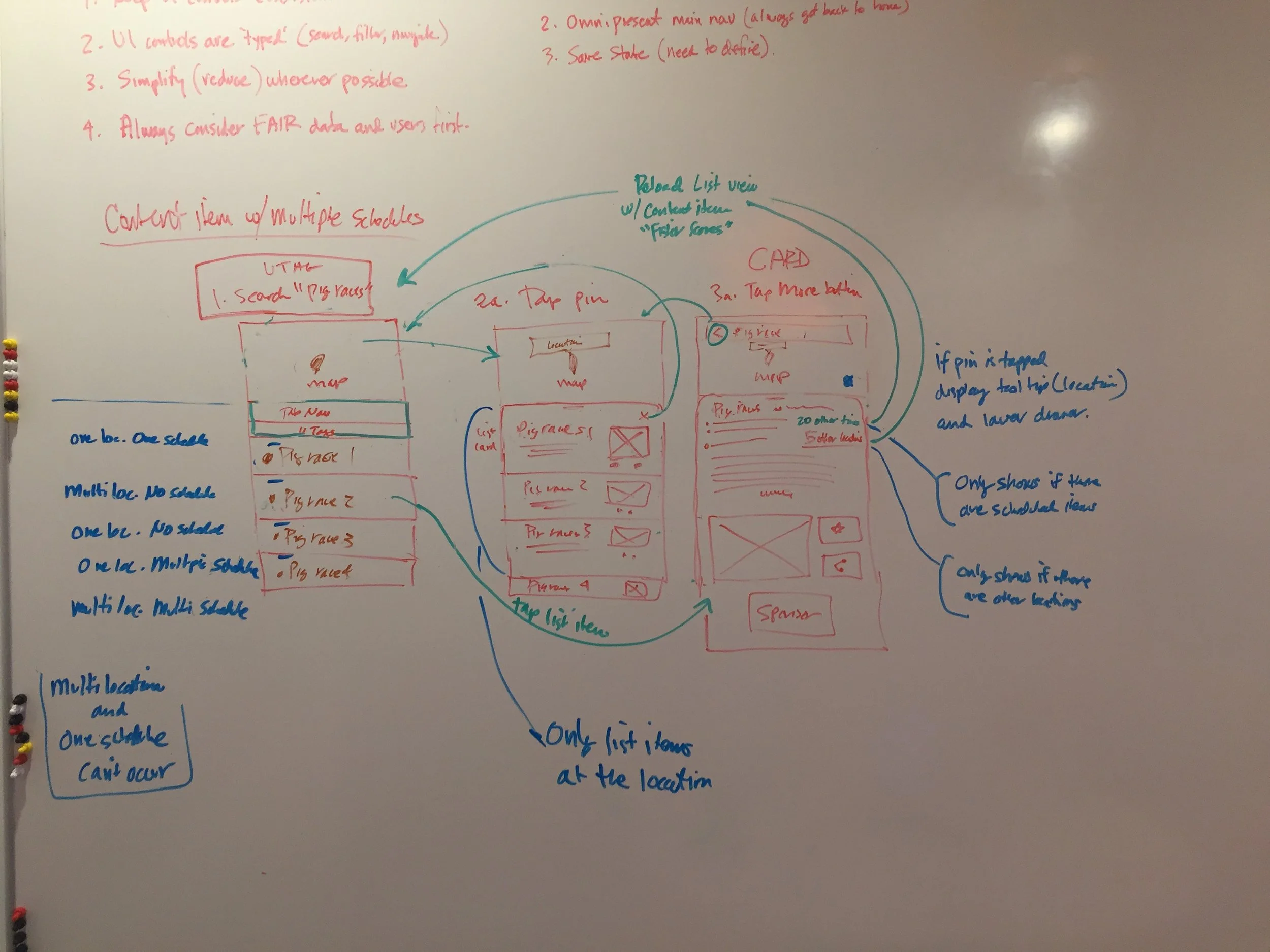
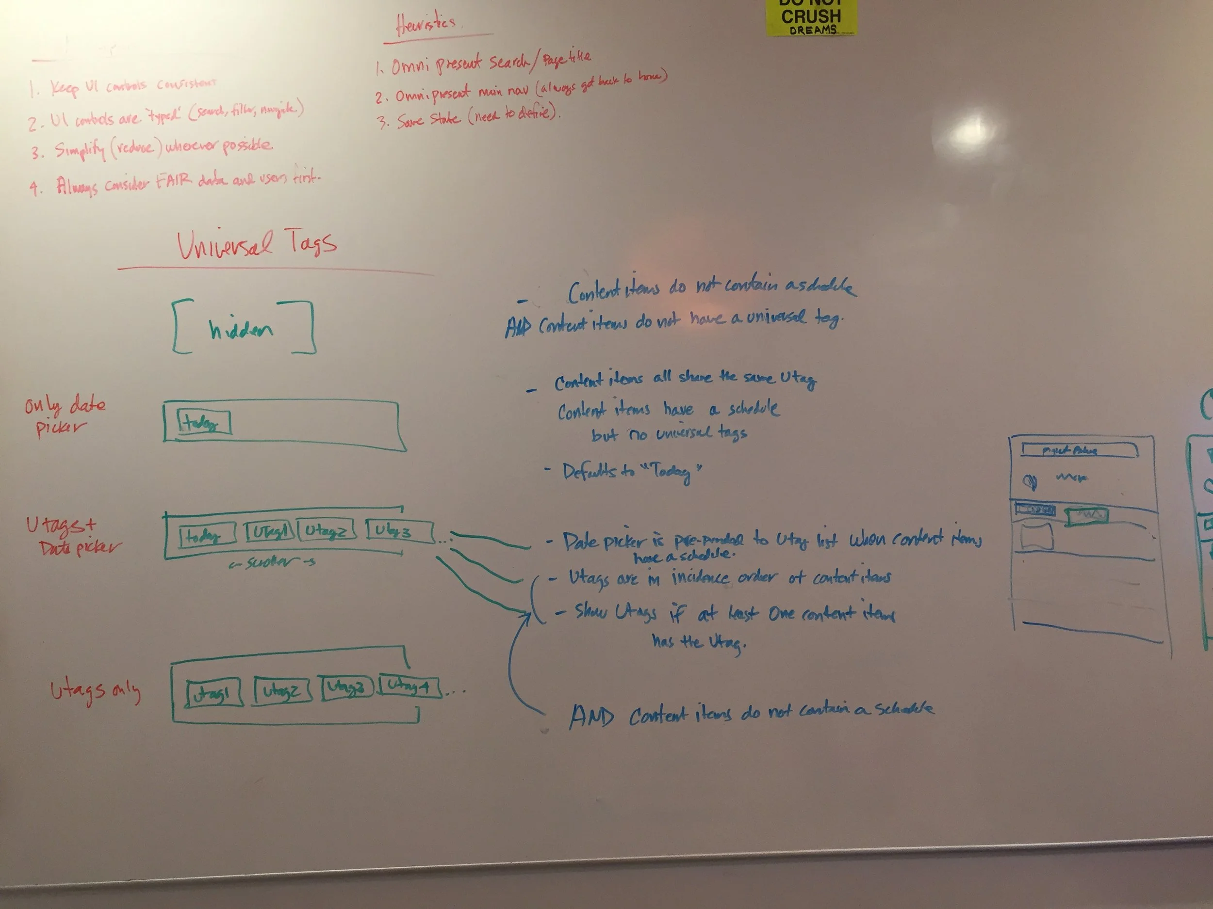
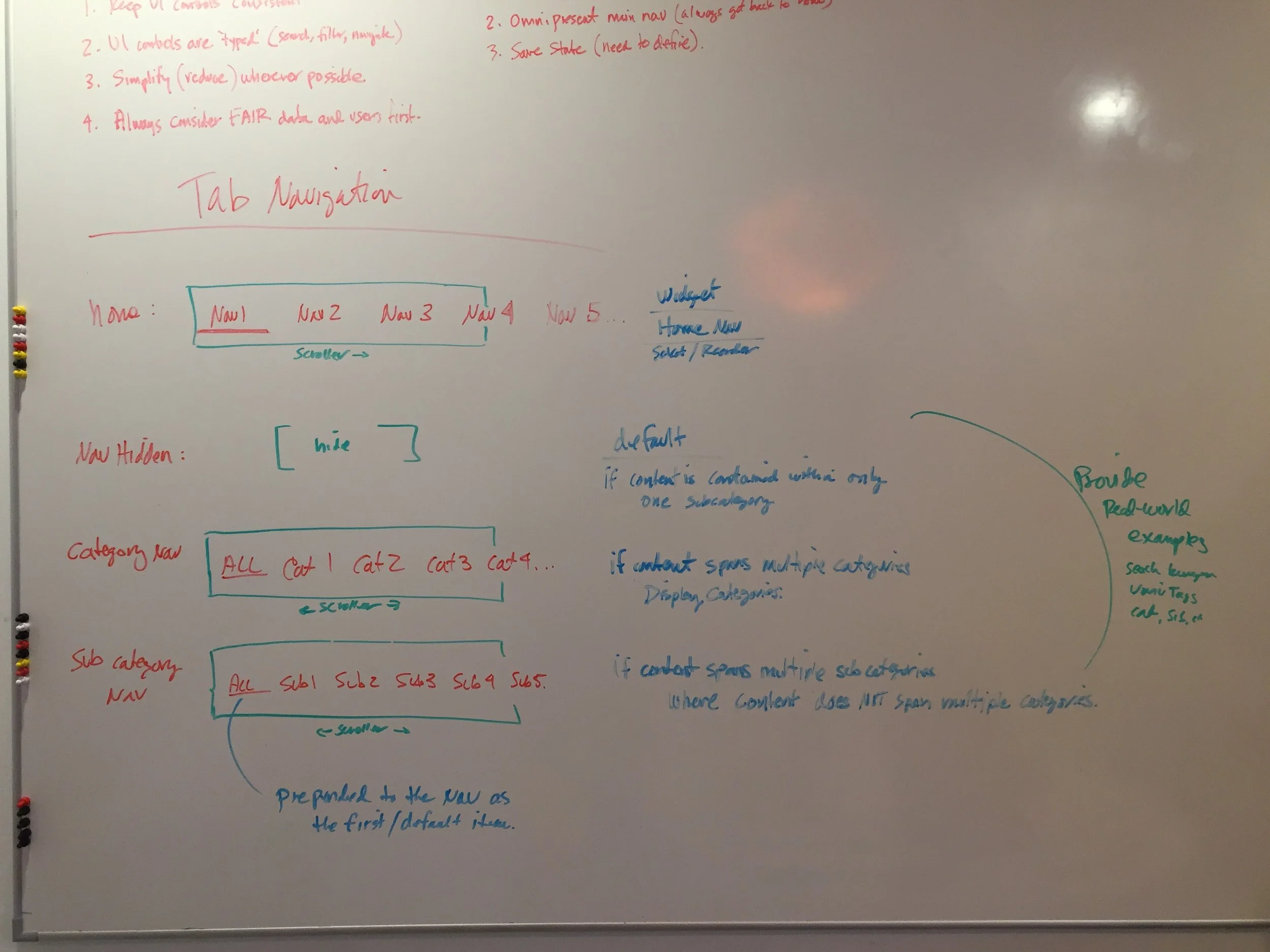
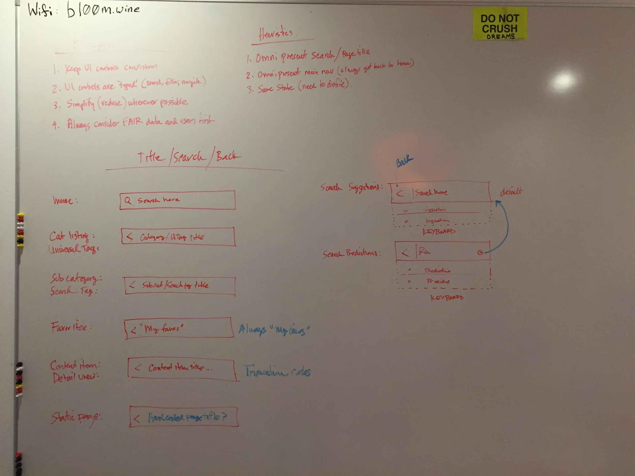
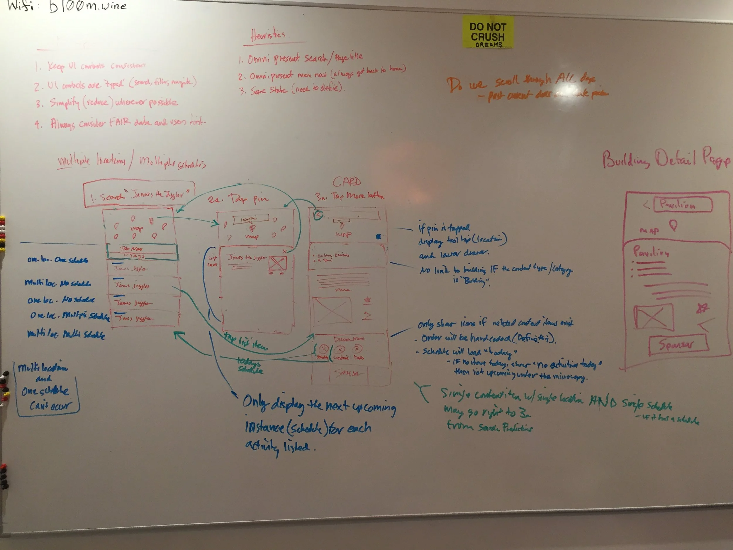

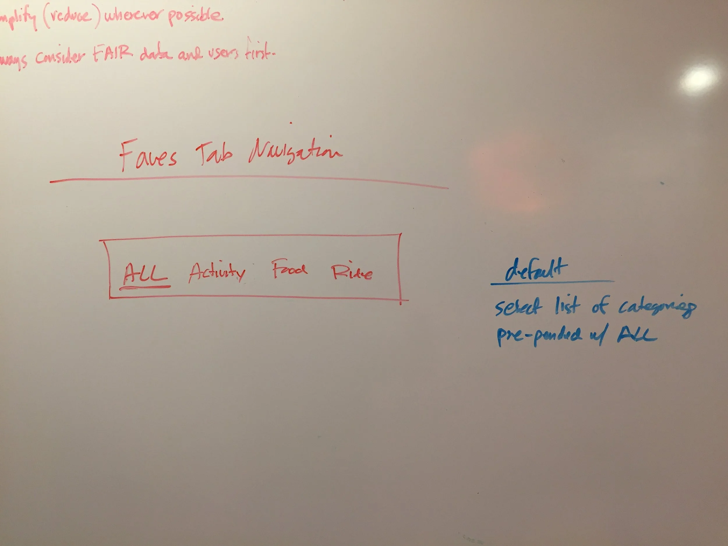
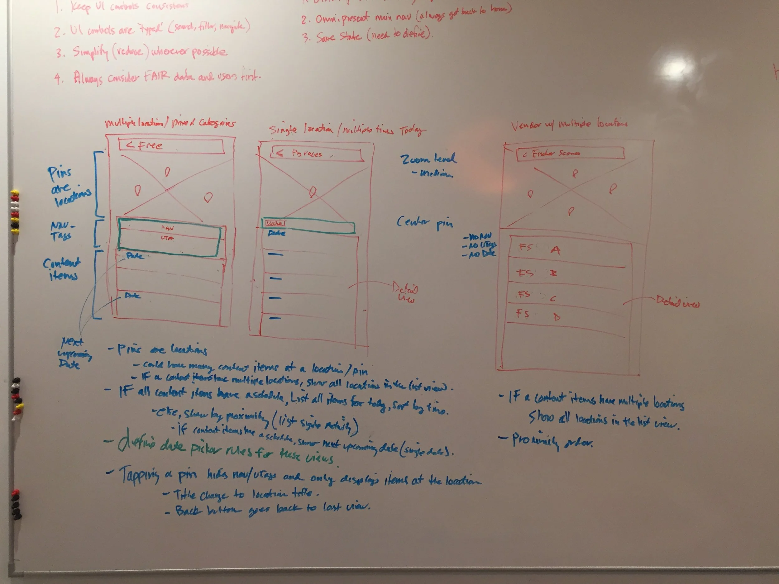
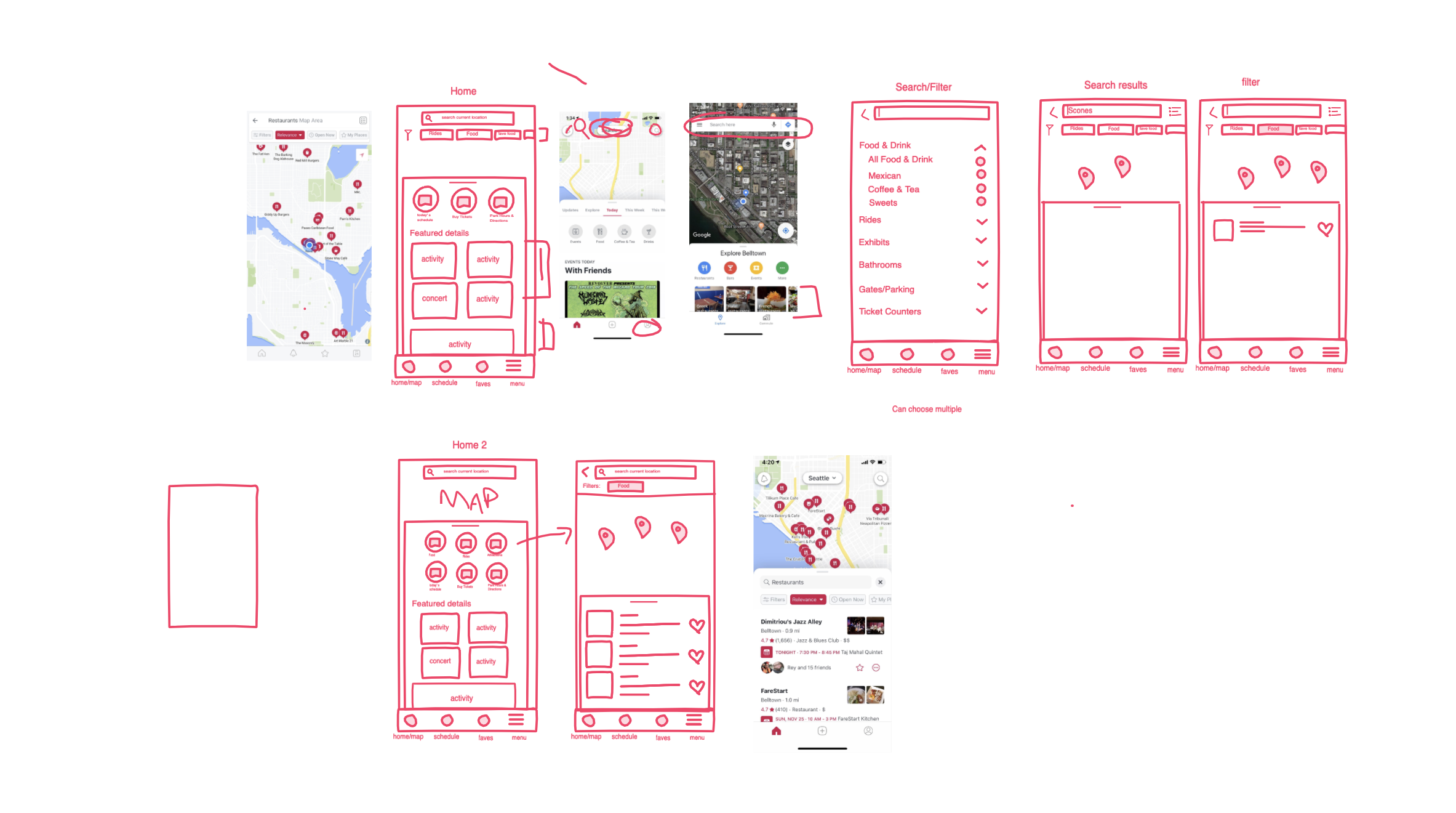
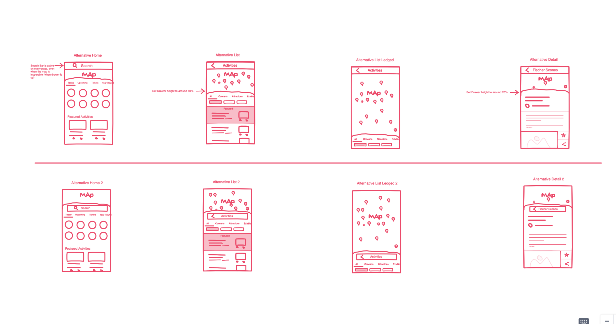

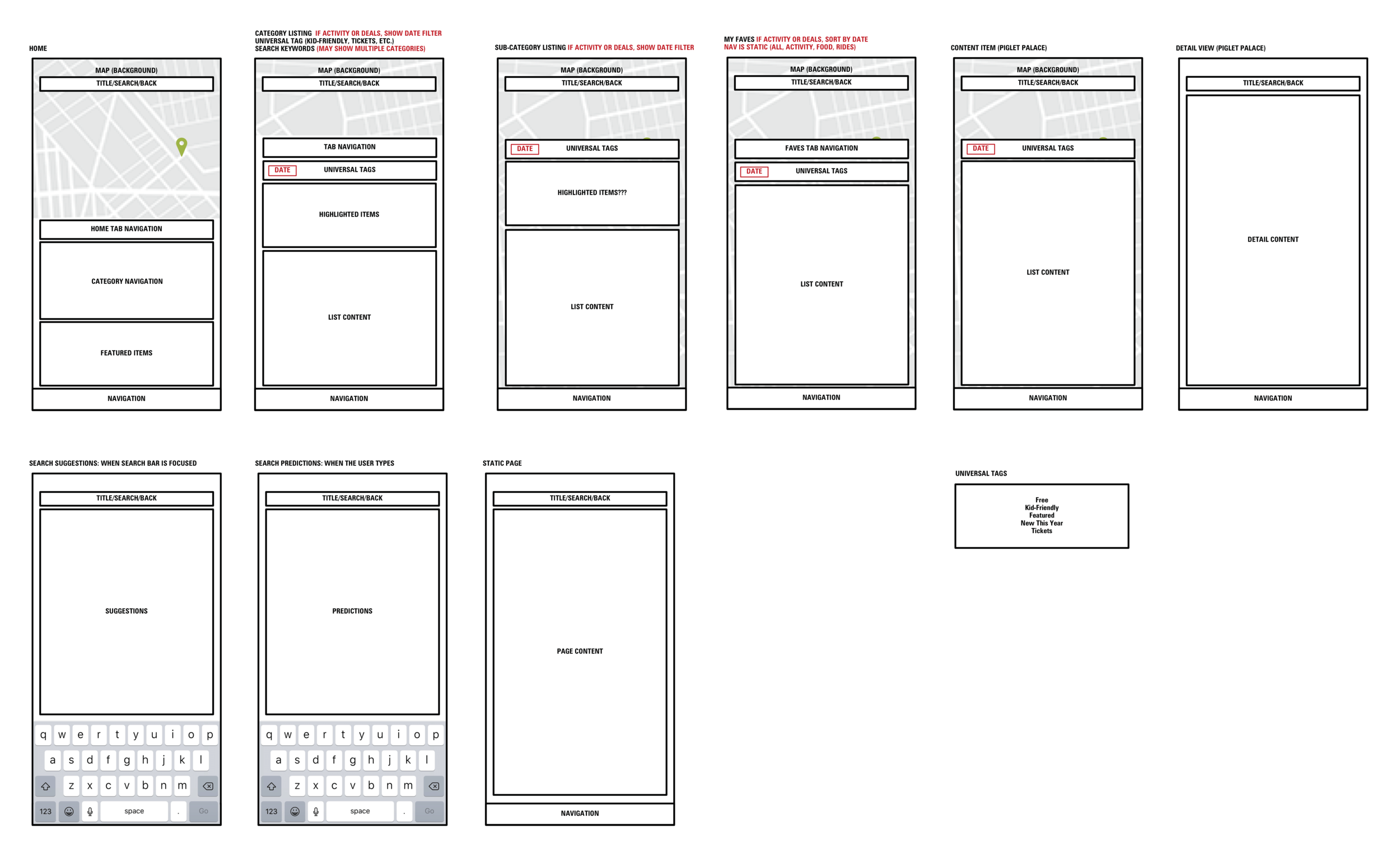
Low-Fidelity Wireframes
Starting with boxes helps identify recurring elements and also helps inform the design in a developer friendly way.
Conditional logic
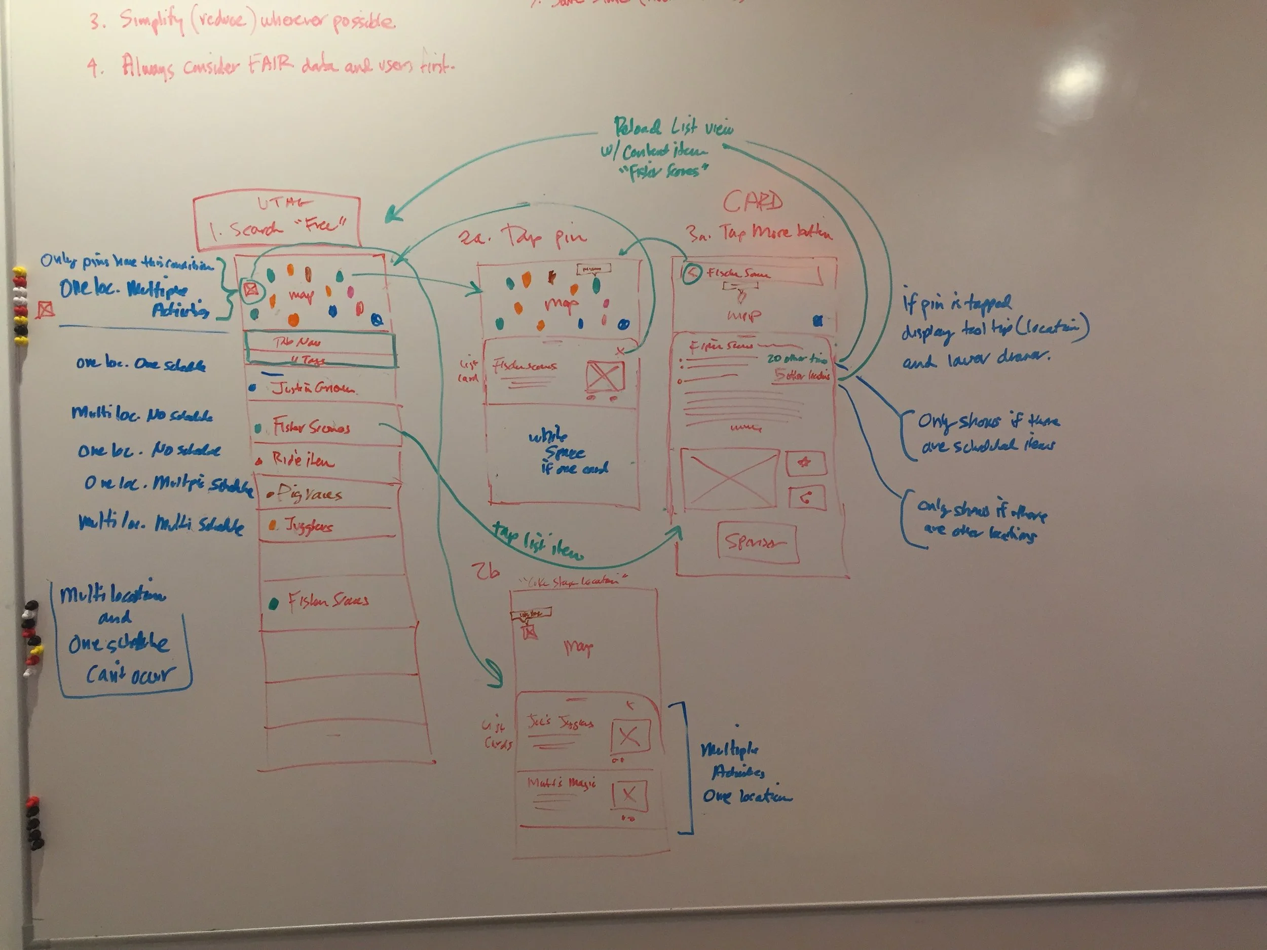
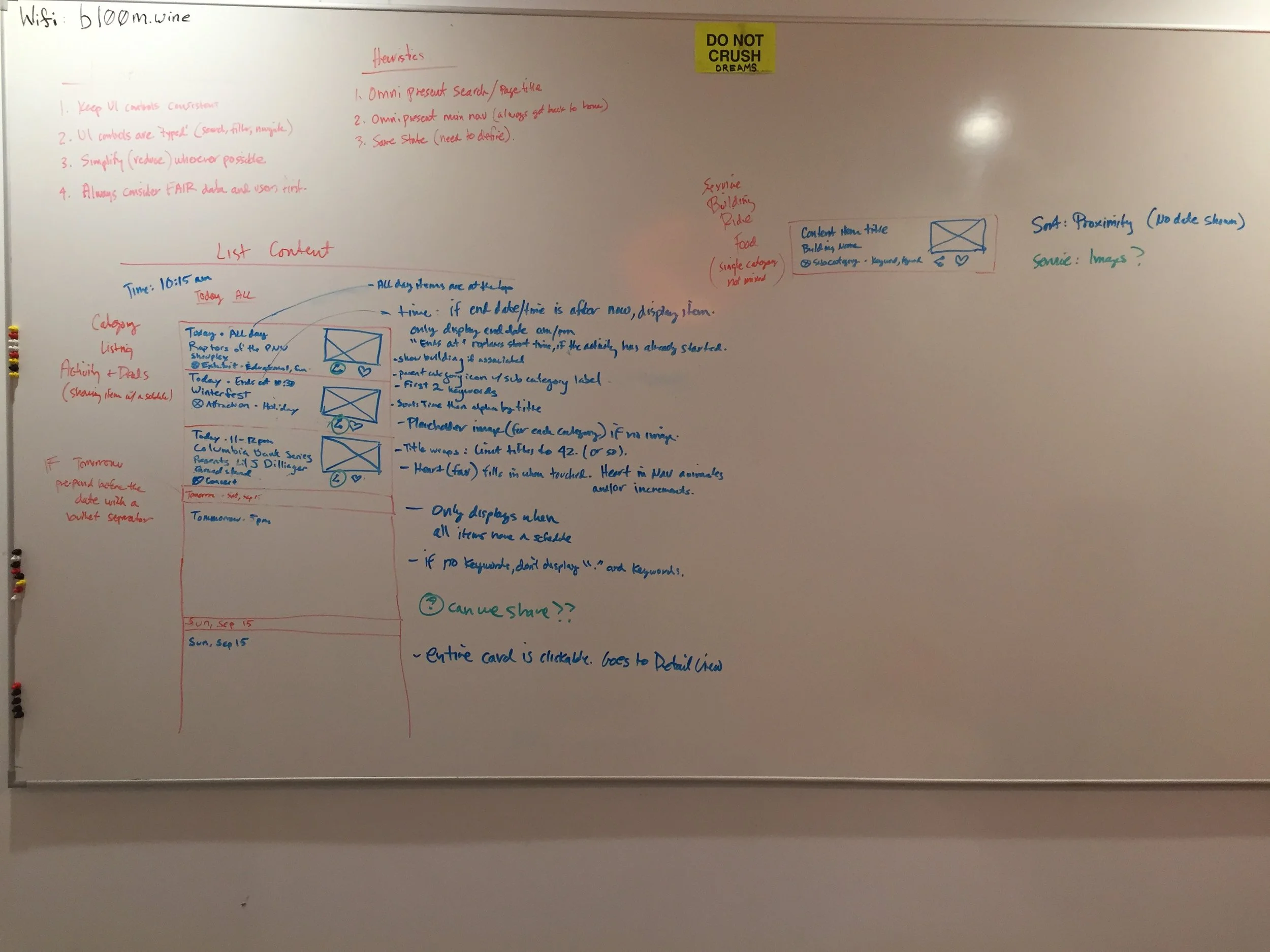
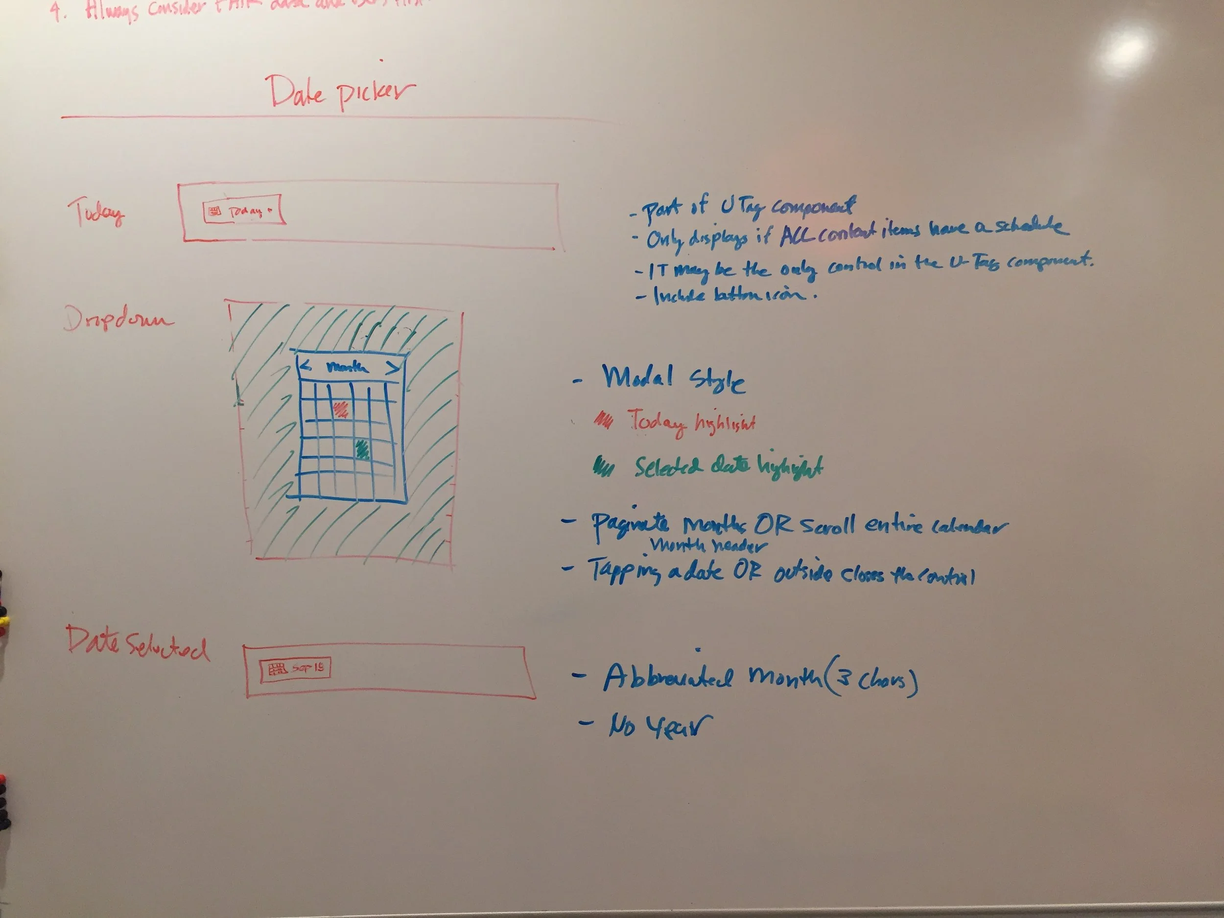
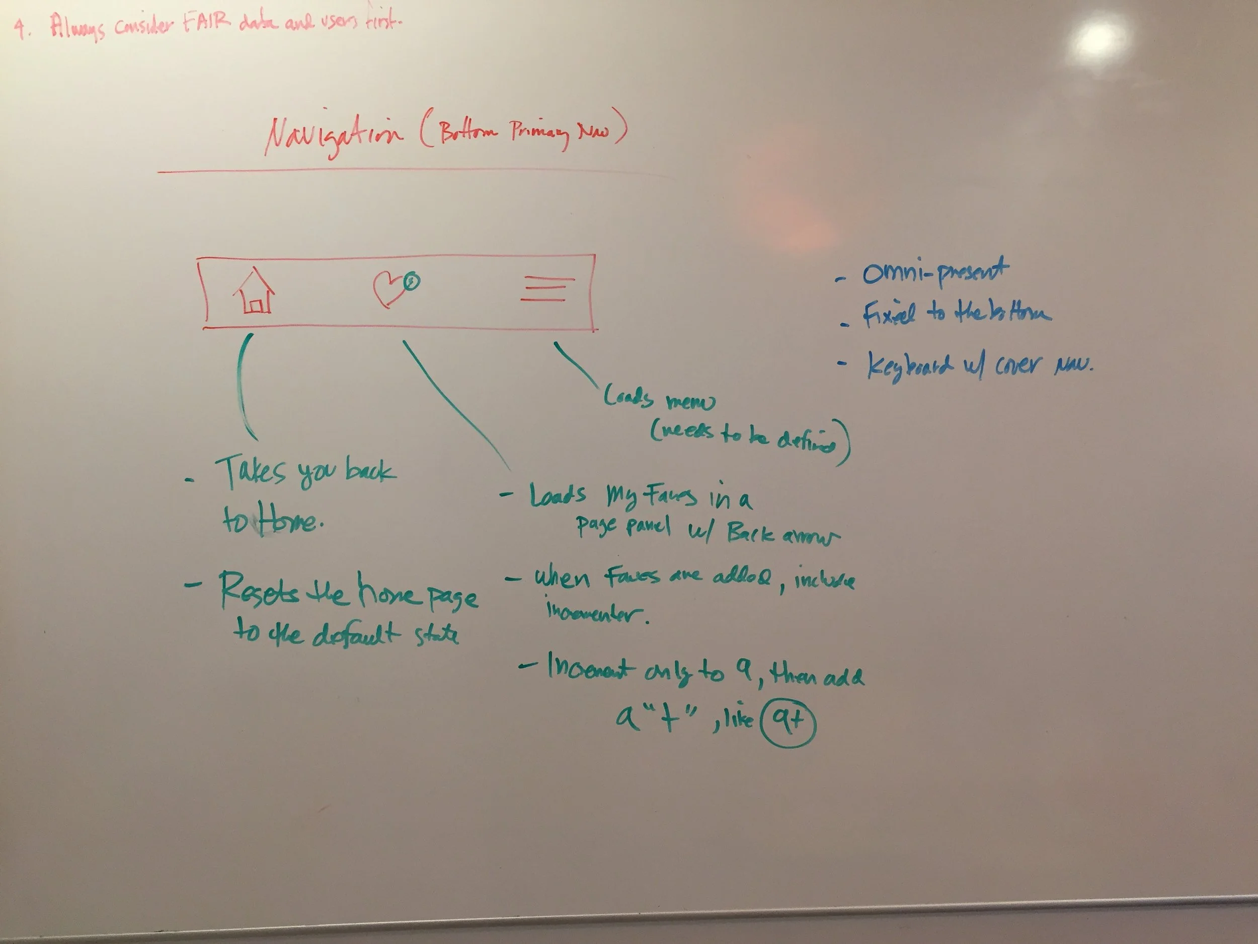
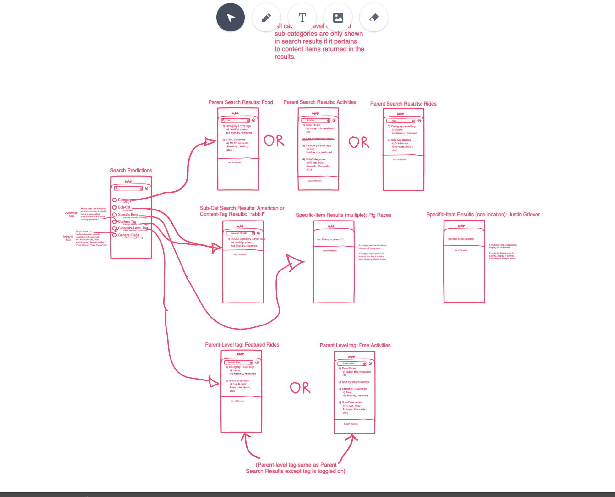
Over several days, I fleshed out every conceivable action within the app.
One of the main elements is a drastically improved and highly complex Search, which required explicit rules to get just right.
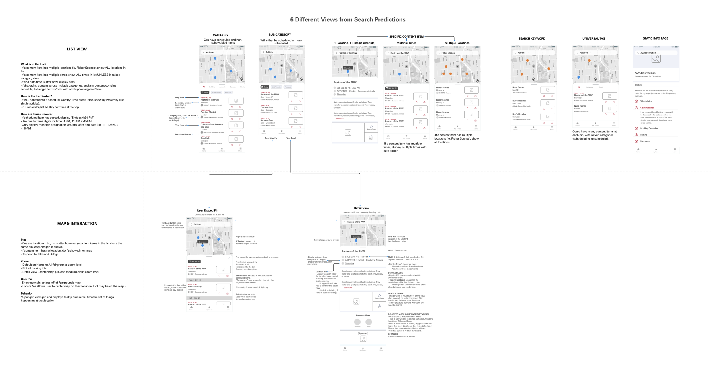
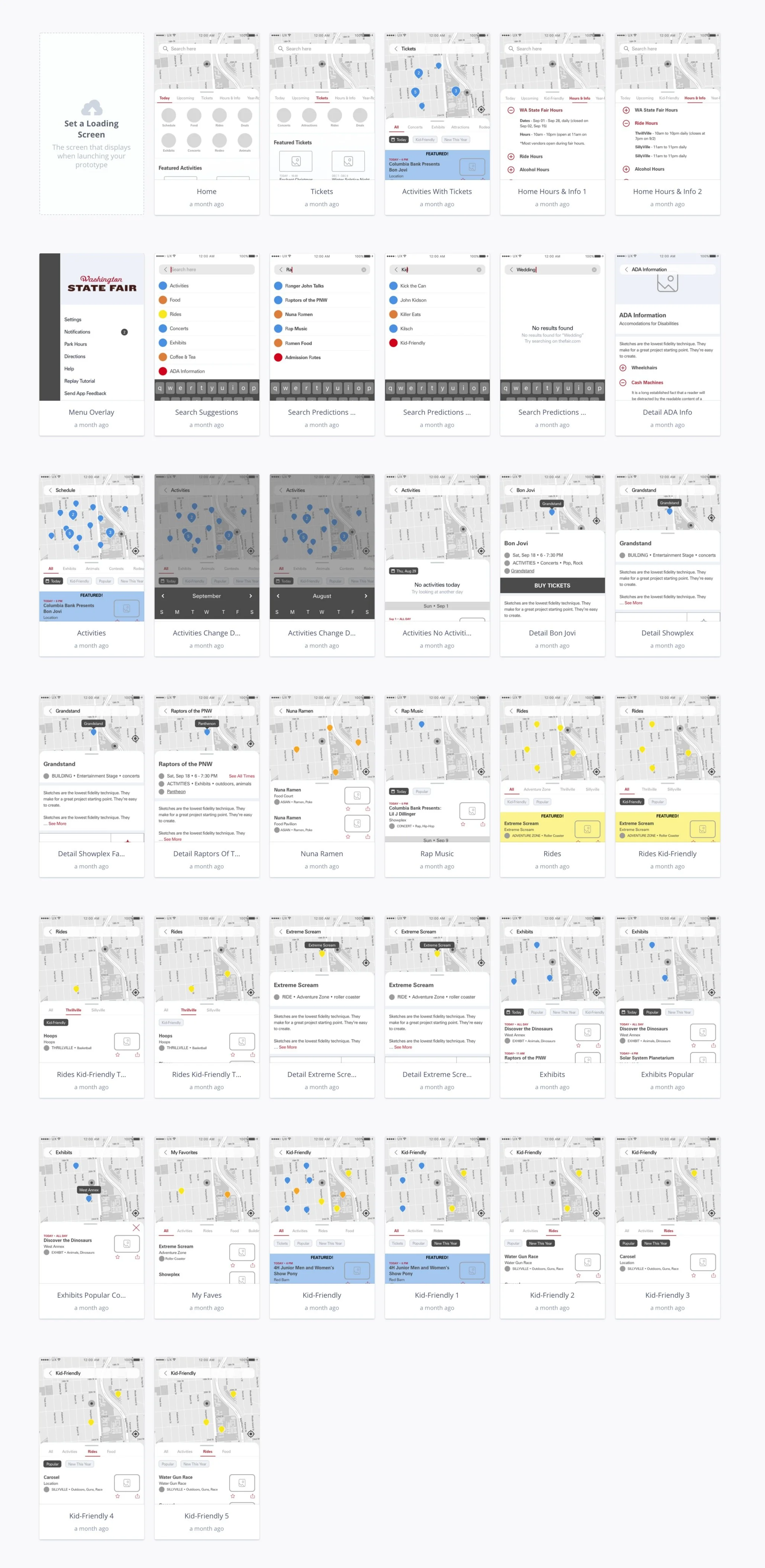
Wireframes
04/ Outcomes
What a great project! The Fair’s tremendous amount of information required a complete overhaul to their data/CMS as well as the information architecture. I introduced a new way of interacting with the app that created a more exploratory and enjoyable experience.
Successes
Winning repeat work: This project won our agency a maintenance contract and repeat business.
User-centric design: Successfully shifted the focus to a more user-centered design, enhancing the overall fairgoer experience.
Stakeholder collaboration: Achieved a high degree of collaboration among stakeholders, leading to a cohesive design process.
Effective prototyping: Developed interactive prototypes communicating the envisioned design, facilitating a smoother development process.
Learnings
Deep dive into user needs: Gained valuable insights into fairgoer preferences and behaviors, which informed the design decisions.
Iterative approach: Learned the importance of iterative design and testing in refining the user experience.
Collaborative dynamics: Understood the value of cross-functional collaboration between UX designers, visual designers, and developers.
What’s next?
After completing the mid-fidelity designs, I handed off the project to a skilled visual designer.
The next phase involved rigorous testing of the app, where we gathered valuable user feedback.
The culmination of this process is evident in the live app and site as you see today.
The journey of the WA State Fair app and site is ongoing. One year after launch, Ply is still monitoring user engagement and feedback to make incremental improvements, ensuring the app and site evolve alongside the fairgoers' ever-changing needs and preferences.