
Symetra
Portal dashboards & Design system
Spearheaded the design of a UI system and co-created user-friendly financial professional and customer portals, resulting in a staggering 20x increase in daily active users and a 4x reduction in support calls, leading to millions in increased revenue and improved customer satisfaction.
TEAM
James L - Designer
Amber F - Designer
My Role
Research review
Persona refinement
Ideation
Workshops
Branding updates
Mockup design
Prototypes
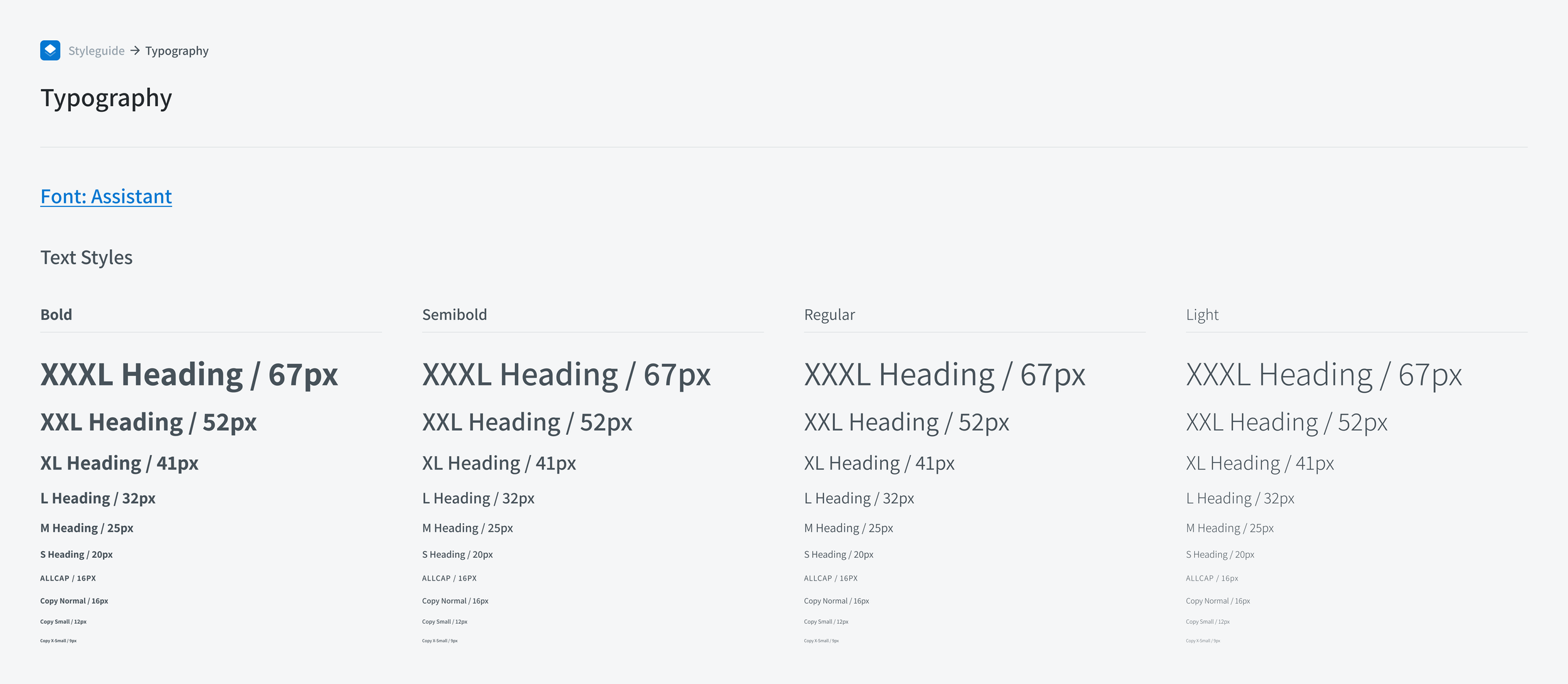
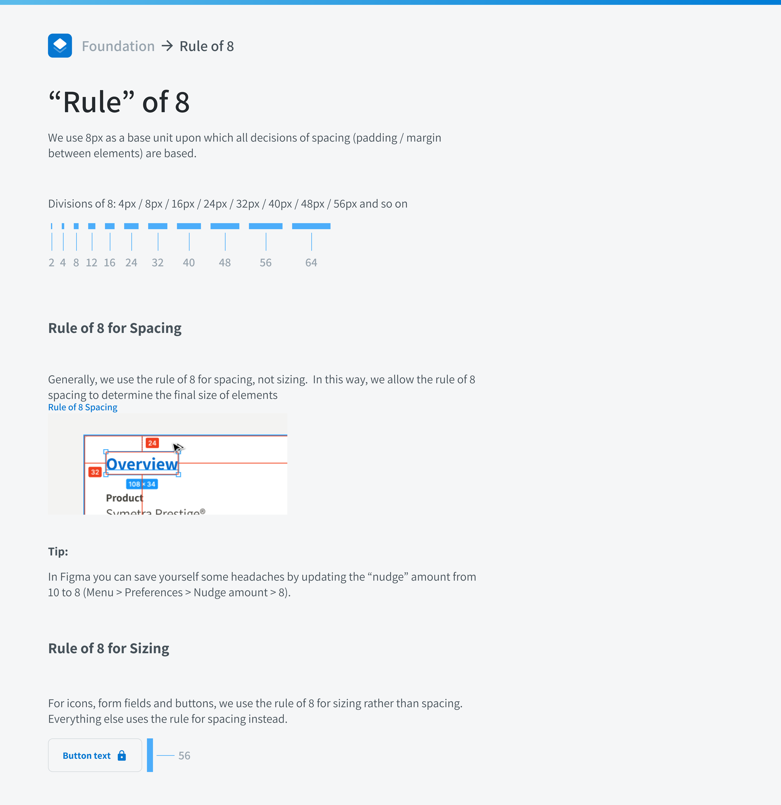
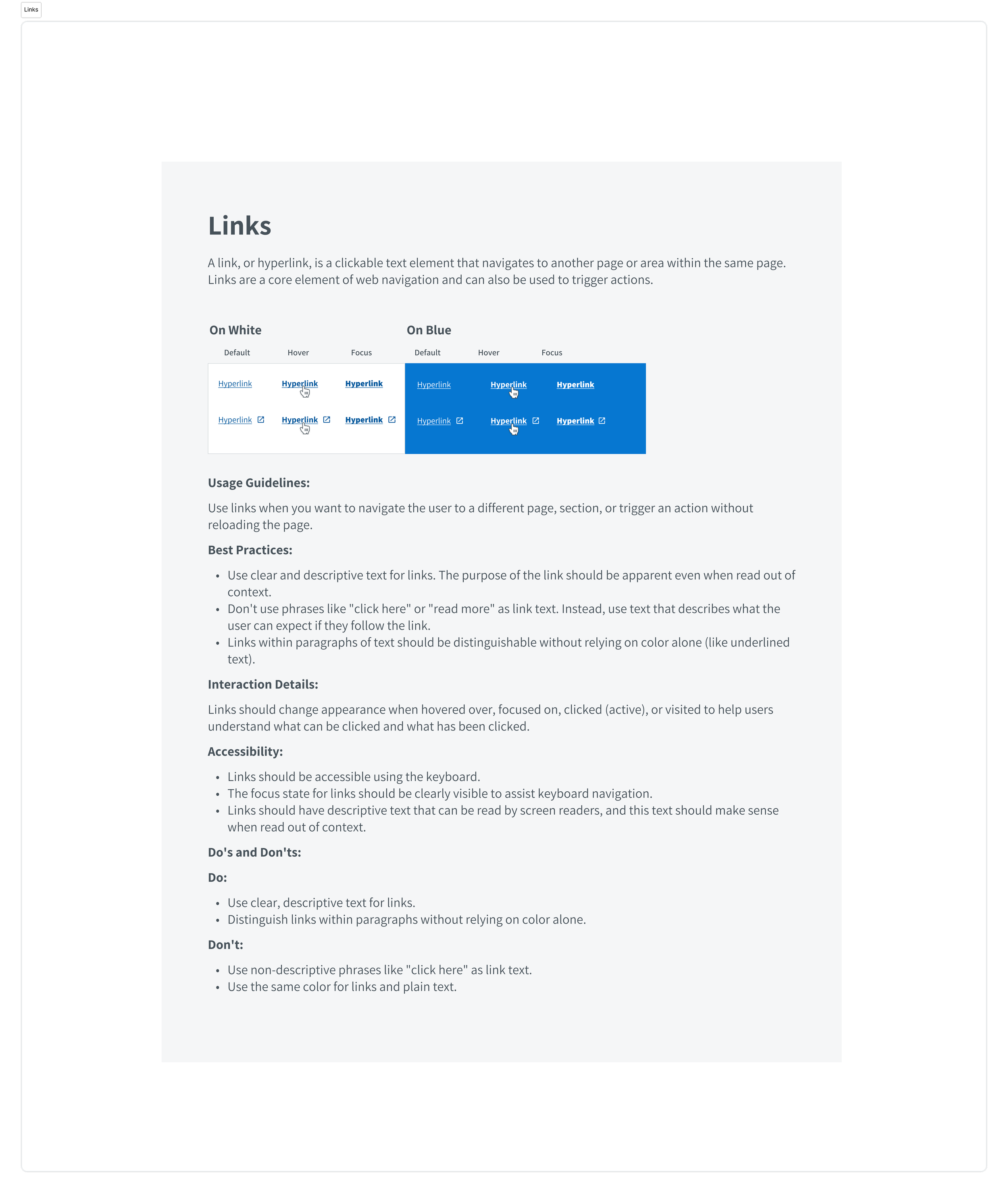
Design system
Accessibility
Testing & refinement
DURATION
8 months

Under Non-Disclosure Agreement
Some of the details in this case study are purposely vague to protect the client’s intellectual property
01/ Summary
Services
Mural workshops
Ideation
Branding
Mockup design
Design system
Prototype testing
Deliverables
Branding & styles
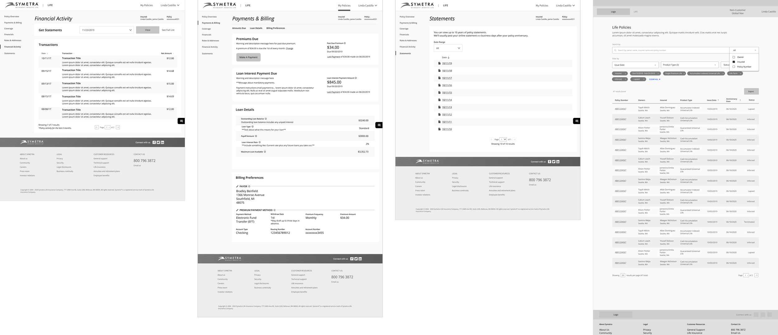
Complete multi-page Figma component design system
Sitemap (IA), wireflows
Figma mockups & prototype
Figma design system (component library)
Presentations to executives
Outcomes
Entirely new Figma component design library
More accessible designs
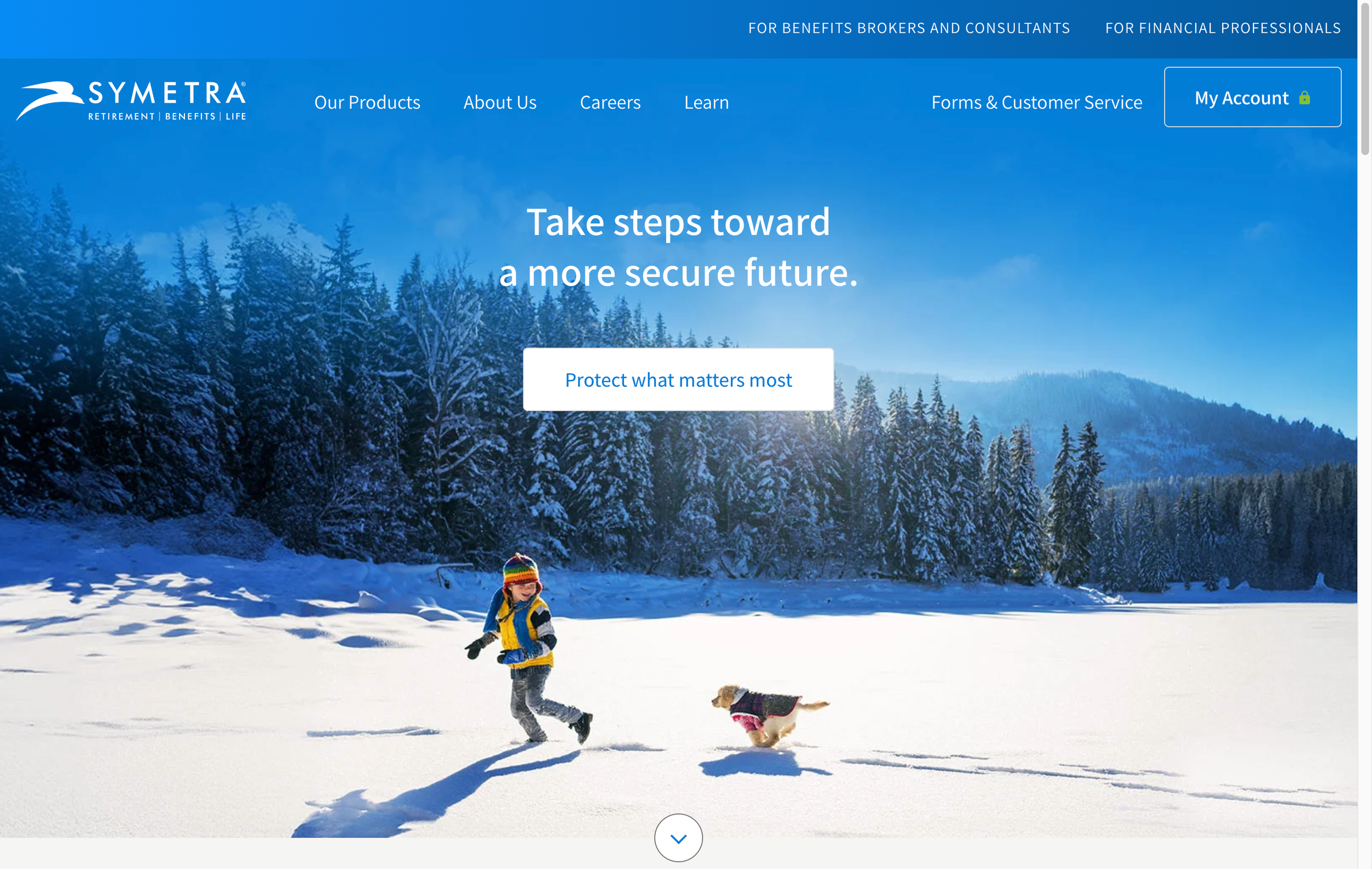
Refreshed branding
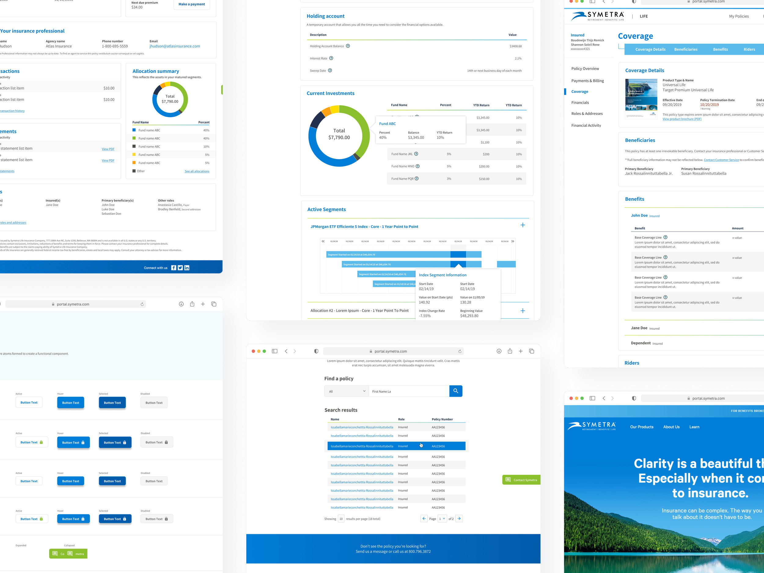
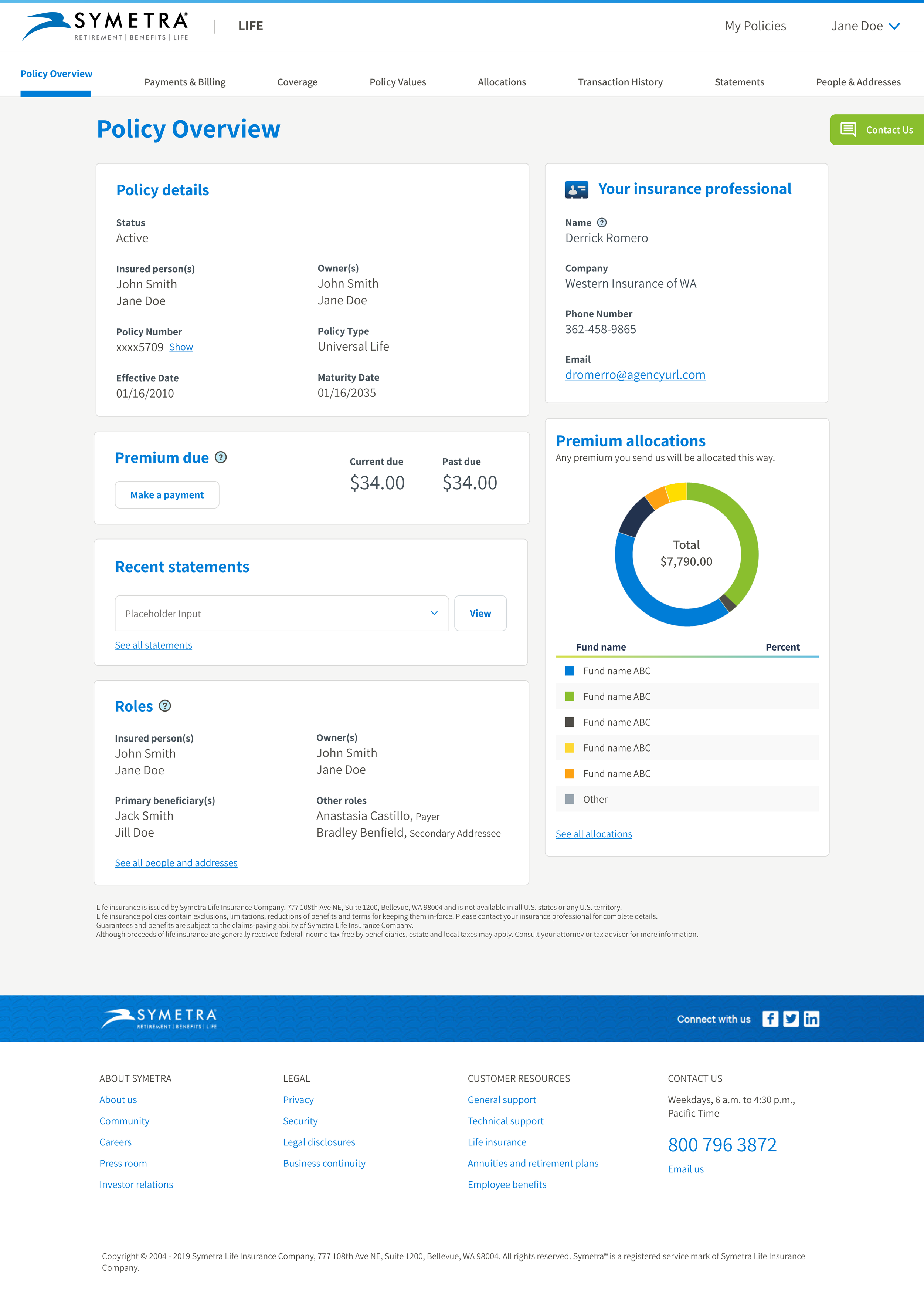
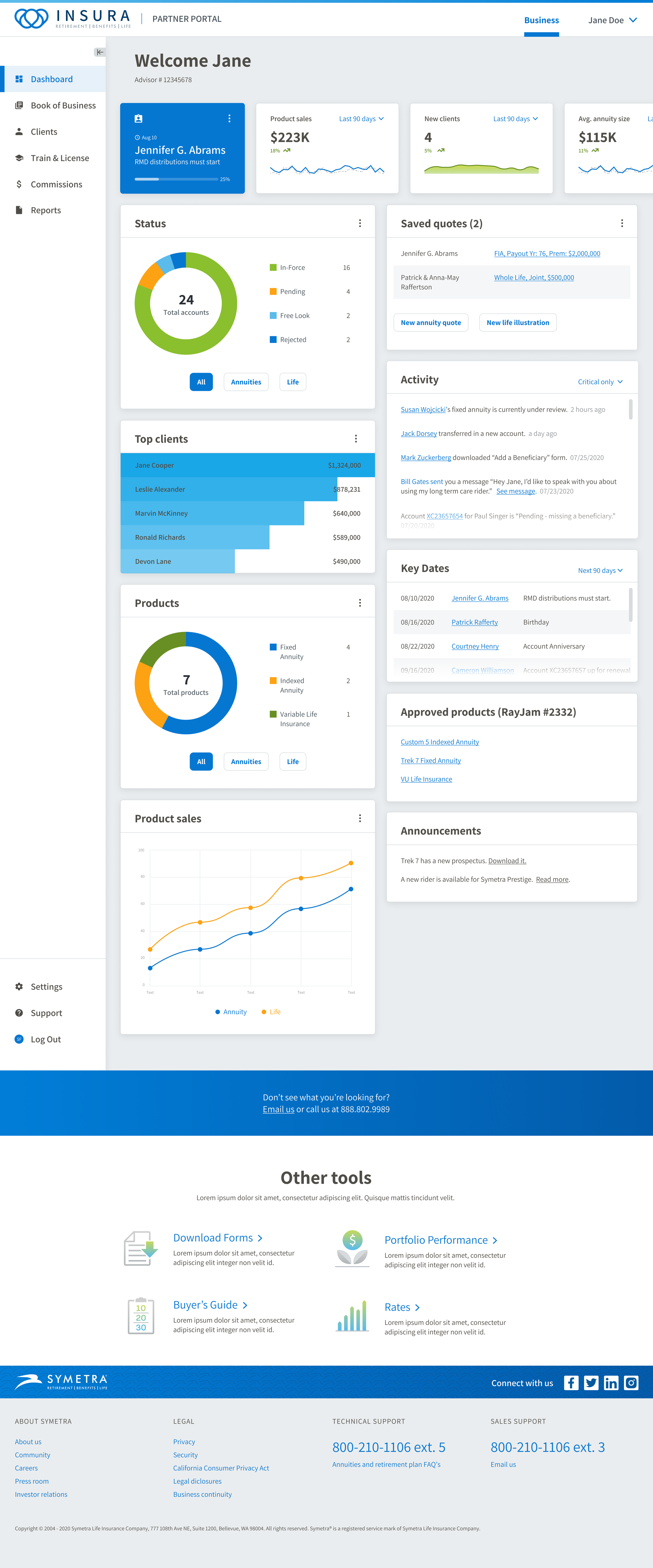
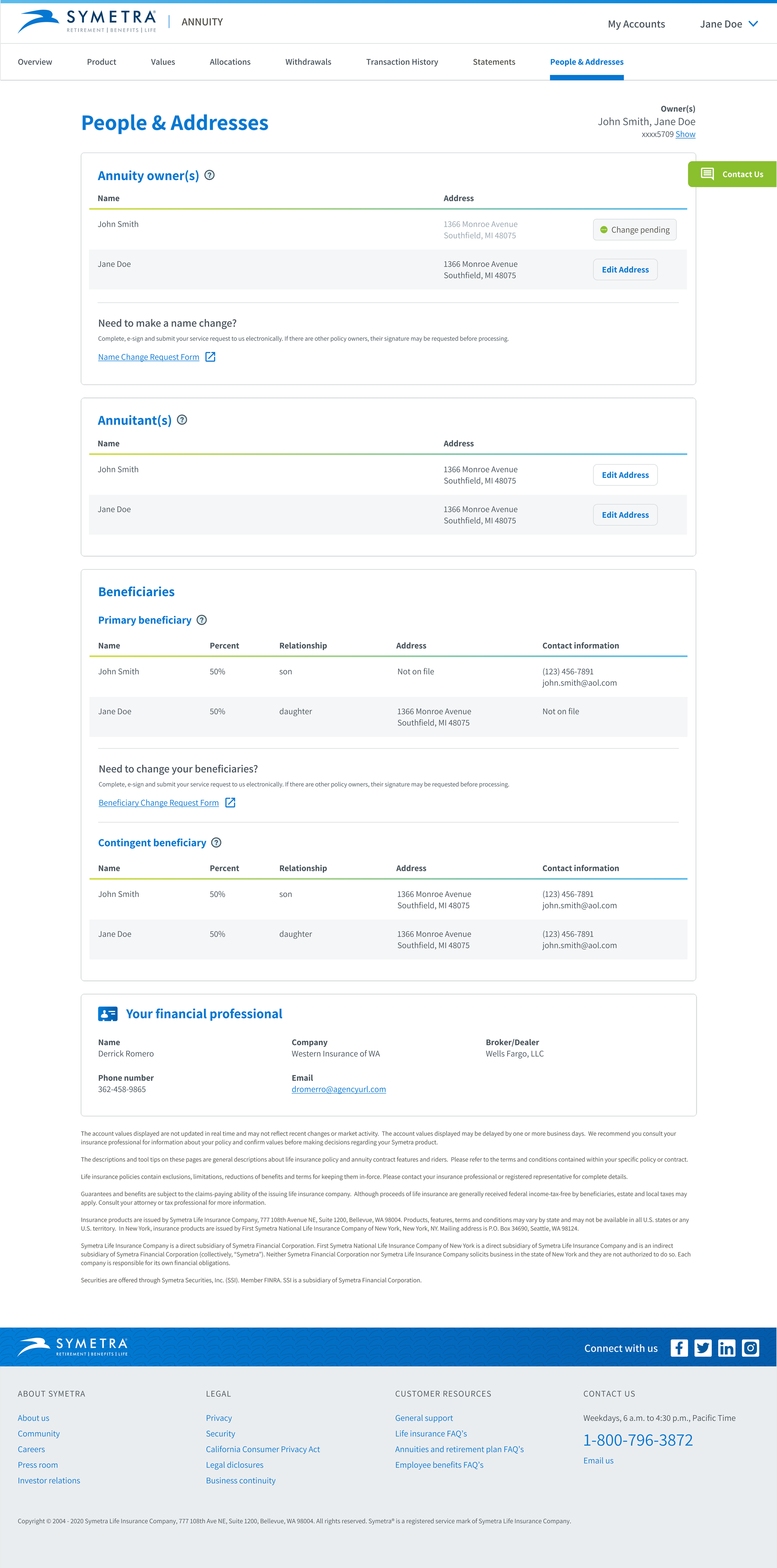
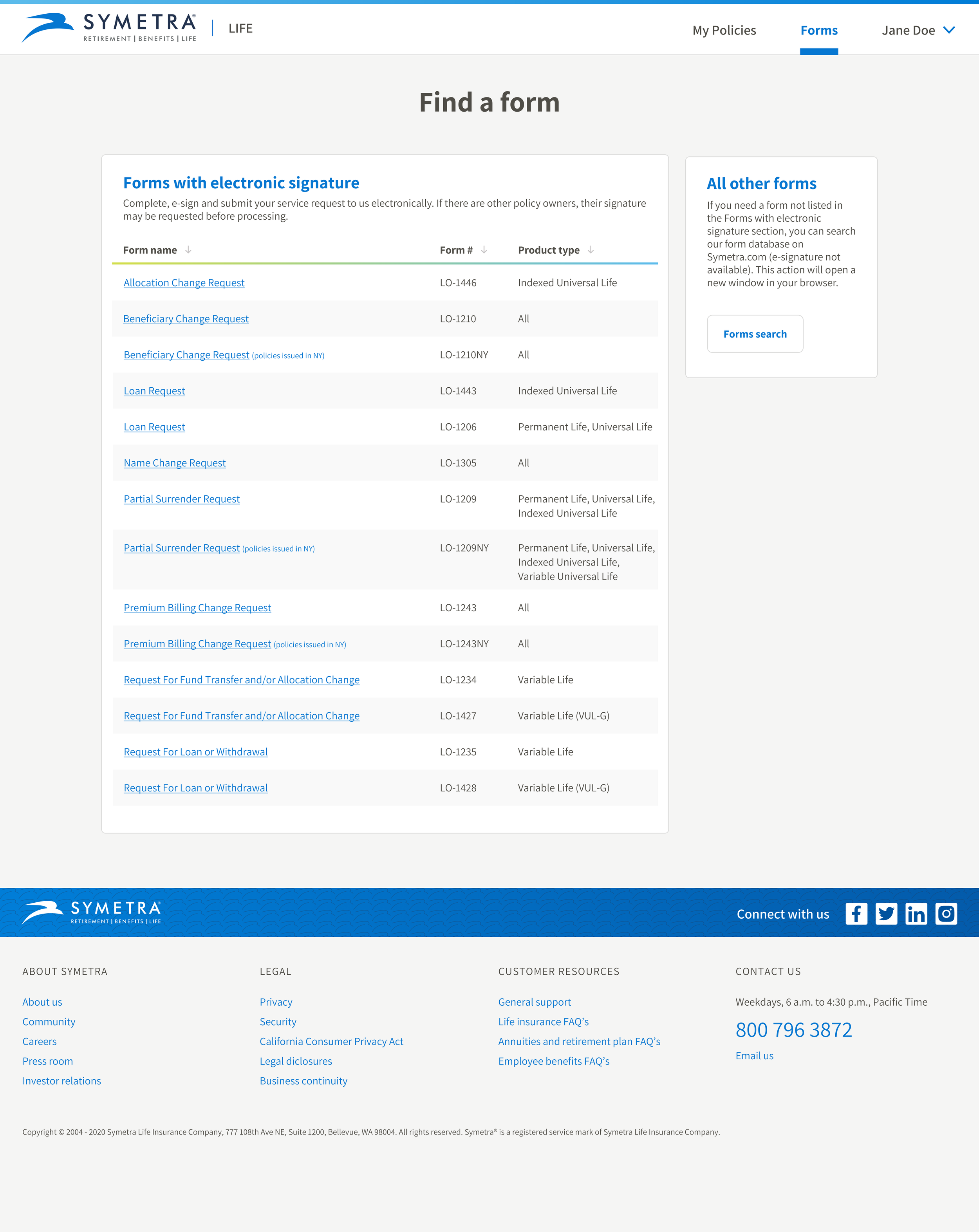
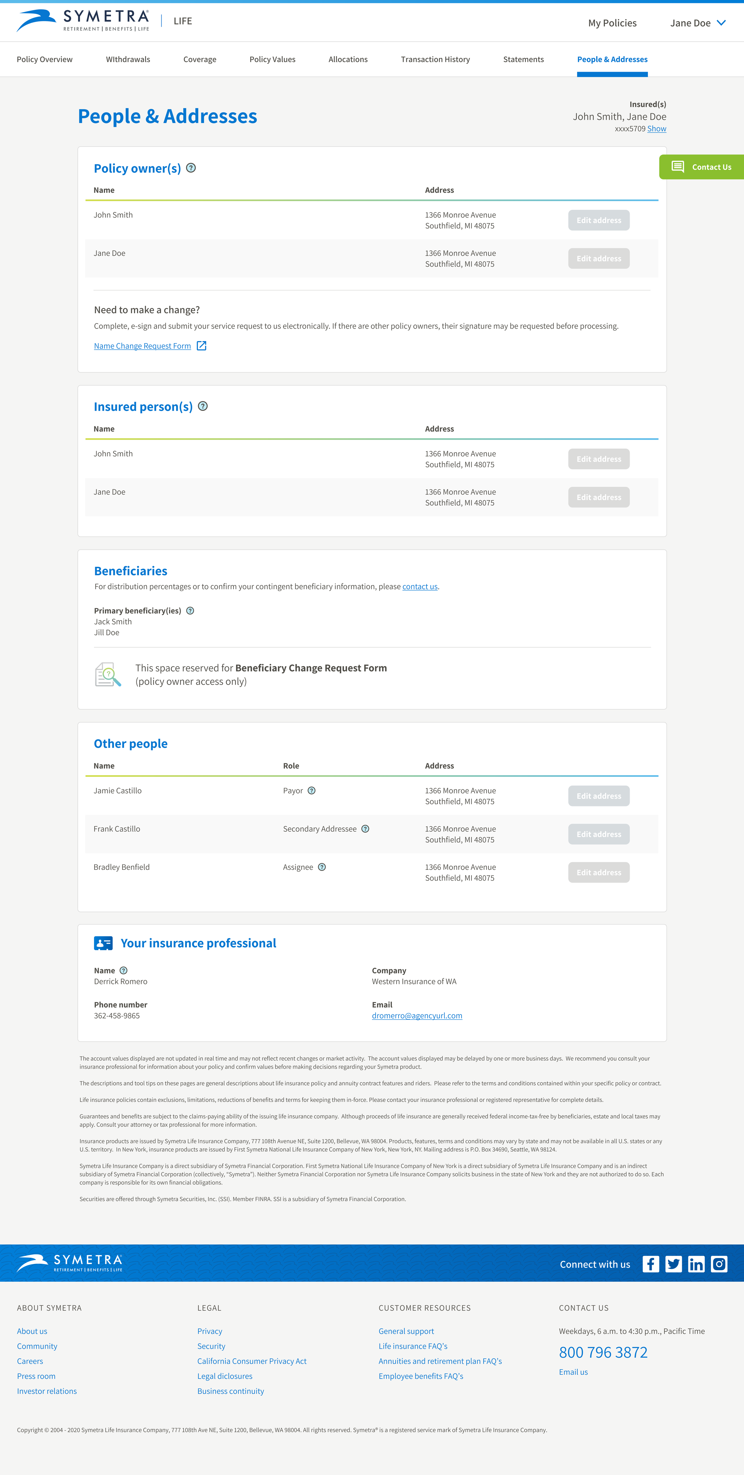
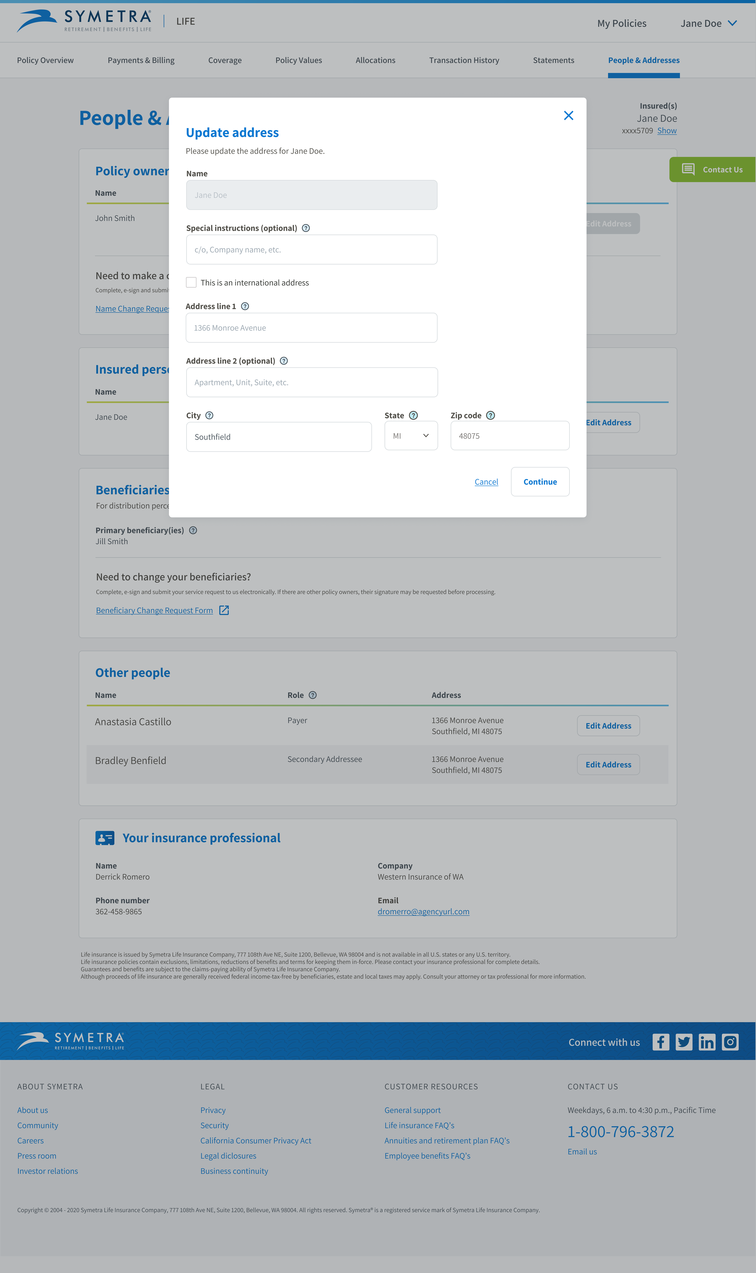
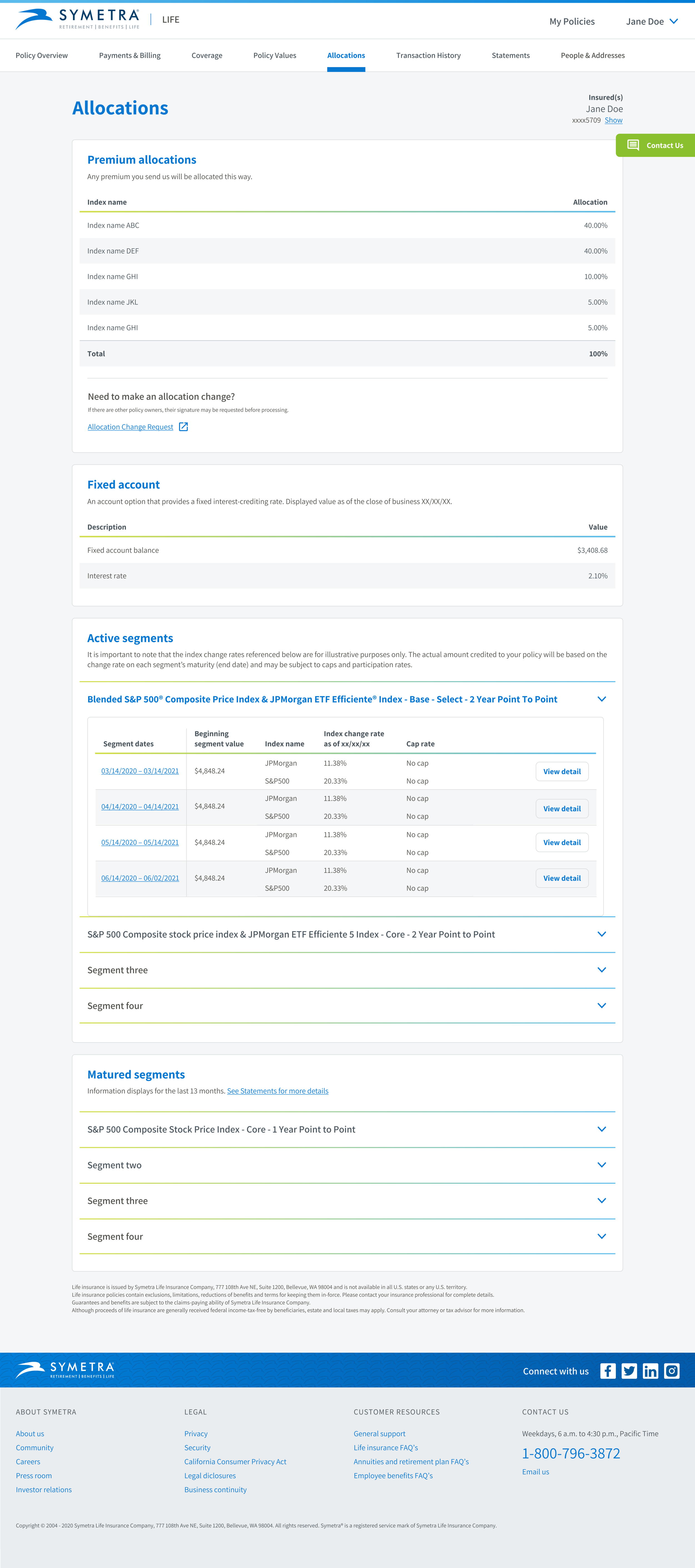
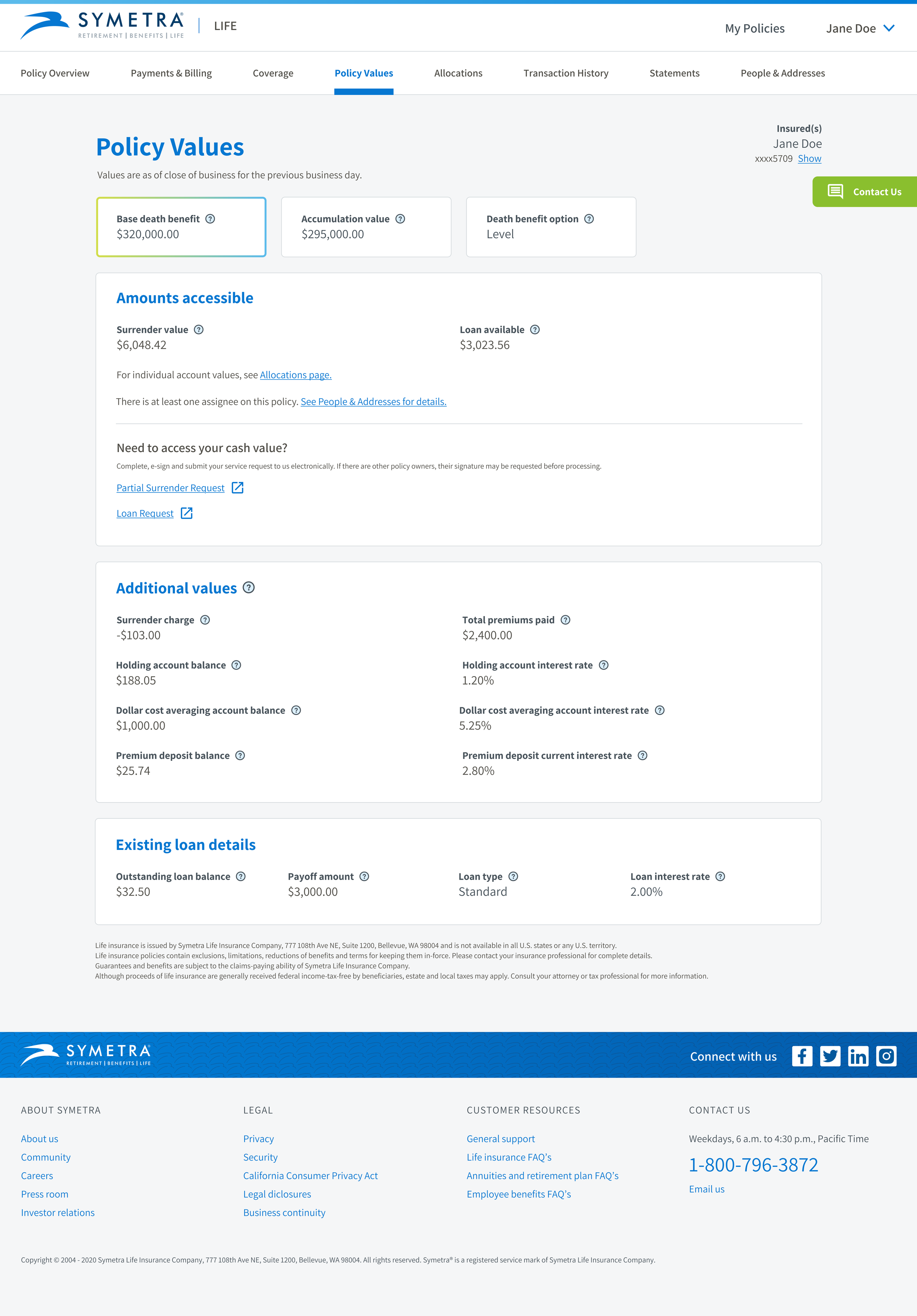
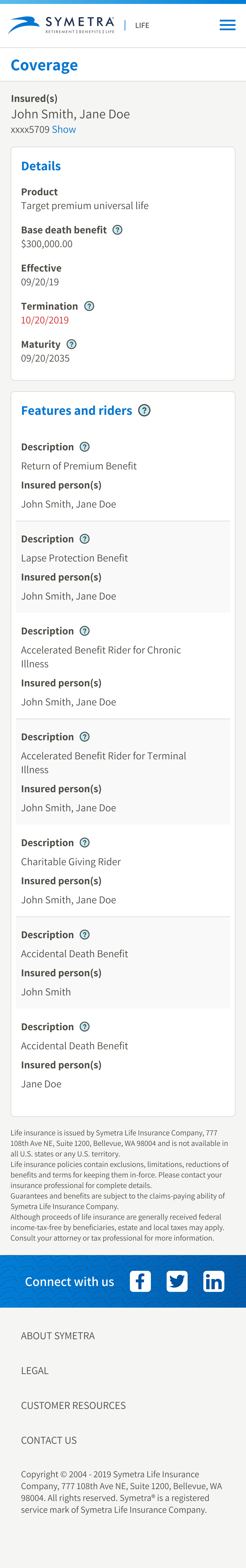
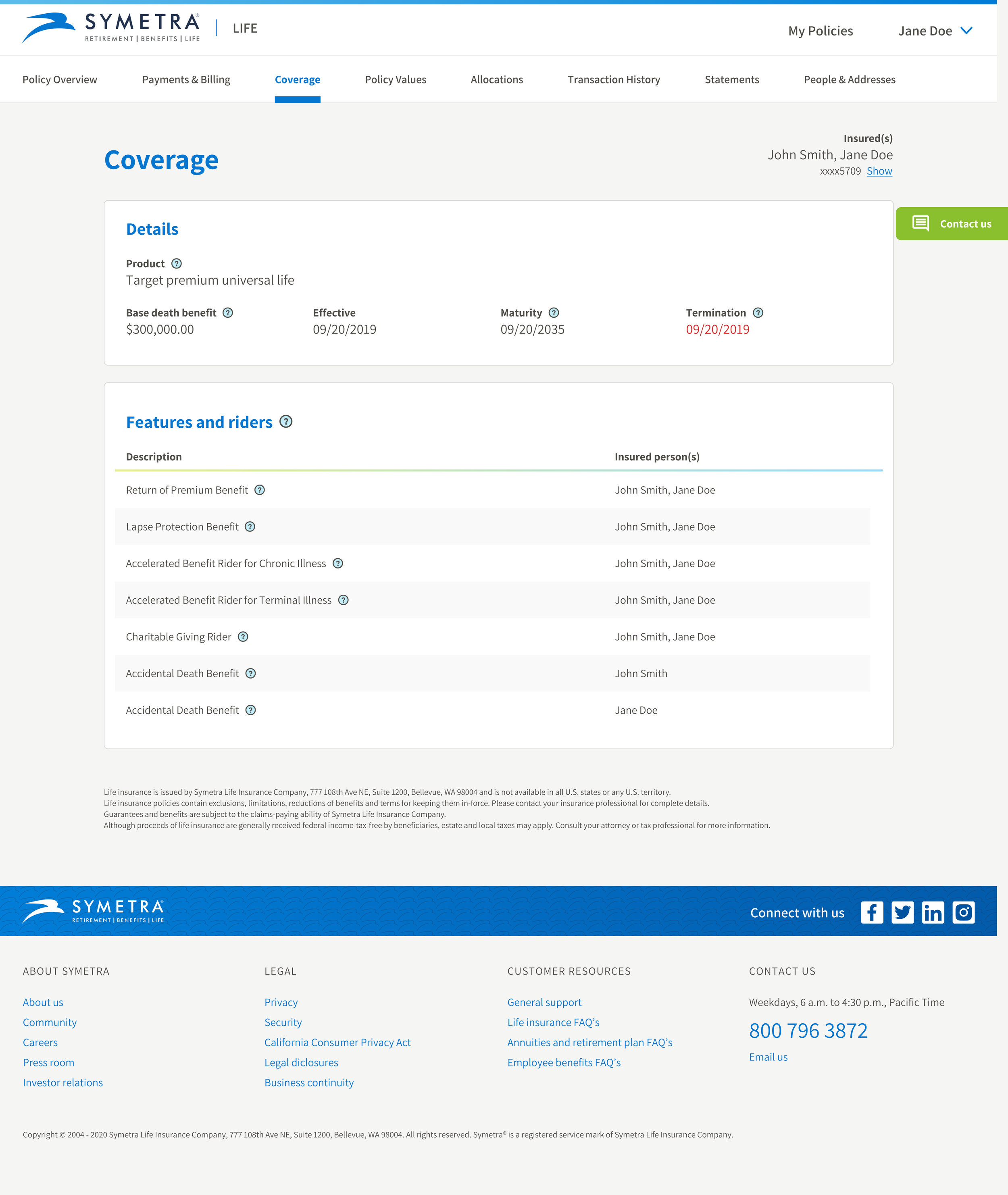
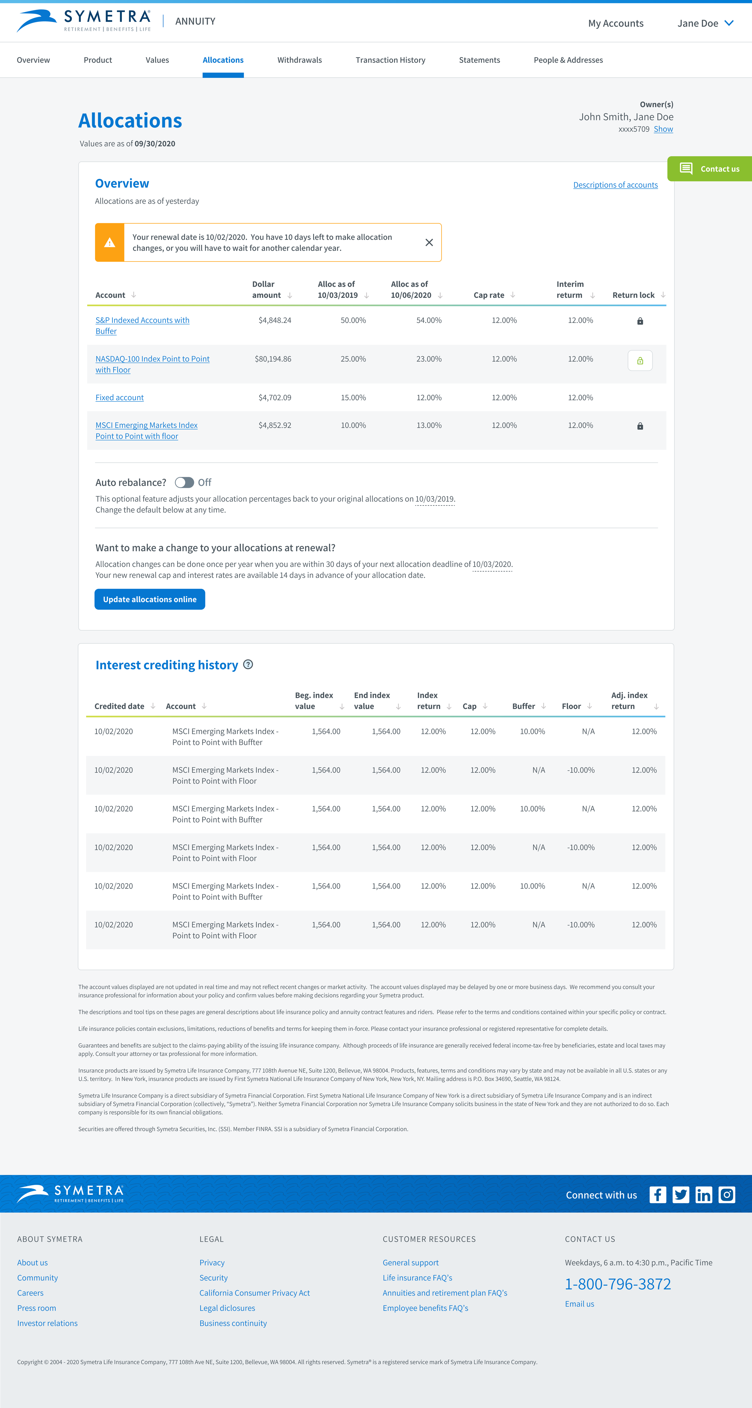
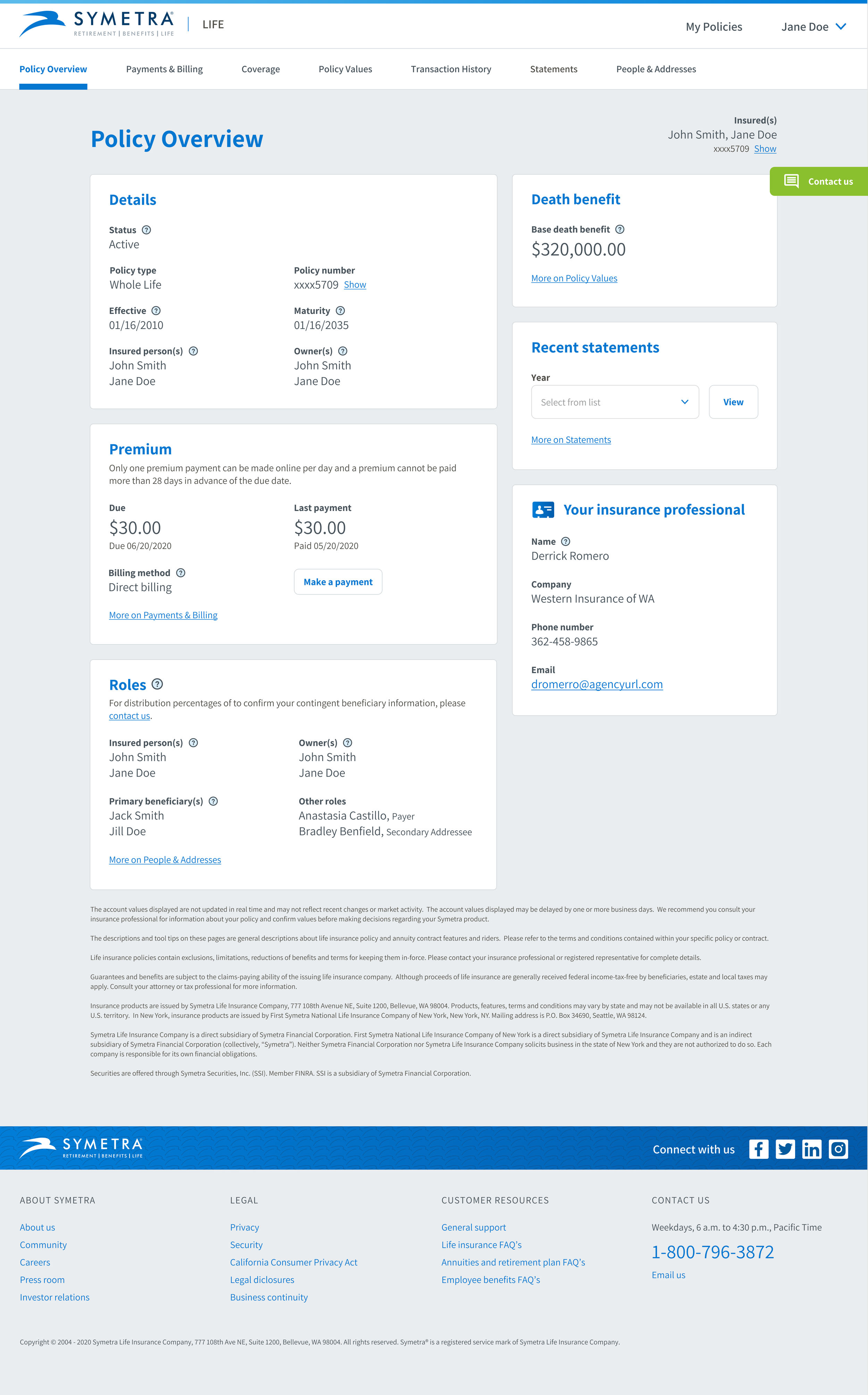
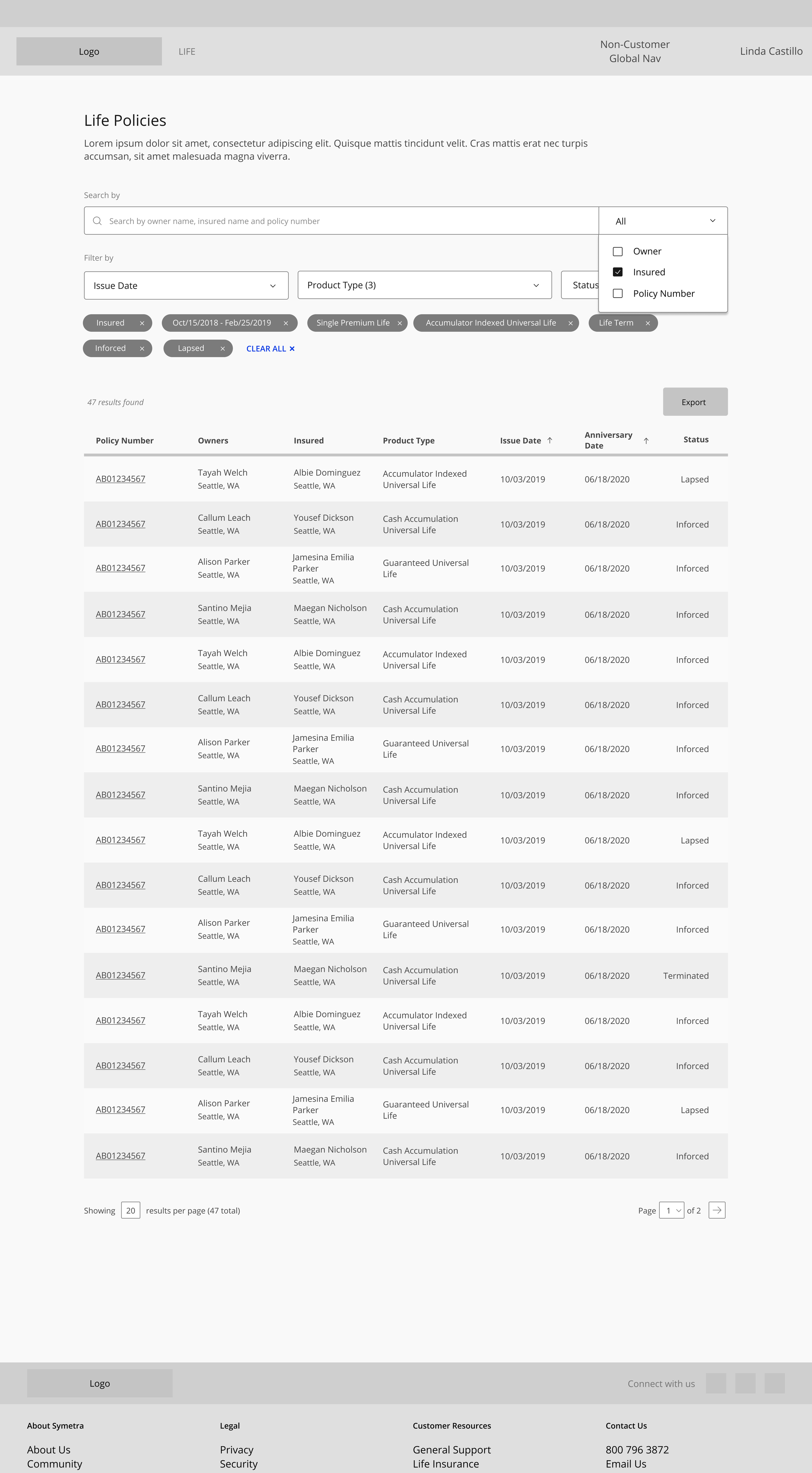
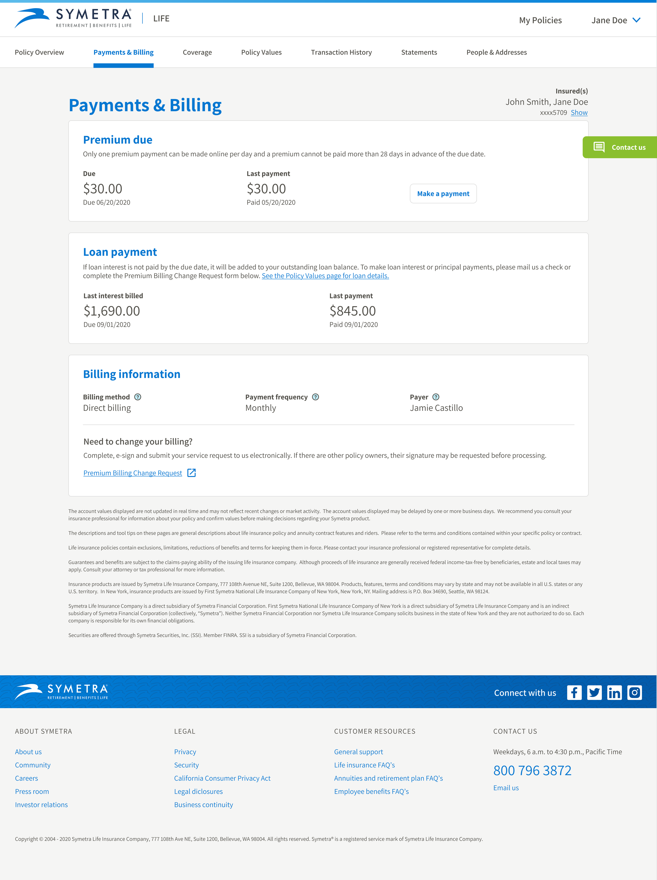
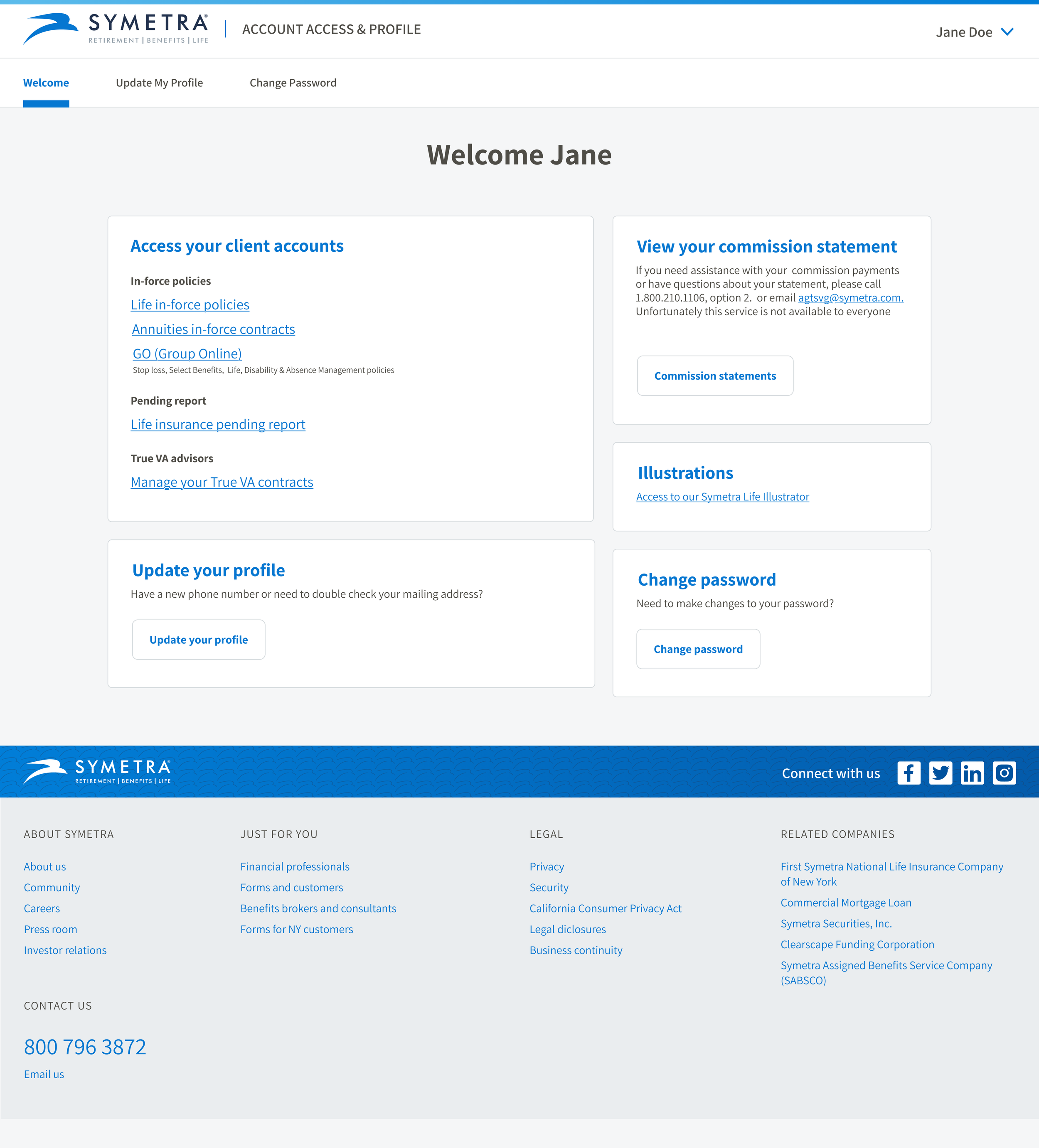
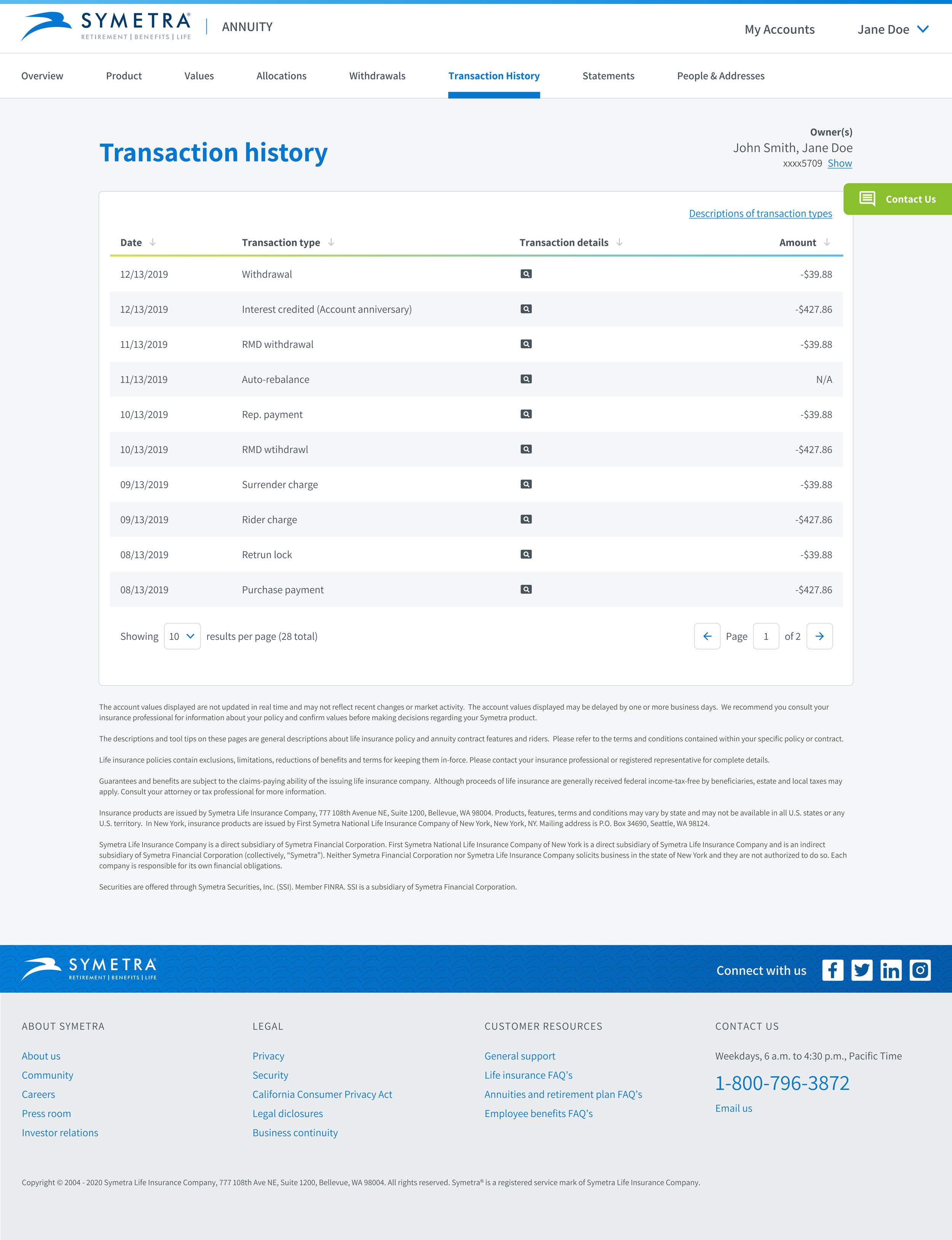
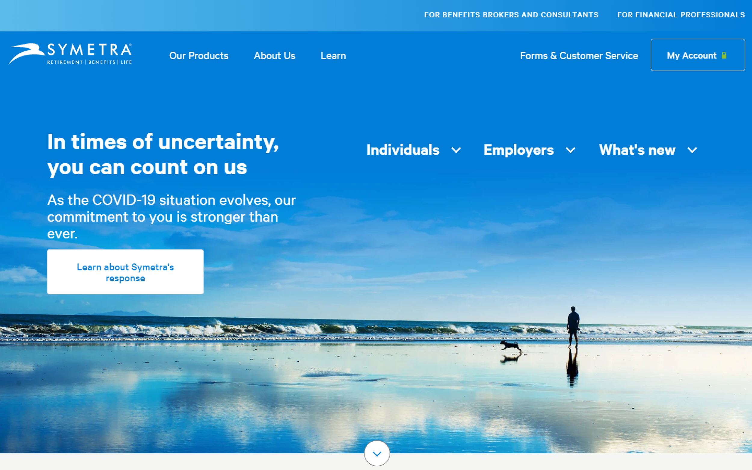
Redesign of customer and financial professional portals
Increased customer engagement (DAUs) by 1400% and financial professional engagement (DAUs) by 2500%
Decreased redundant support calls by more than 400%
Significantly improved customer and professional self-reported satisfaction
02/ Opportunity
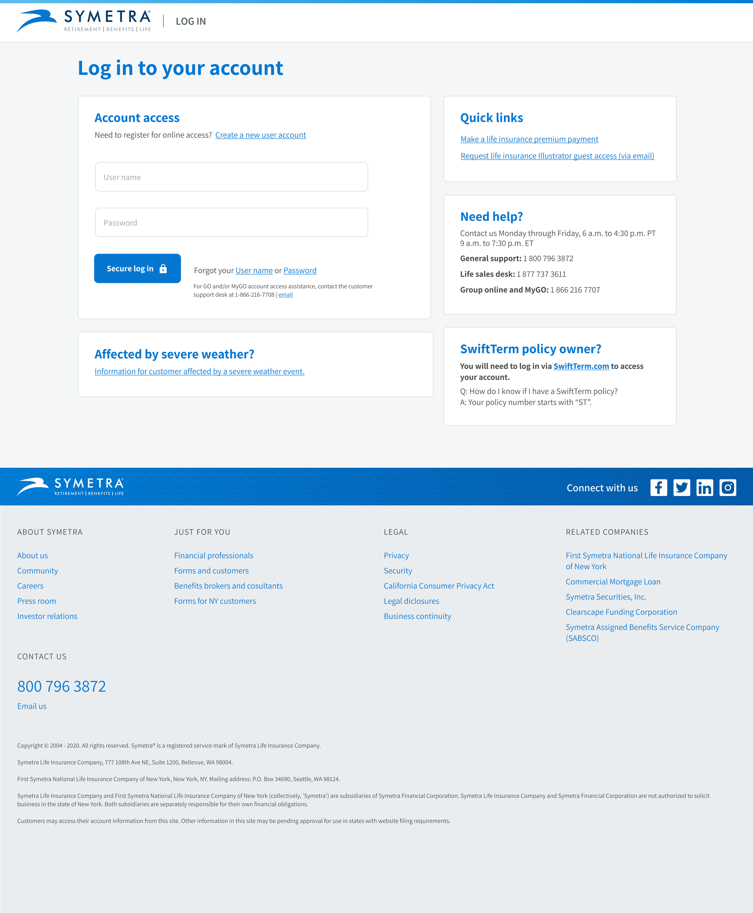
Symetra, a prominent provider of life insurance and annuities, approached us with a critical challenge. They sought design expertise to enhance their customer and financial professional portals but faced limitations with their existing systems. Our initial analysis revealed a significant opportunity beyond mere redesign: the creation of a comprehensive, unified design system. This system would not only elevate the user experience across various touchpoints but also ensure congruence and cohesion with the brand identity.
Goal 1 - new ui
The primary challenge was to develop a user-friendly, efficient, and aesthetically pleasing interface that would resonate with Symetra's user base.
Goal 2 - ⬆︎ engagement
Dramatically increase user engagement and satisfaction, thereby driving business growth.
Goal 3 - Design system
Creation of a comprehensive and congruent UI component library along with a refreshed and accessible styles.
03/ Process
Amber, the other Fresh designer, and I joined the Symetra sprint team handling customer and financial professional portals. We began by reviewing Symetra's backlog and improving it based on how many people it affects, how important it is, and how much work it would take.
Working towards more impactful work
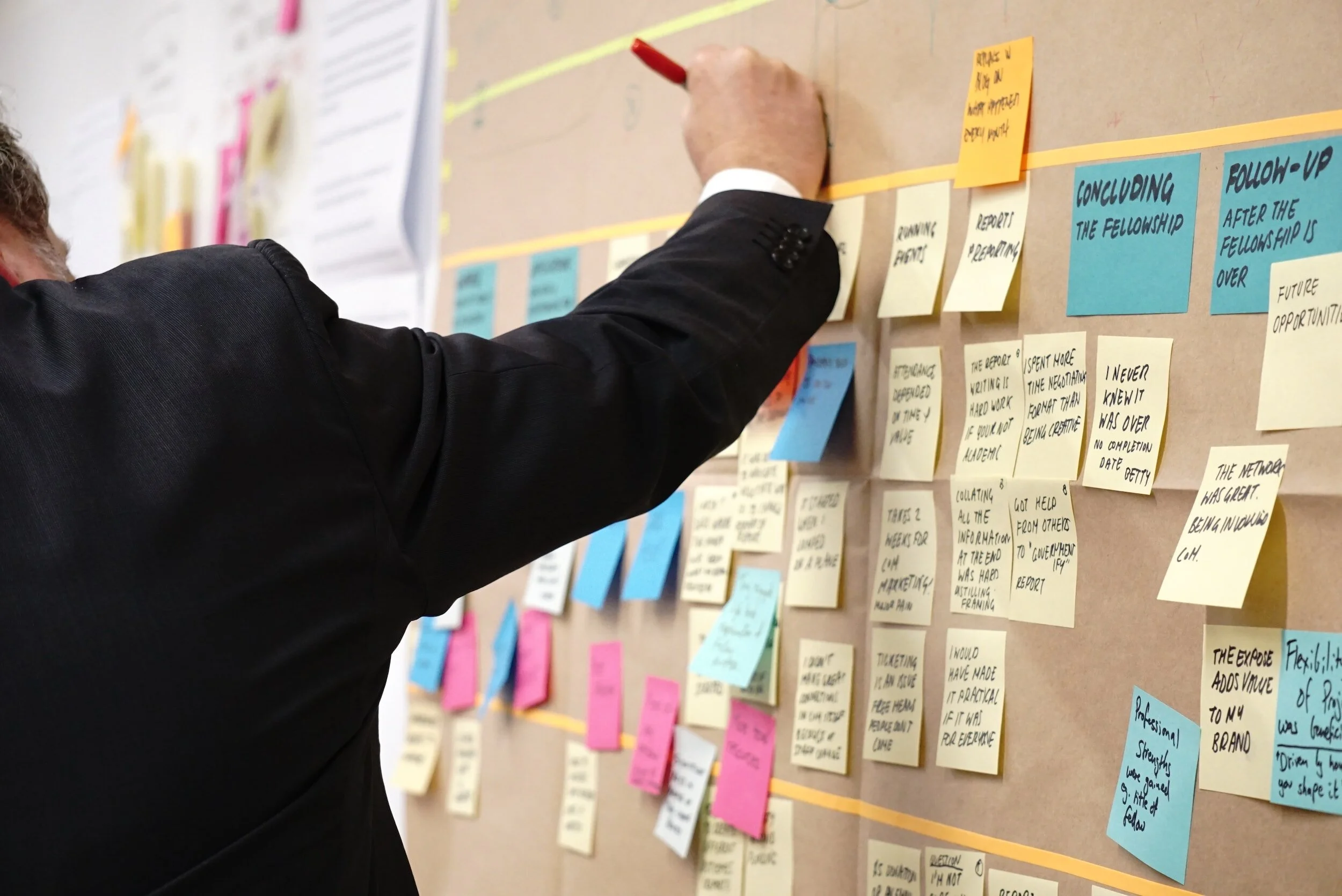
I conducted an informal collaborative workshop to focus on mapping out the current experience and identifying customer pain points, goals, and risks.
-
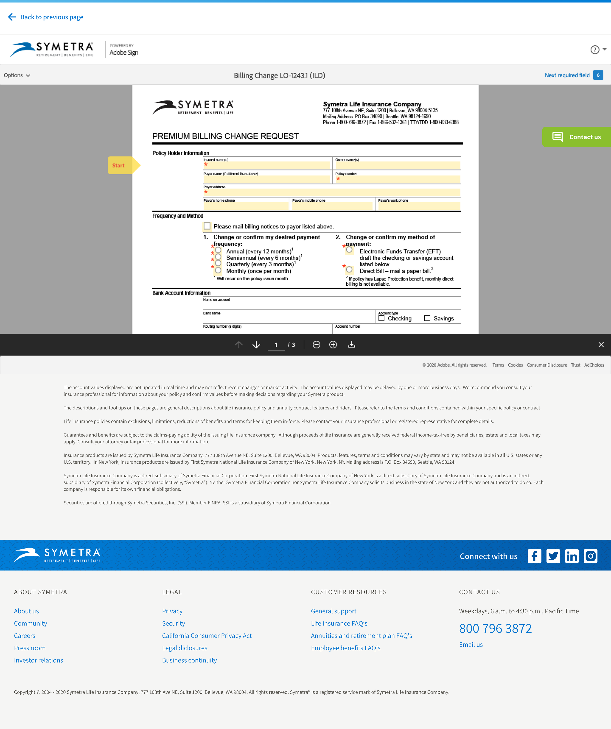
Production design
Amber and I eagerly jumped into an active sprint, swiftly picking up some tickets for mid-fidelity wireframes to begin working through the backlog.
-
Earning the team's trust
Initially, we needed to integrate in as seamlessly as possible and show that we could deliver on Symetra’s explicit design needs. Doing so gave me insight into the team’s priorities and helped when we pitched, focusing on what we believed to be the most impactful design problems to solve.

-
Looking at the industry
The competitive analysis gave us insight into how other life and annuity insurance companies approach portals for their customers and advisors.

-
UX Audit
To identify usability issues, understand user behavior, and ensure the redesign aligns with both user needs and business goals, I performed a UX assessment AKA heuristic analysis.
-
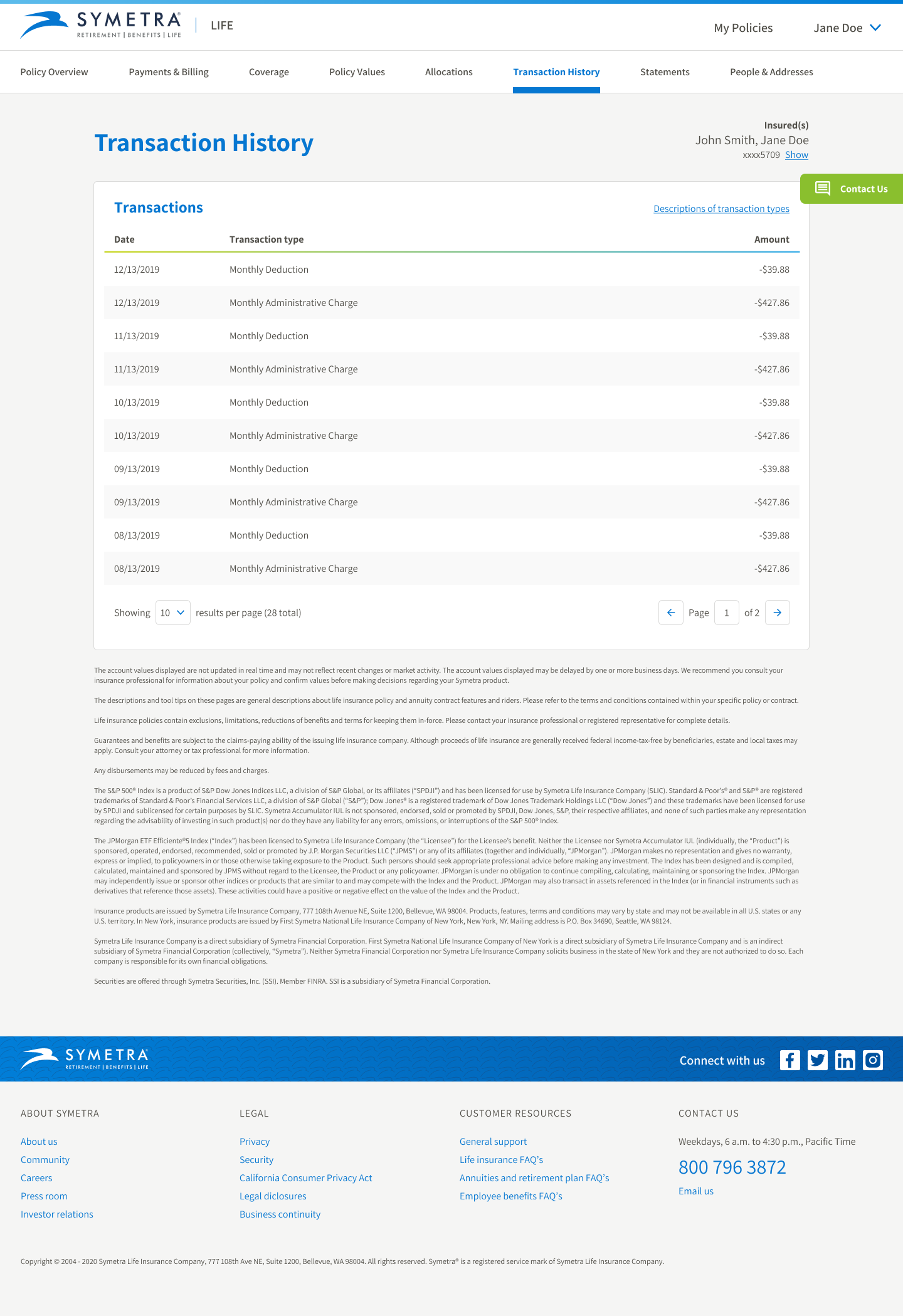
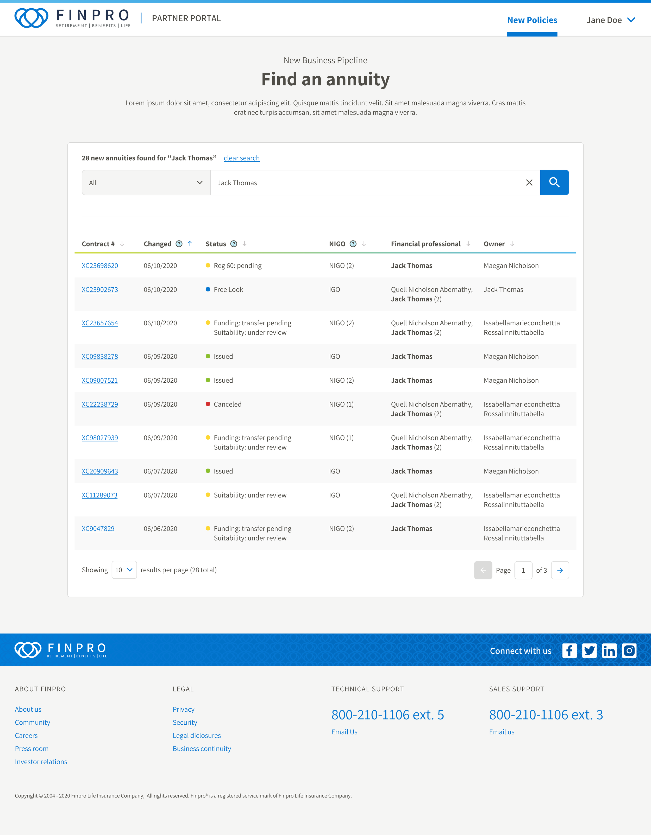
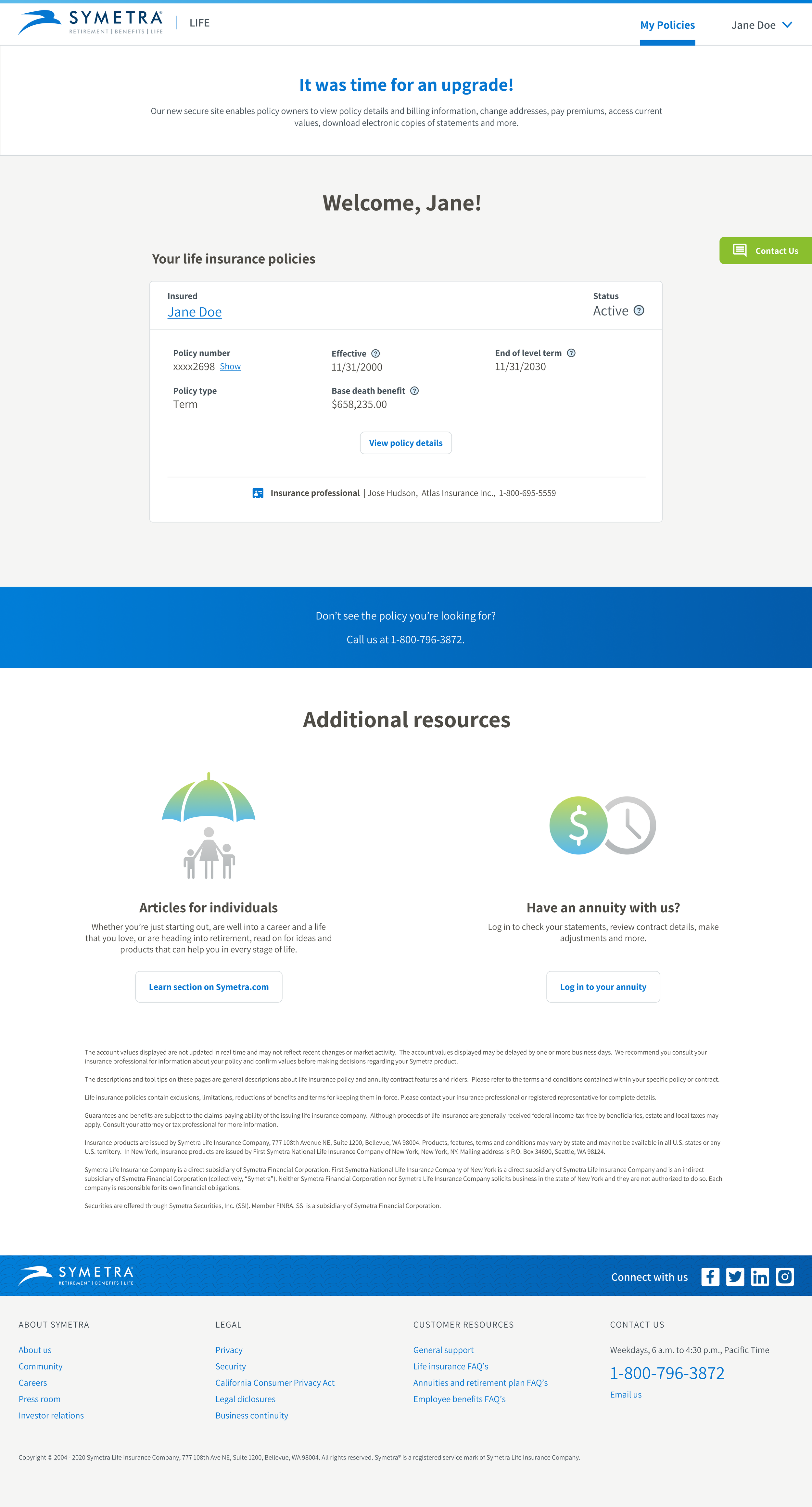
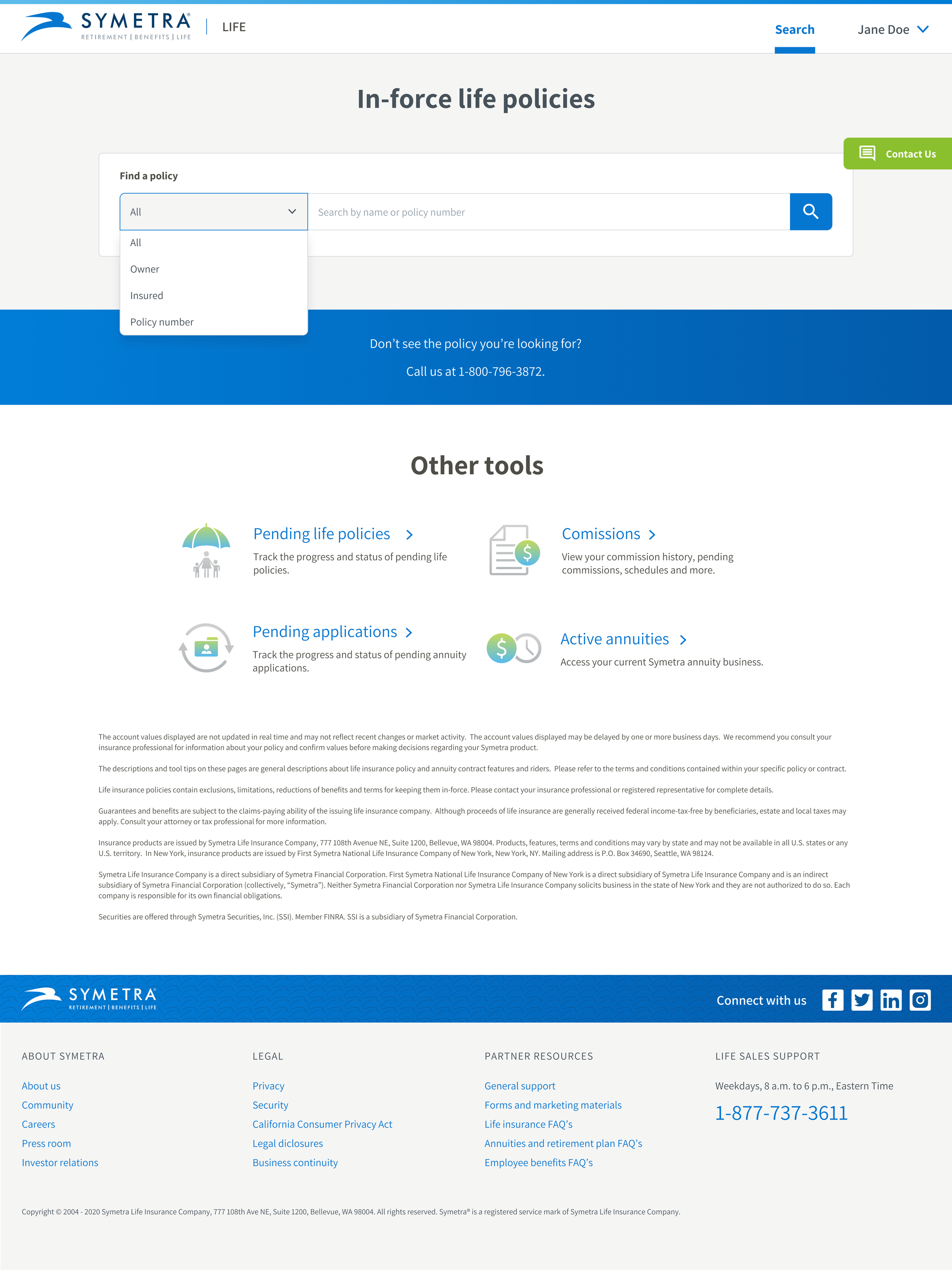
User flows
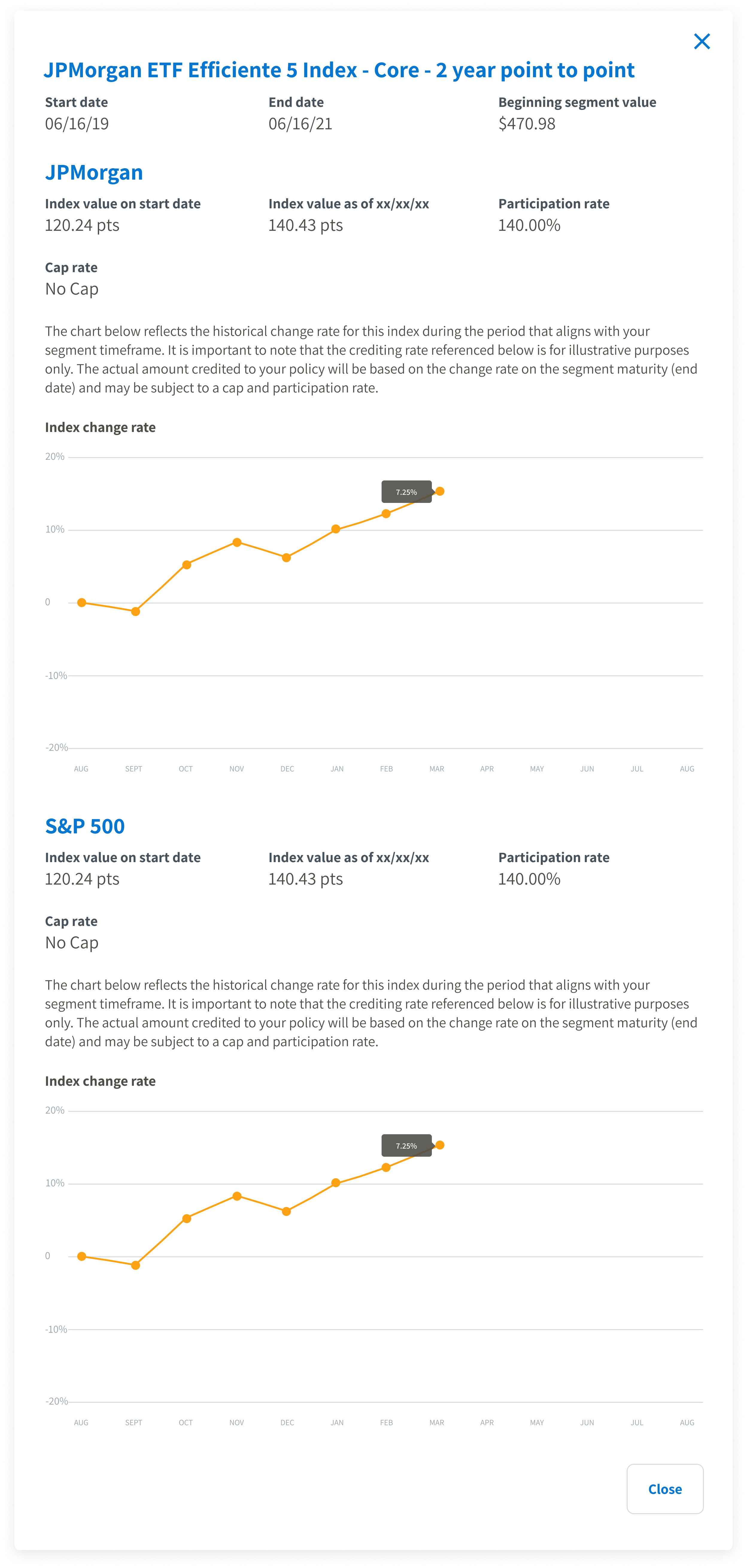
Description goes here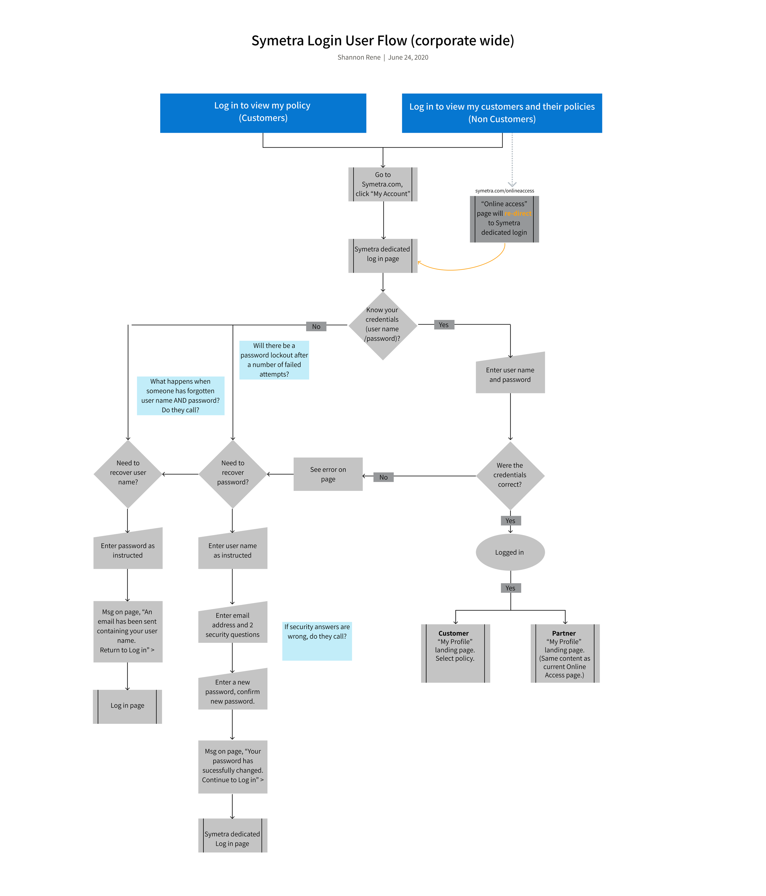
Understanding the problem
After running through a few sprint cycles, we earned enough trust to spend some dedicated time delving deeper into Symetra’s challenges.
-
Outdated tech stack
The existing portals were built using outdated technology stacks, leading to challenges in maintaining and updating the systems. This outdated infrastructure limited the introduction of new features and interactions.
-
Siloed systems
More than 15 separate systems handled customer and product data, causing isolated information and integration problems. This made data management harder, decreased efficiency, and created inconsistent information throughout the organization, impacting decision-making and customer experiences.
-
Agile Scrum teams stuck in backlog quagmire
The team followed a SCRUM philosophy. However, due to extensive backlogs, the teams often prioritized clearing tickets over addressing critical problems or opportunities that could lead to impactful solutions. This approach resulted in a reactive approach rather than a strategic one. Although the teams worked efficiently, they couldn’t focus on the most valuable goals and work effectively toward them.
-
Company culture resistant and slow to change
Symetra's culture resisted change, avoiding new processes, technologies, and innovative approaches. This made change slow, holding the company back from staying competitive, meeting market demands, and taking advantage of new opportunities for growth and improvement.
Design time!


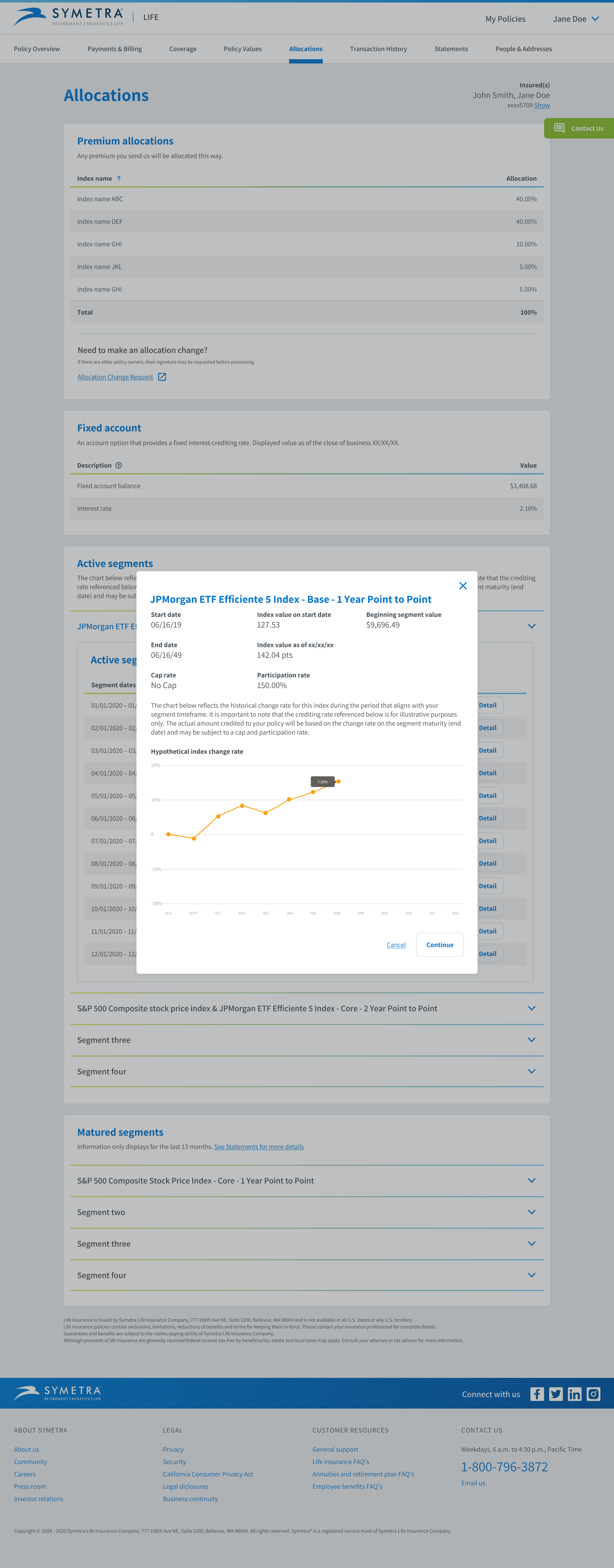
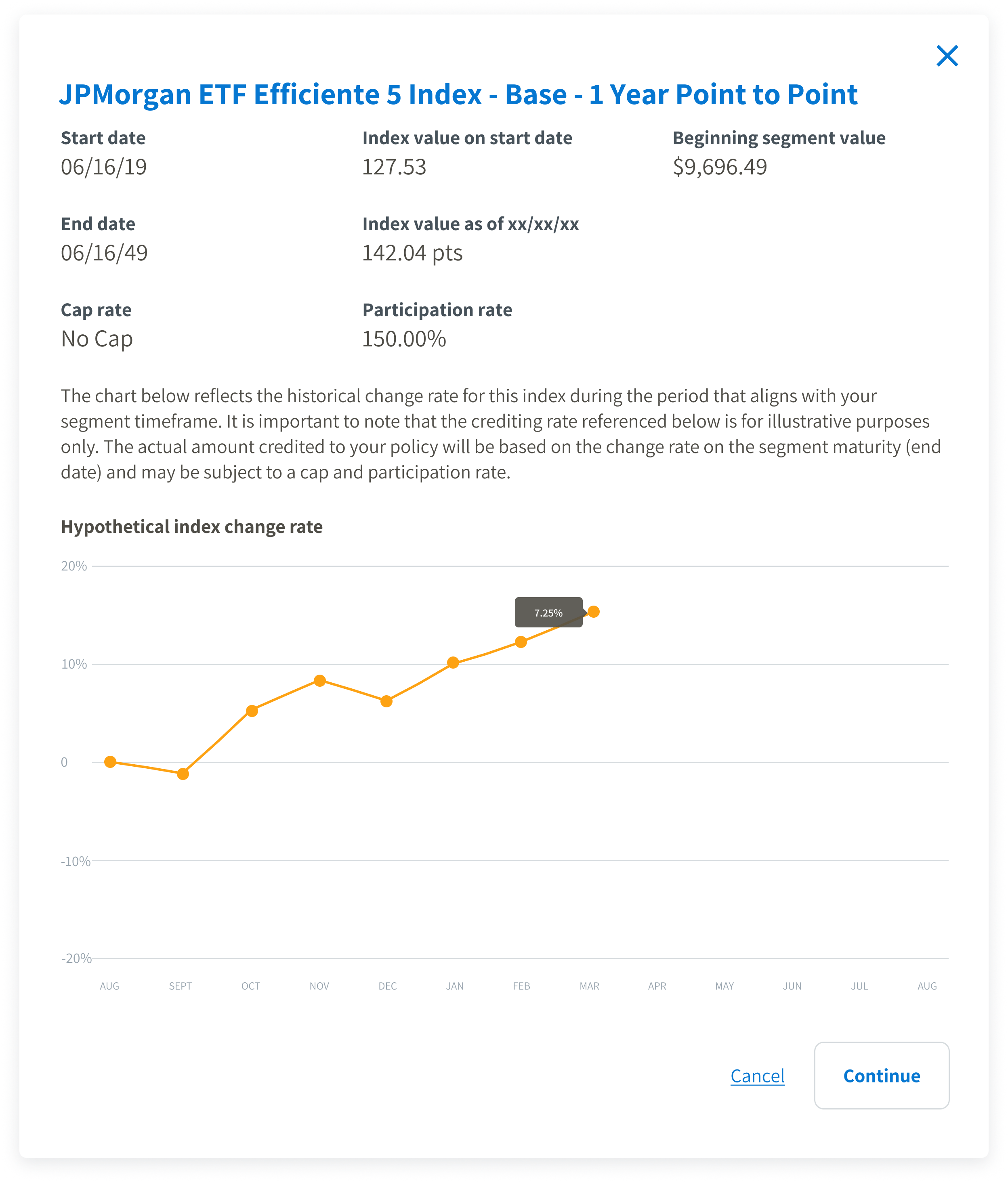
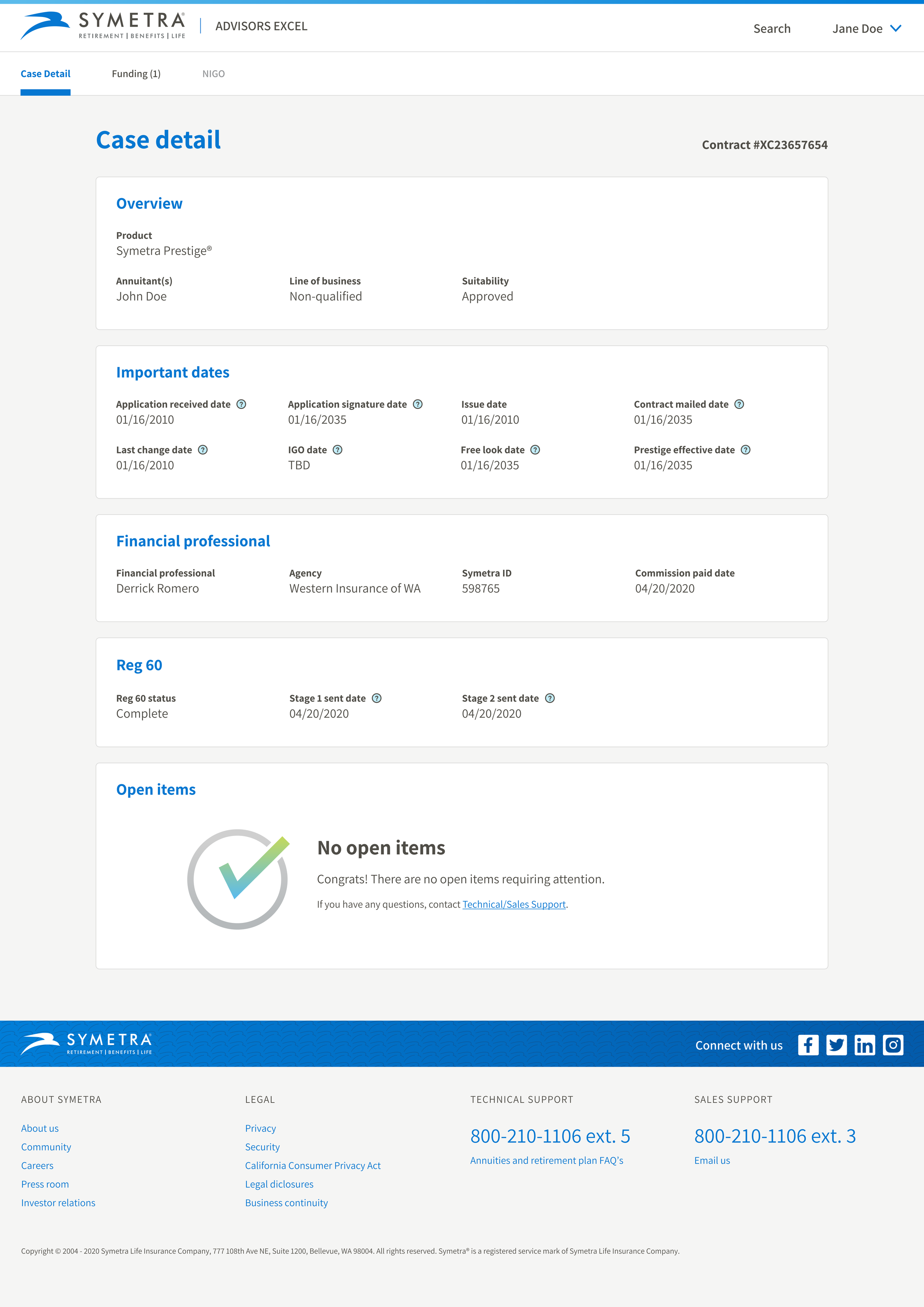
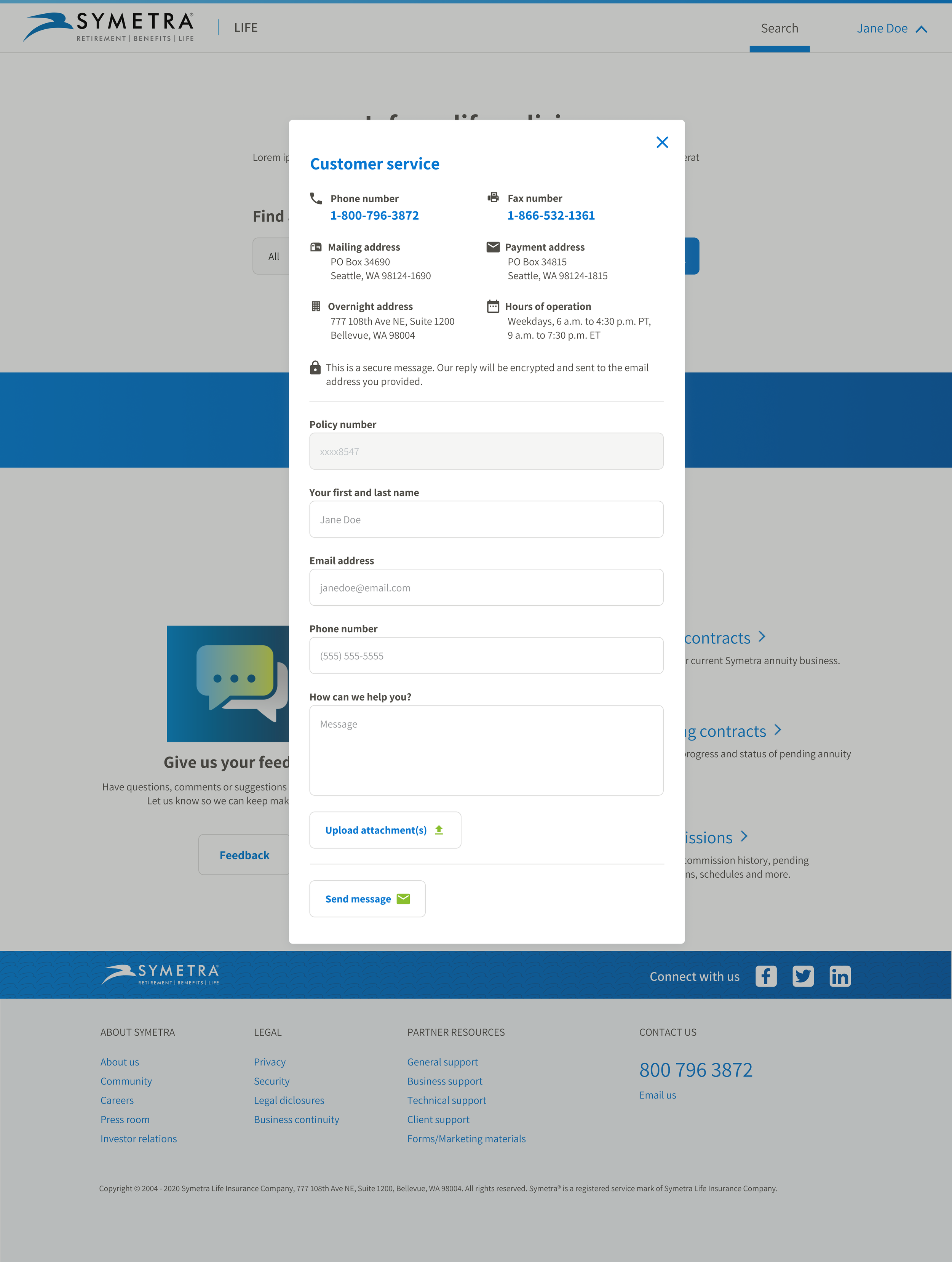


User testing prototype
Make sure to view full-screen!
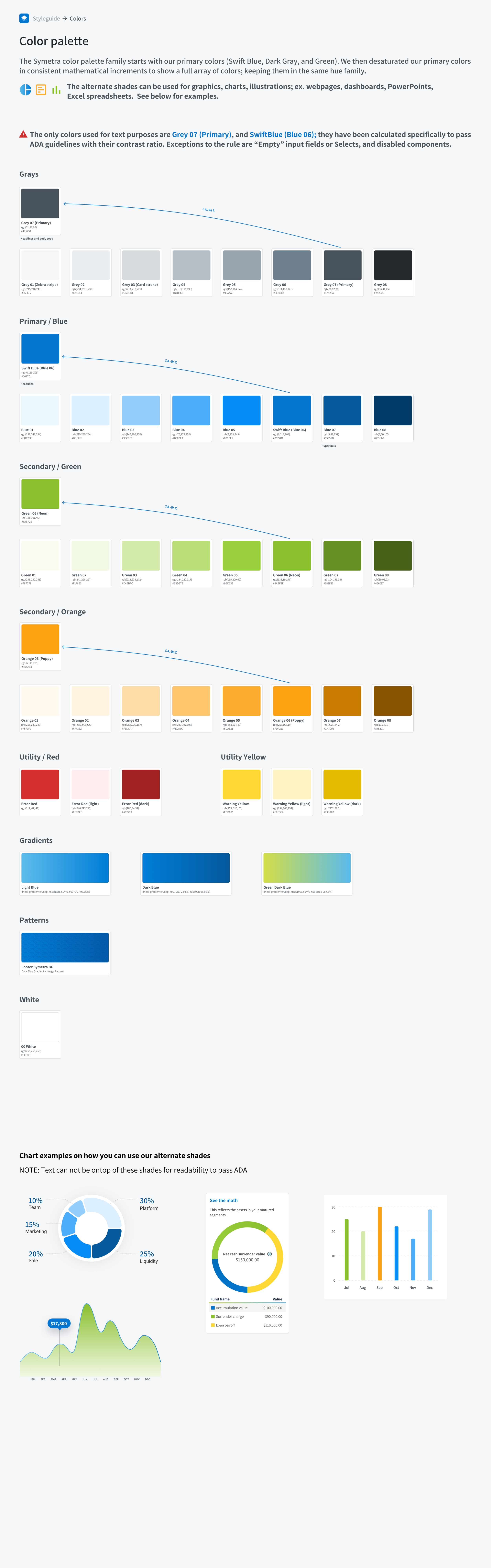
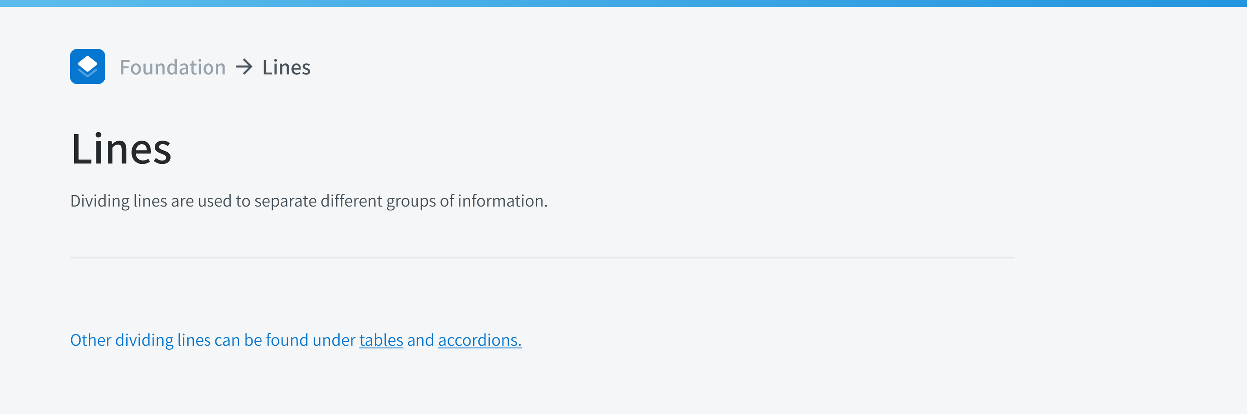
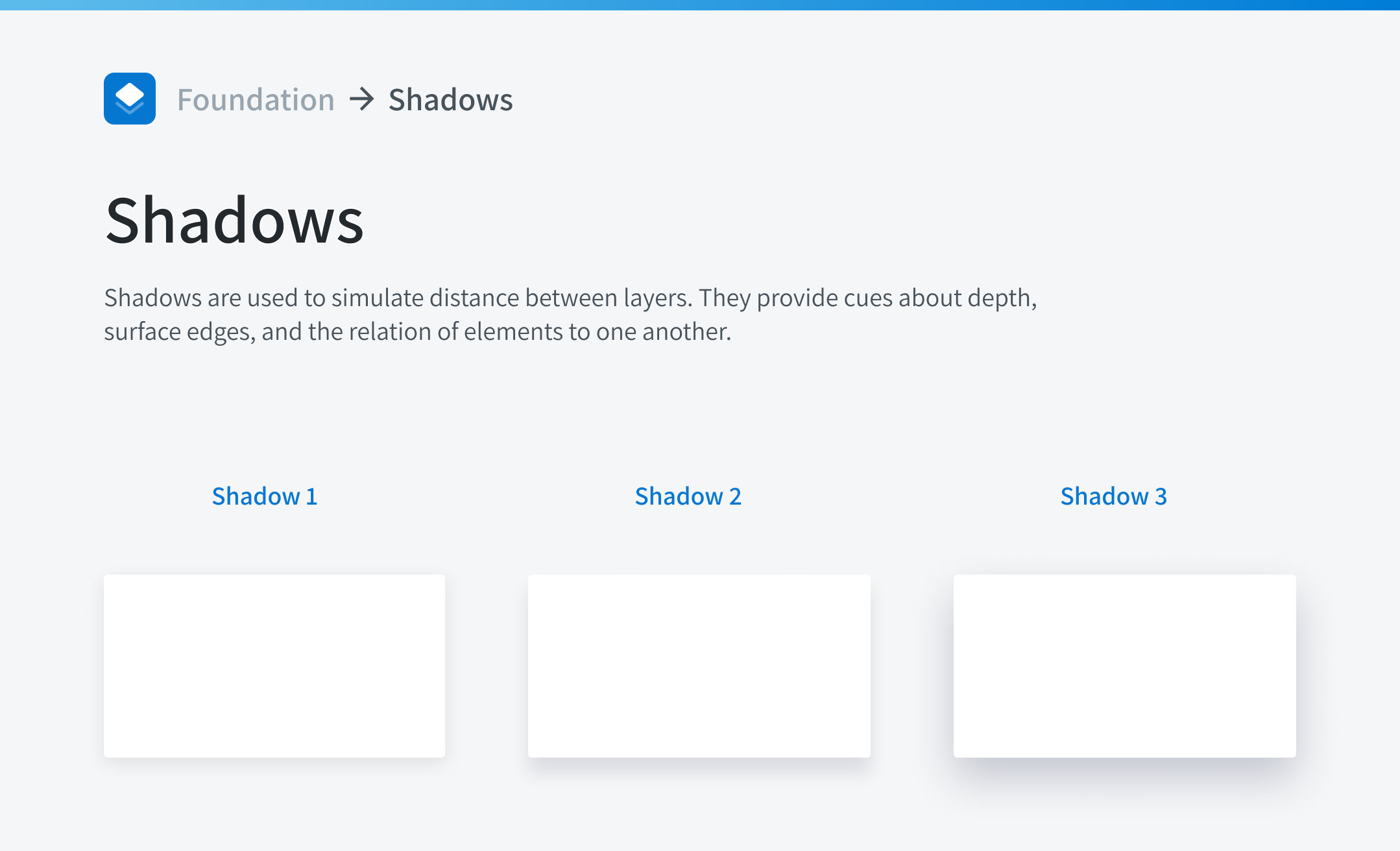
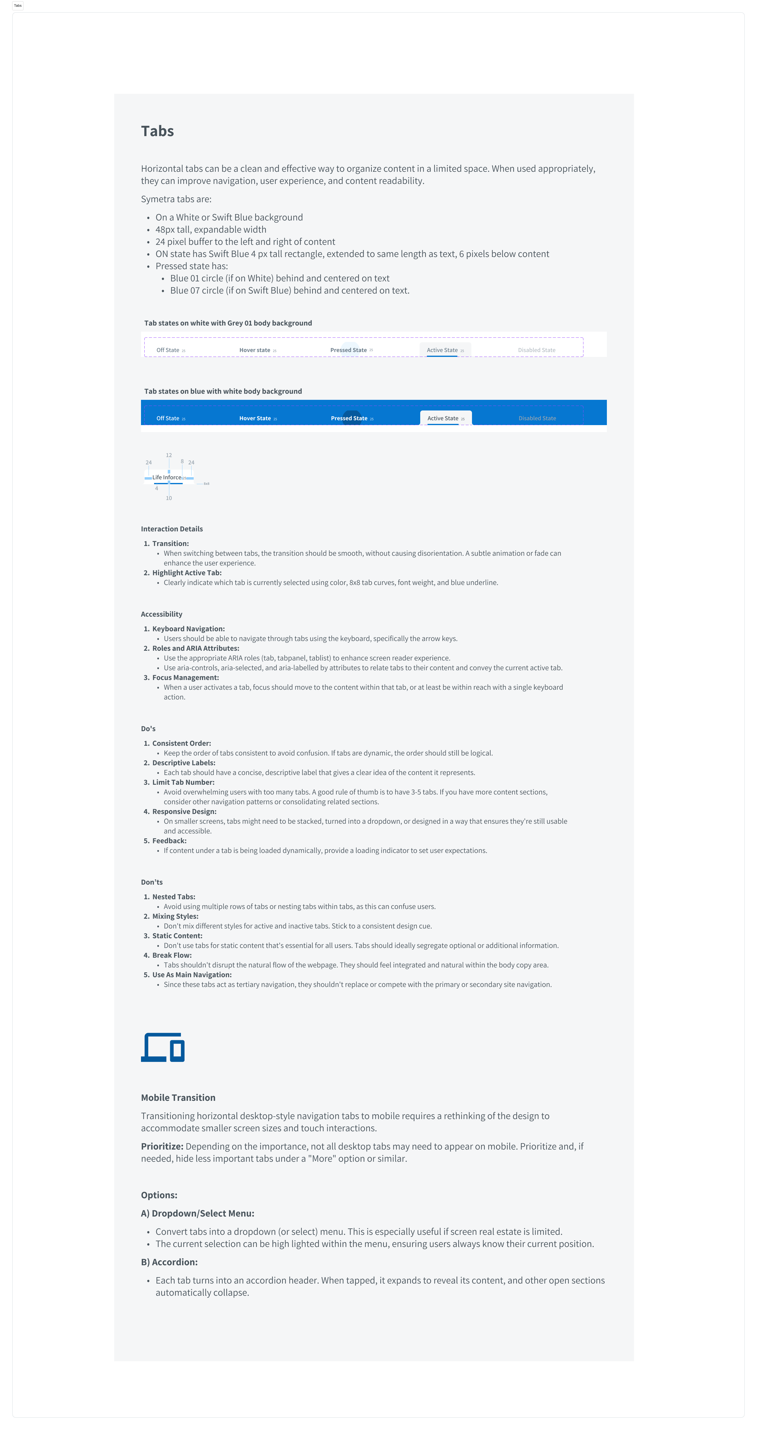
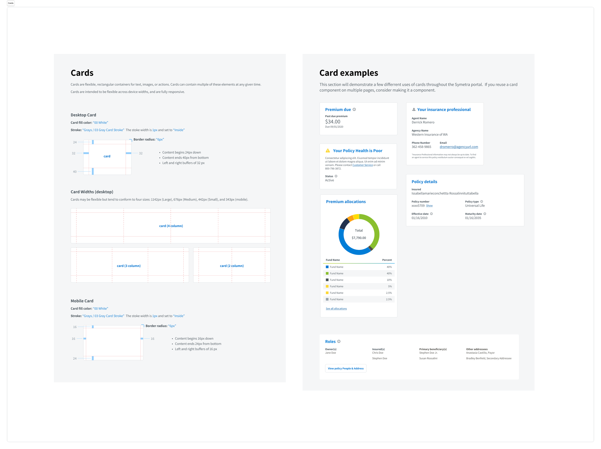
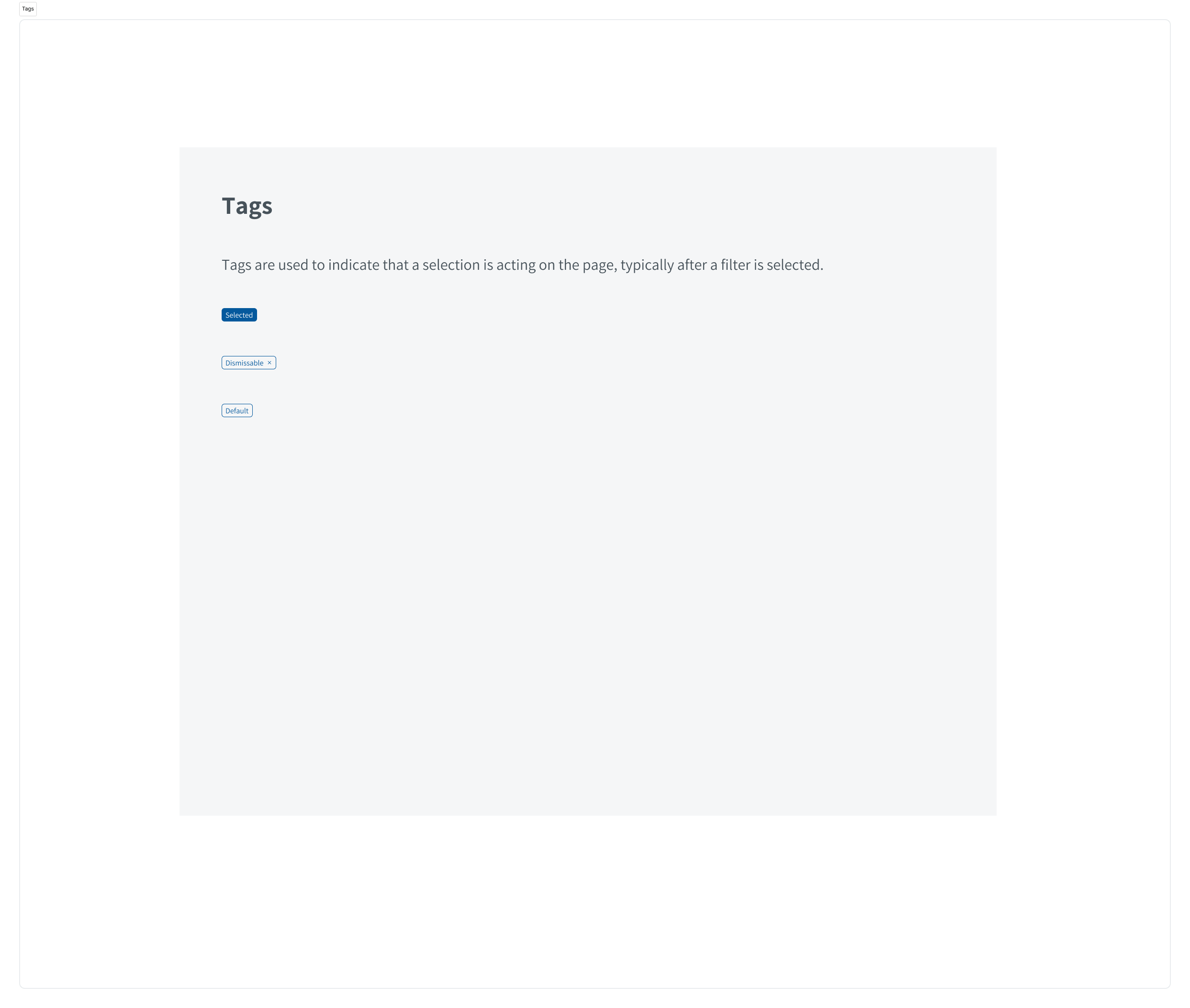
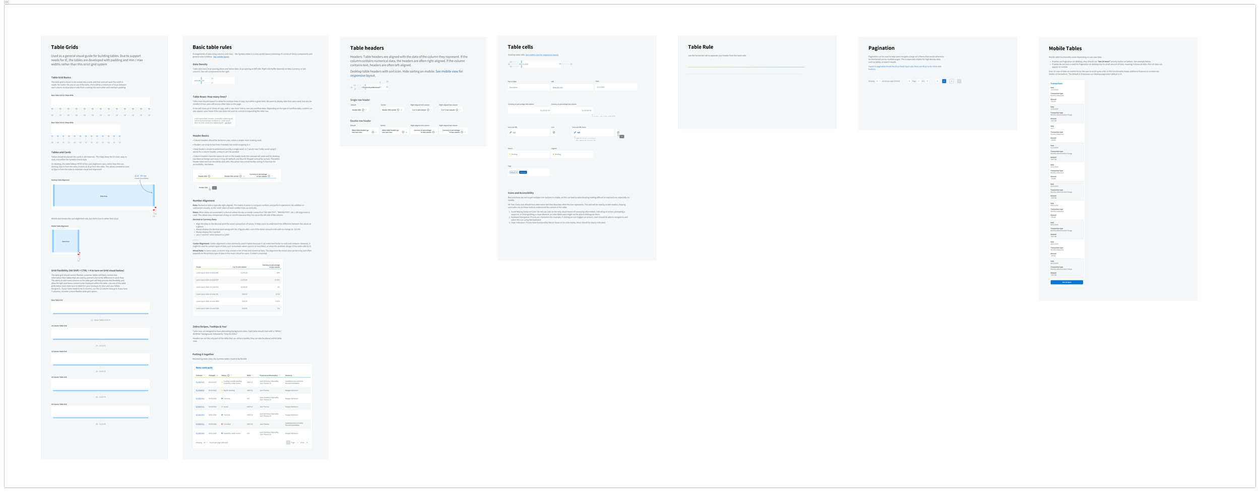
Styles
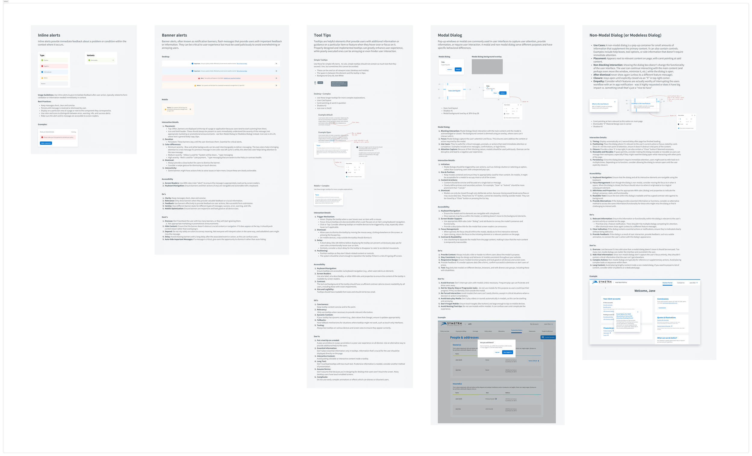
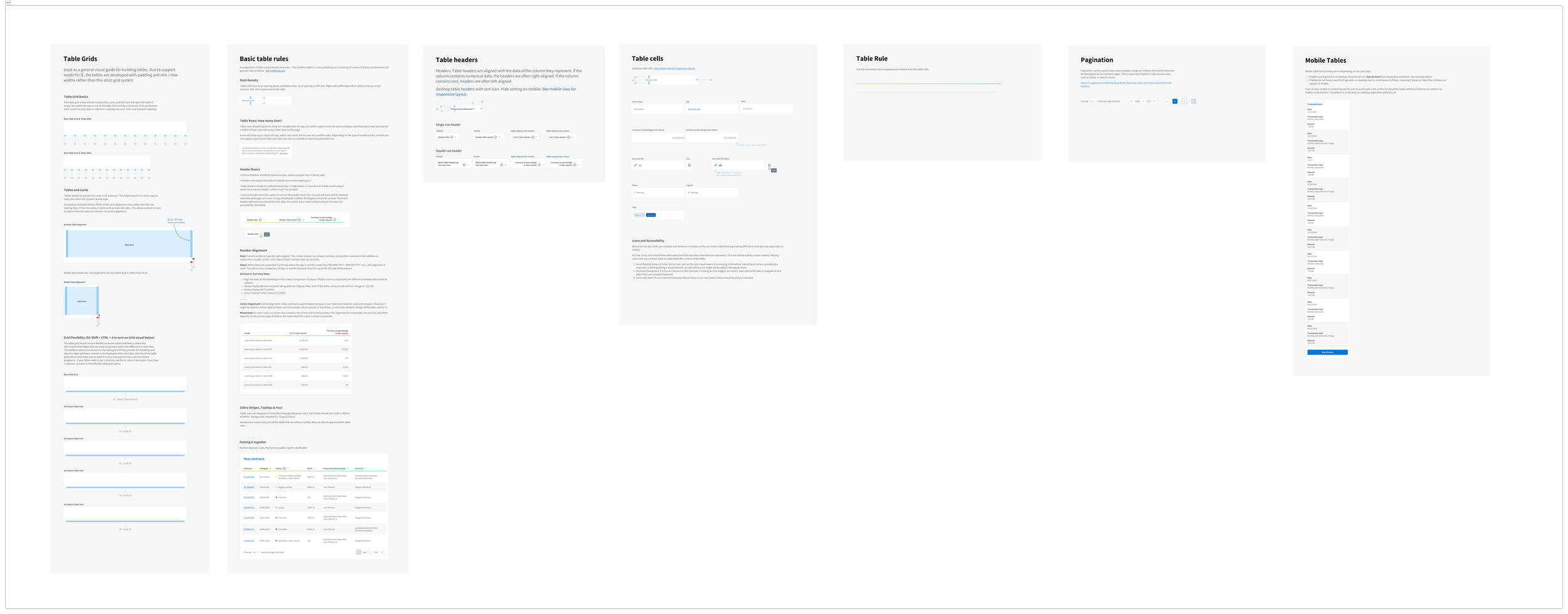
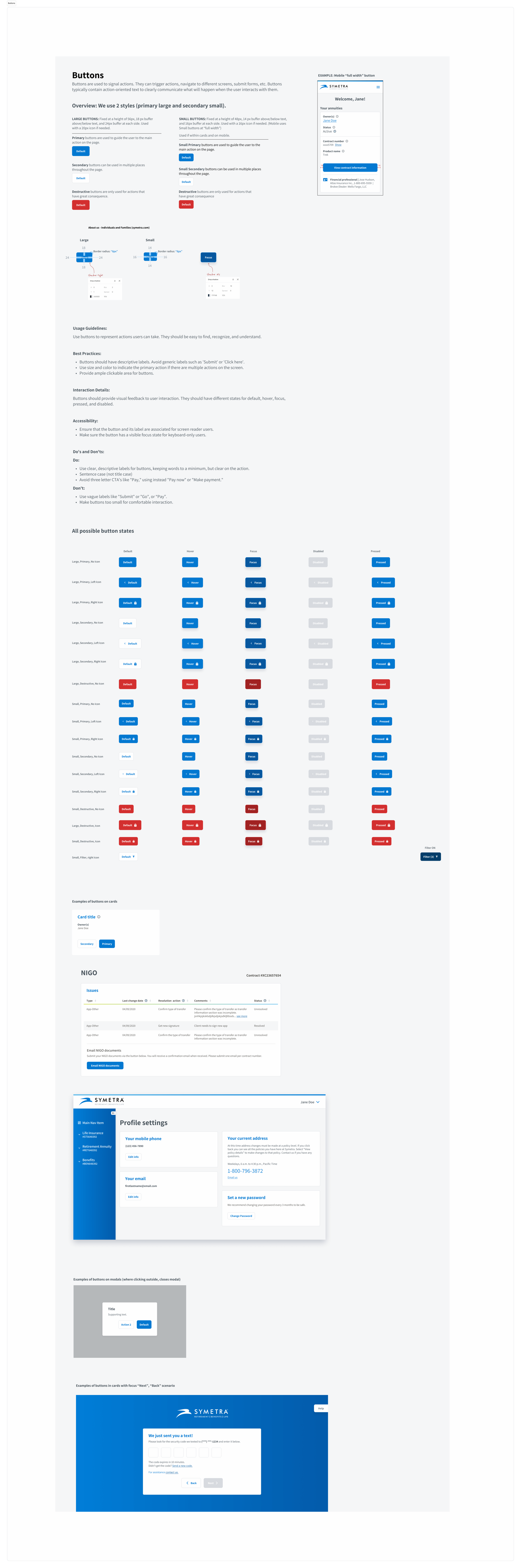
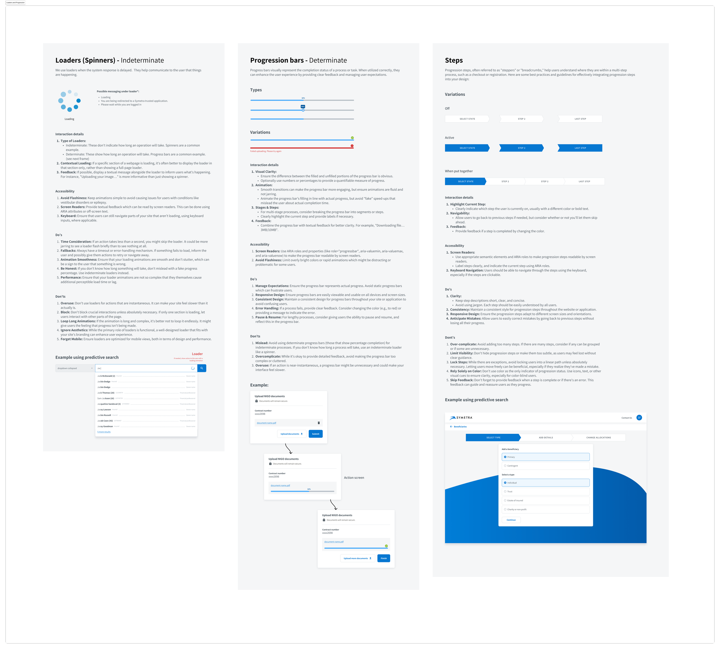
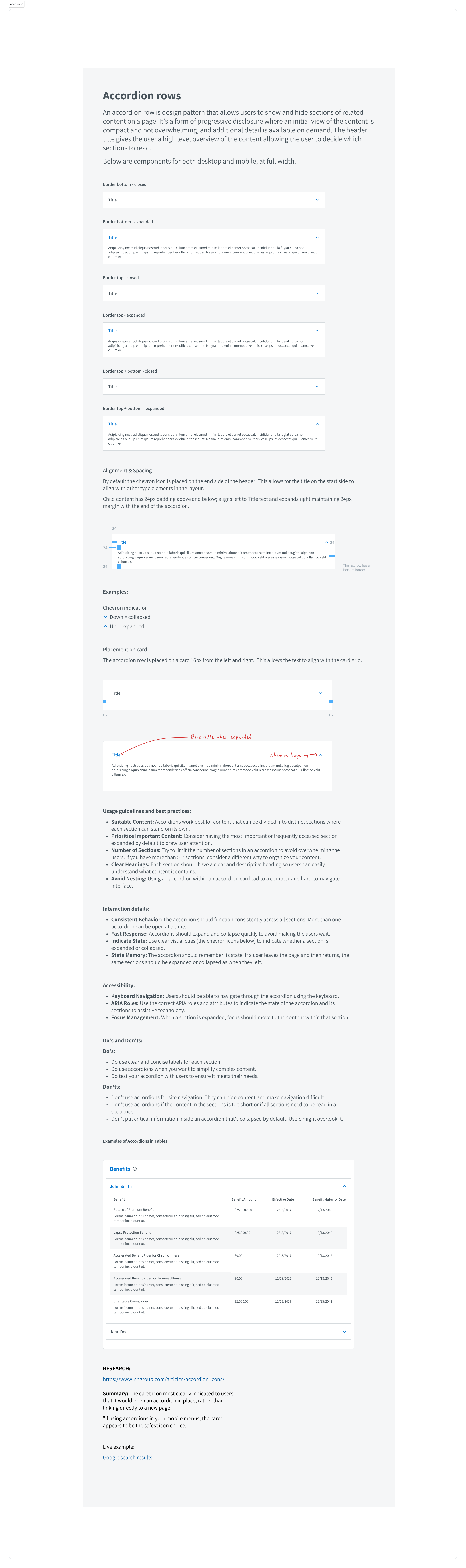
Components

04/ Outcomes
Successes
Entirely new Figma component design library
More accessible designs
Refreshed branding
Redesign of customer and financial professional portals
Increased customer engagement (DAUs) by 1400% and financial professional engagement (DAUs) by 2500%
Decreased redundant support calls by more than 400%
Significantly improved customer and professional self-reported satisfaction
Learnings
It’s important to earn trust before making recommendations.
Designing without considering the technical constraints is a waste of time. Much better is to understand the technical strengths and weaknesses upfront.
Creating a design system can be time-consuming, but it is worth its weight in gold for unifying the look, feel, and function across products and touchpoint.
What’s next?
Moving forward, the focus will be on executing (developing) the new dashboard, mitigating the risks with targeted persona validation, and redesigning the existing Whiz robot dashboard, ensuring continuous improvement and innovation in line with SoftBank’s evolving needs and market trends.