
Kaus Insurance
A new, easy way for younger people to buy insurance directly.
My Role
Research
Branding
Design
Art Direction
DATE
2017
01/ Summary
Services
Market research
User research
Ideation
Information architecture
Design
User testing
Deliverables
Competitive analysis
User interviews
Hypothesis statement
Persona
Empathy map
Card sort
Task flows
Responsive wireframes
Design system
Logo & icon design
Affinity Maps
Style guide
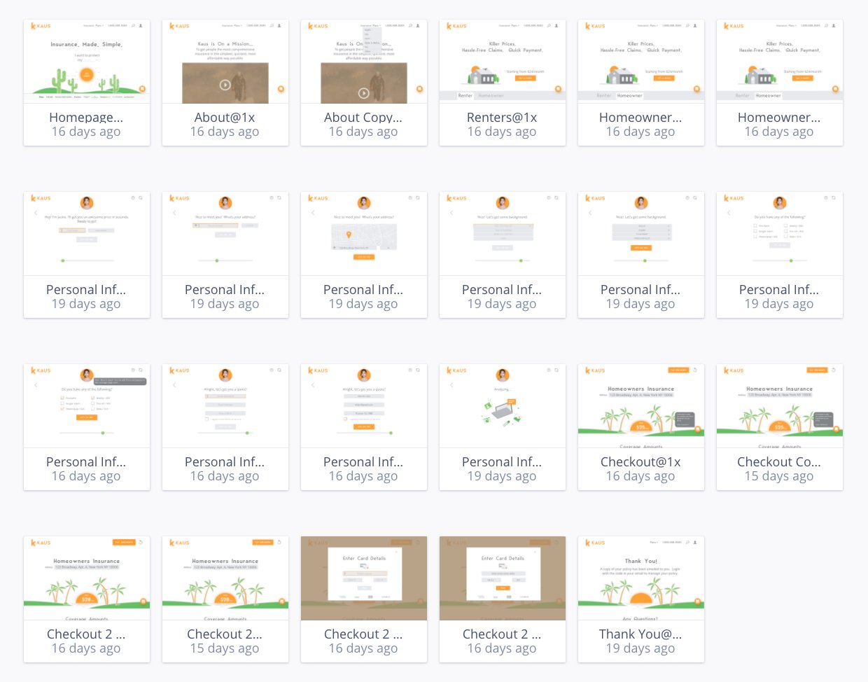
Prototypes
Outcomes
Polished web portal prototype ready to be developed and launched to the web.
02/ Opportunity
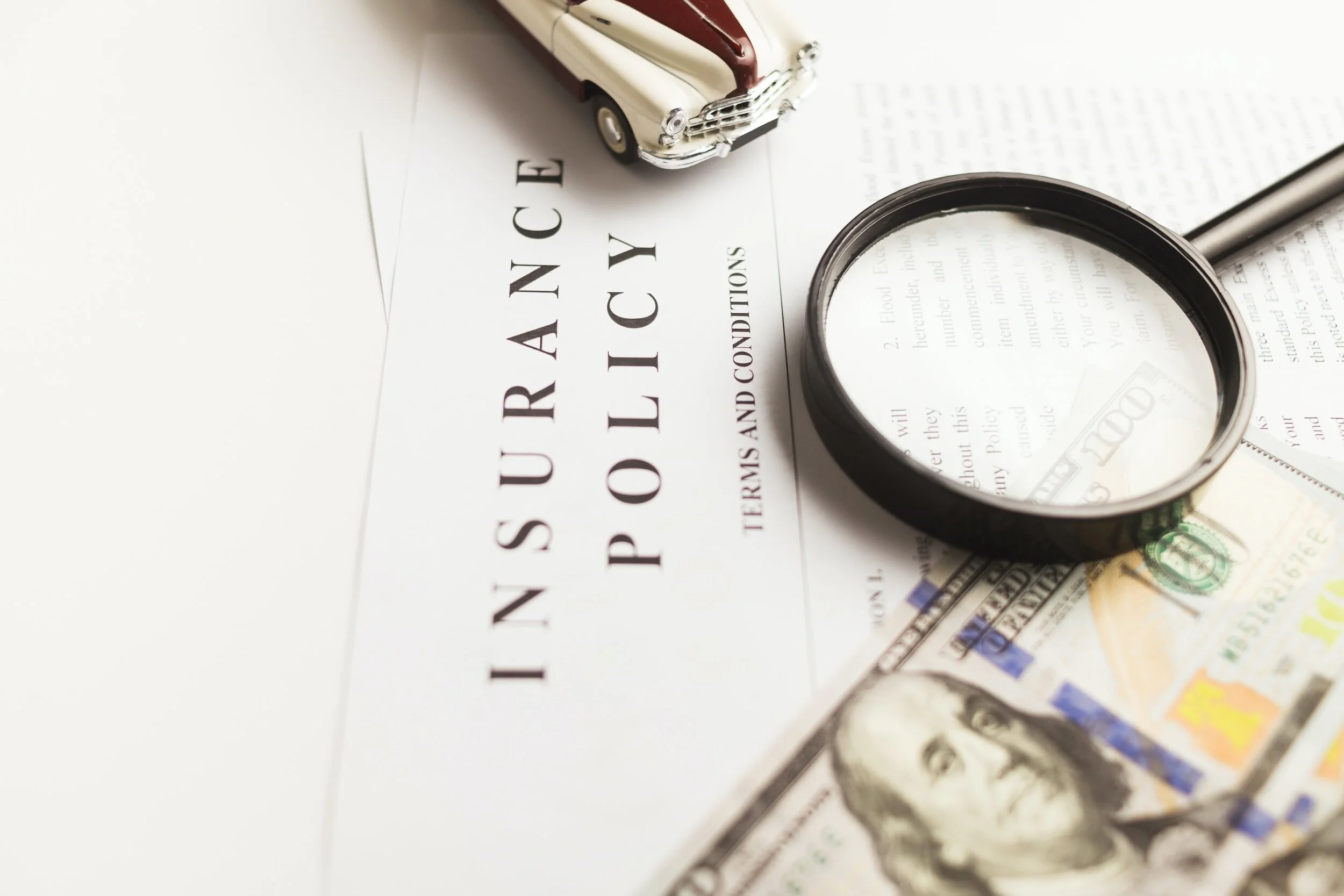
KAUS is a large insurance agency in business over 30 years. In the past, they worked through agents. Now, they want to sell their policies directly to consumers online.
Audience
Digitally-savvy urbanites who are Xennials (32-42 years old) and Millennials (21-36)
Disruption
The digital revolution has changed our lifestyles and our values disrupting most industries including insurance.
How might we…
How can I create a user-friendly, responsive insurance platform for digitally-savvy customers?
03/ Process
Market research
I read through anything I could get my hands on about the industry and industry trends, which included articles in finance magazines, numerous white-papers and other content around the net.
Competitive analysis
Performing a competitive analysis involves comparing companies addressing similar challenges. I compared features, collected screenshots, and evaluated strengths and weaknesses.
User interviews
To grasp buyer motivations and pain points in insurance, I asked open-ended questions to 4 recent shoppers recruited through Facebook. I used an Affinity Map to distill insights and patterns.
White paper - Industry white papers are often a good source for background context
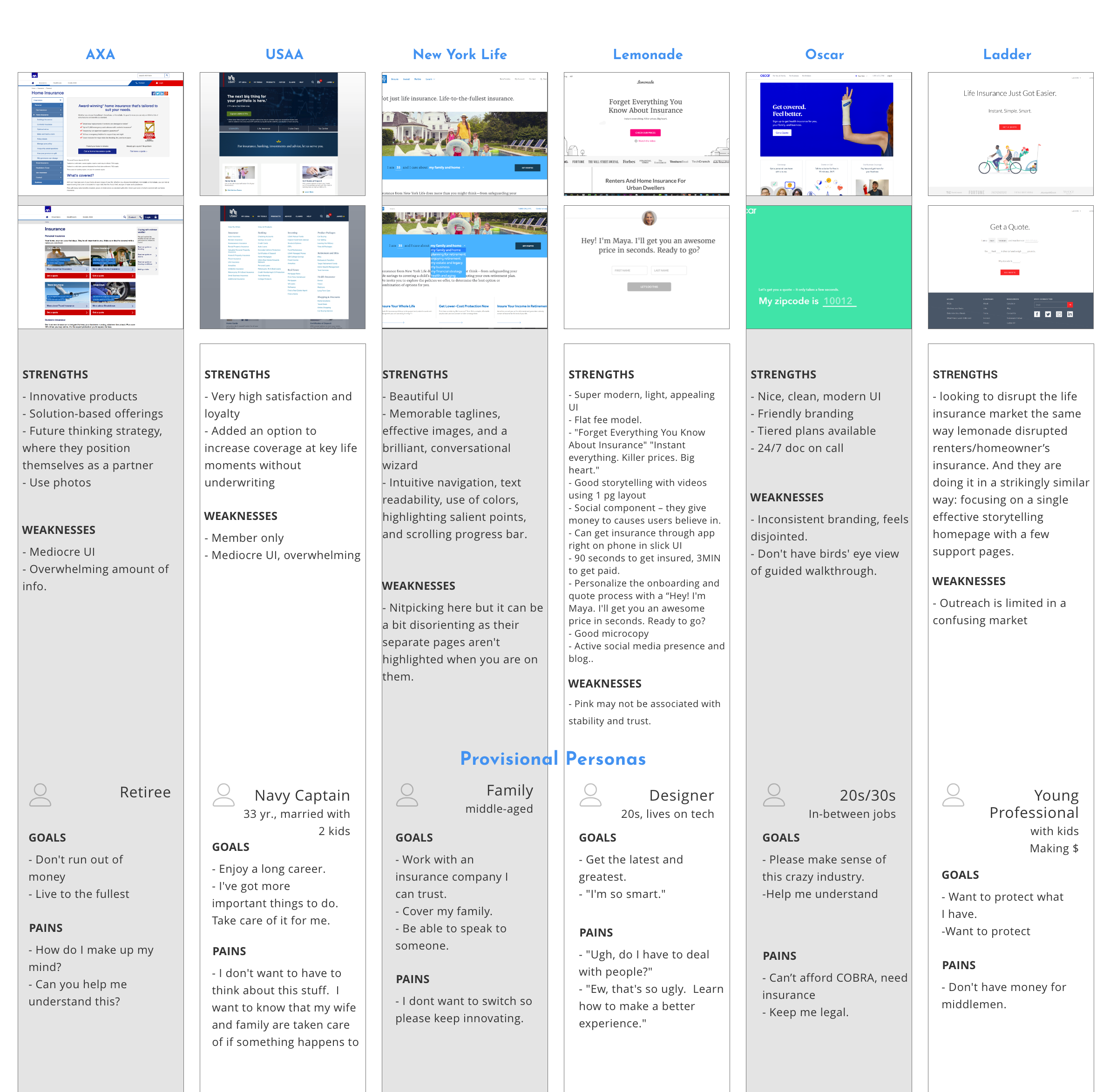
Competitor analysis
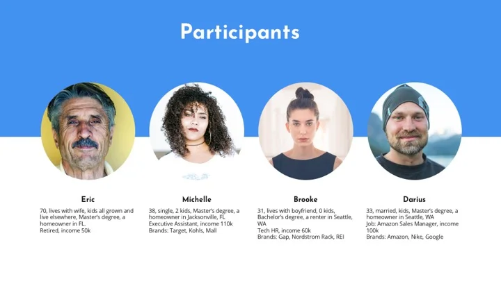
User interviews - I conducted interviews with 4 participants
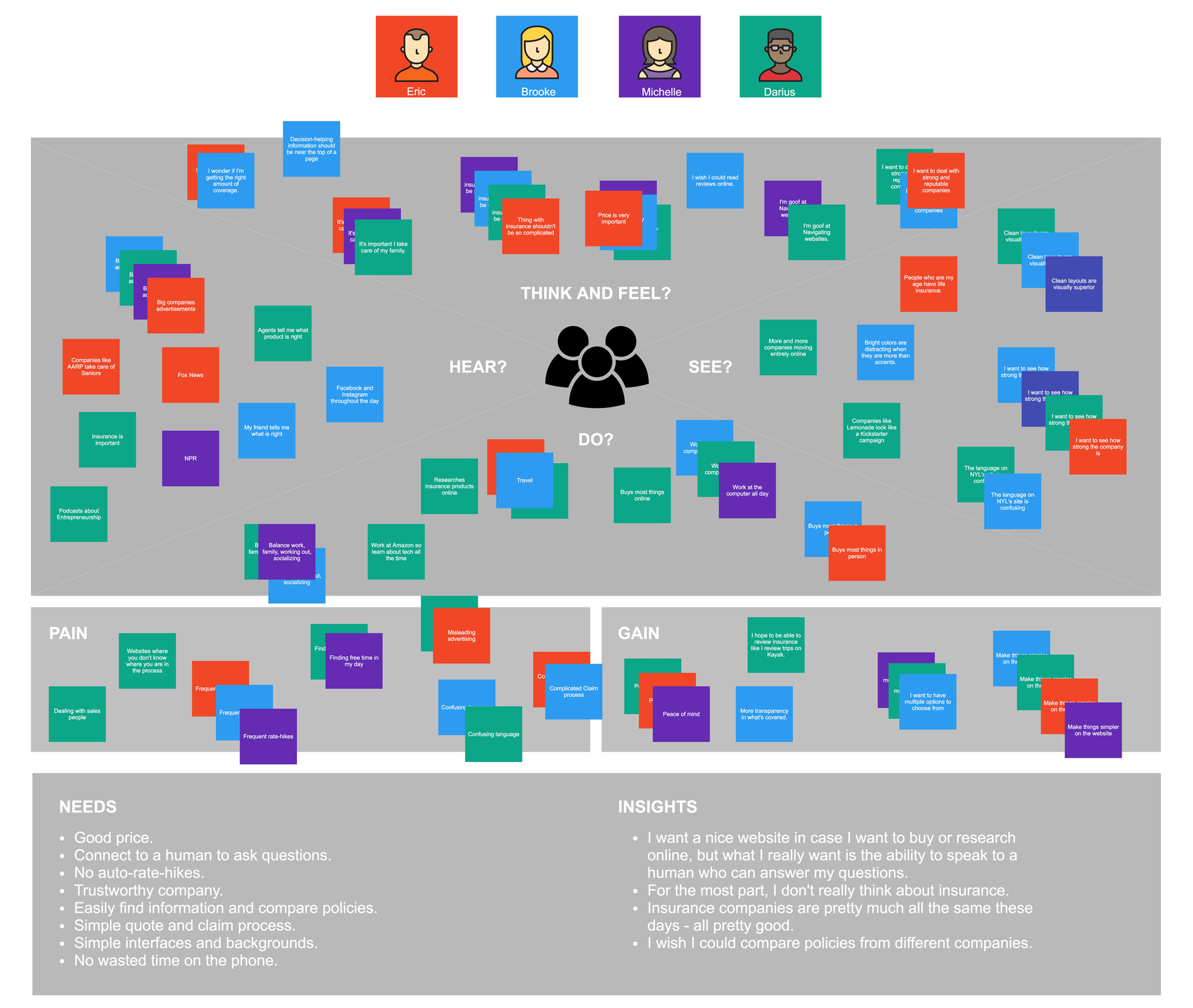
Empathy Map - I used an empathy map to help synthesize the findings...
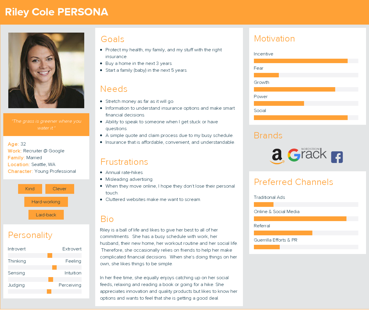
Persona - Using the insights derived from the empathy map, I created our persona. Say hello to Riley!
Research findings
The insurance industry is outdated and complex. Younger generations prefer digital processes for financial decisions.
Within digital, the biggest opportunity lies in personalization.
When moving online, it is still very important not to lose the human feel.
Storyboard
From the research, I crafted a realistic story around her lifestyle and goals.
Prioritize features
I used the Reach, Impact, Confidence, Effort framework to prioritize features.
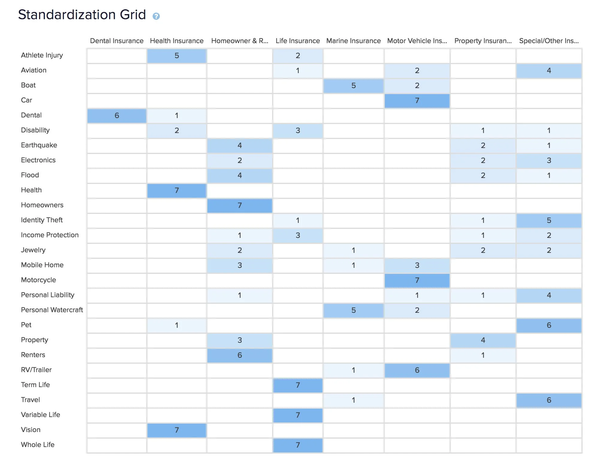
Card sort
Strong information architecture (IA) is key to project success! I wrote down all 27 of Kaus’ insurance products and asked participants to group them.
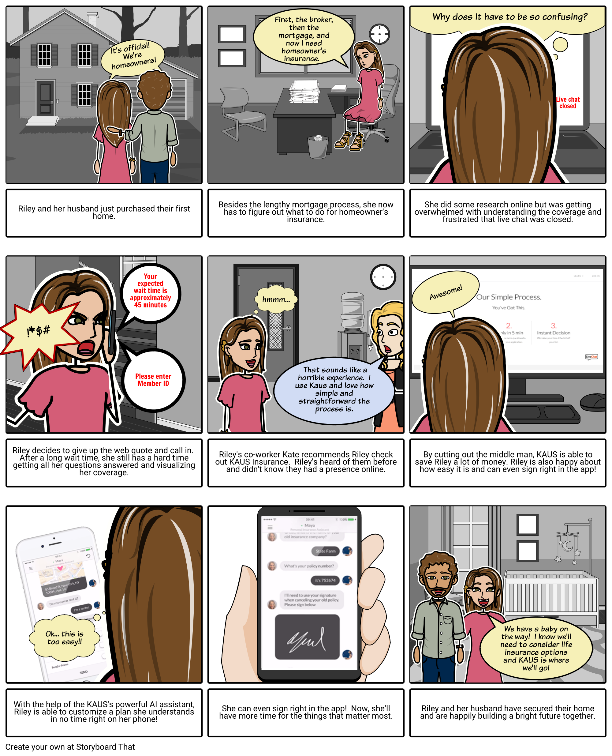
Storyboard
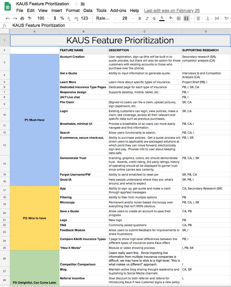
Feature prioritization
Card sort
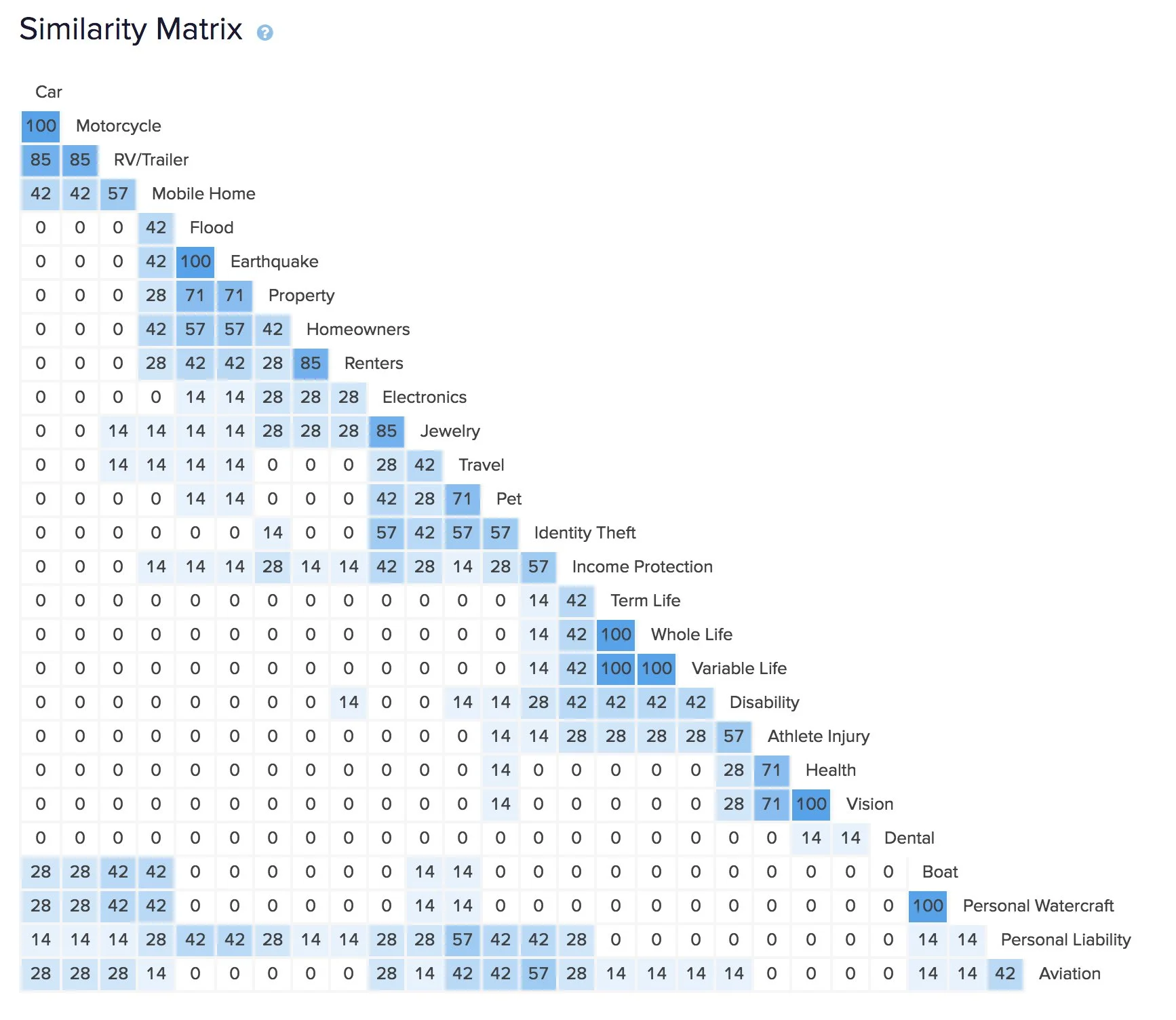
Card sort
Sitemap
The card sort helped me envision the sitemap and organize content.
Task flows
With the sitemap worked out, I created a task flow of a customer purchasing insurance.
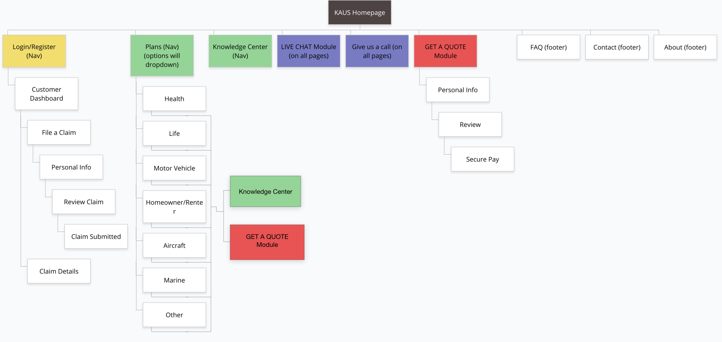
Sitemap
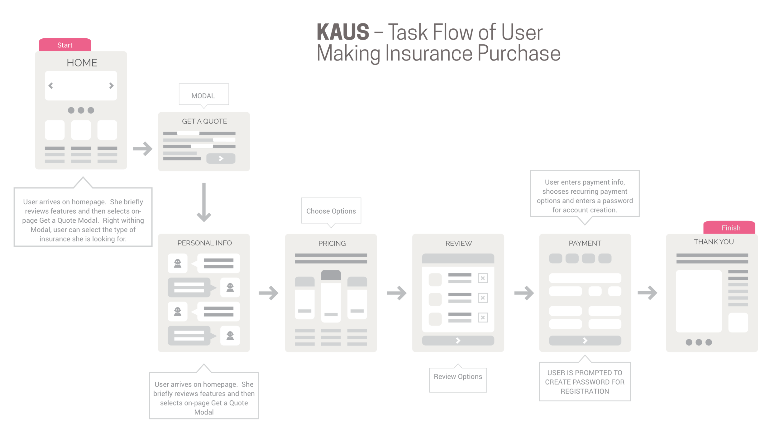
Task flow
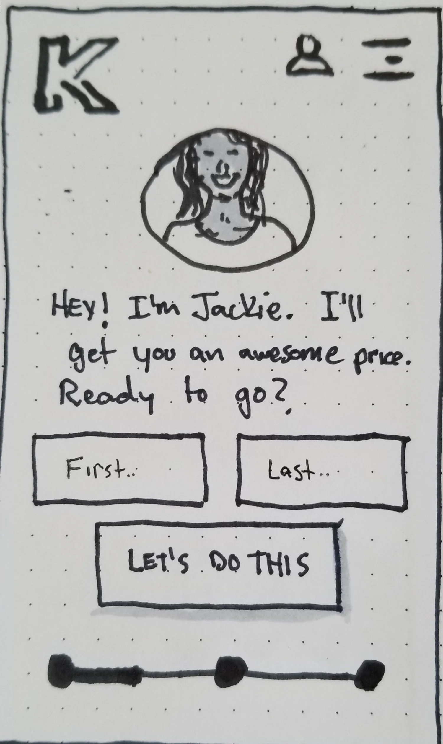
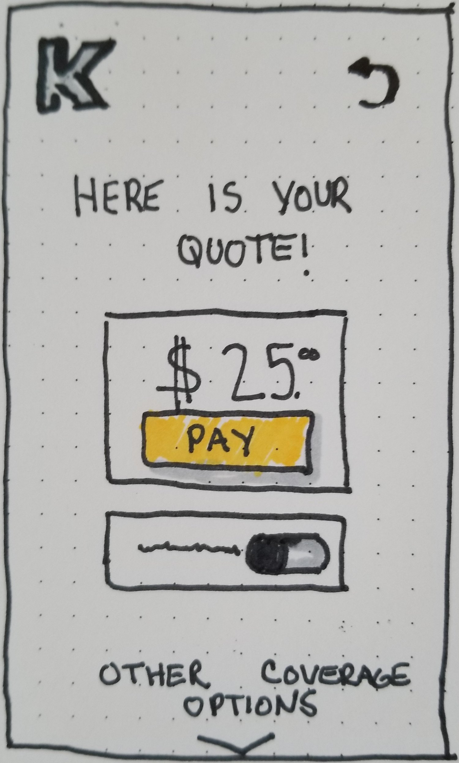
Sketching
I started the design phase by sketching our initial screens on paper to better understand how am I going to structure content and lead users through the insurance buying journey.
Wireframes
I created an annotated, lo-fidelity wireframe
Mobile first sketches
Sketch

Annotated wireframe
Annotated wireframe
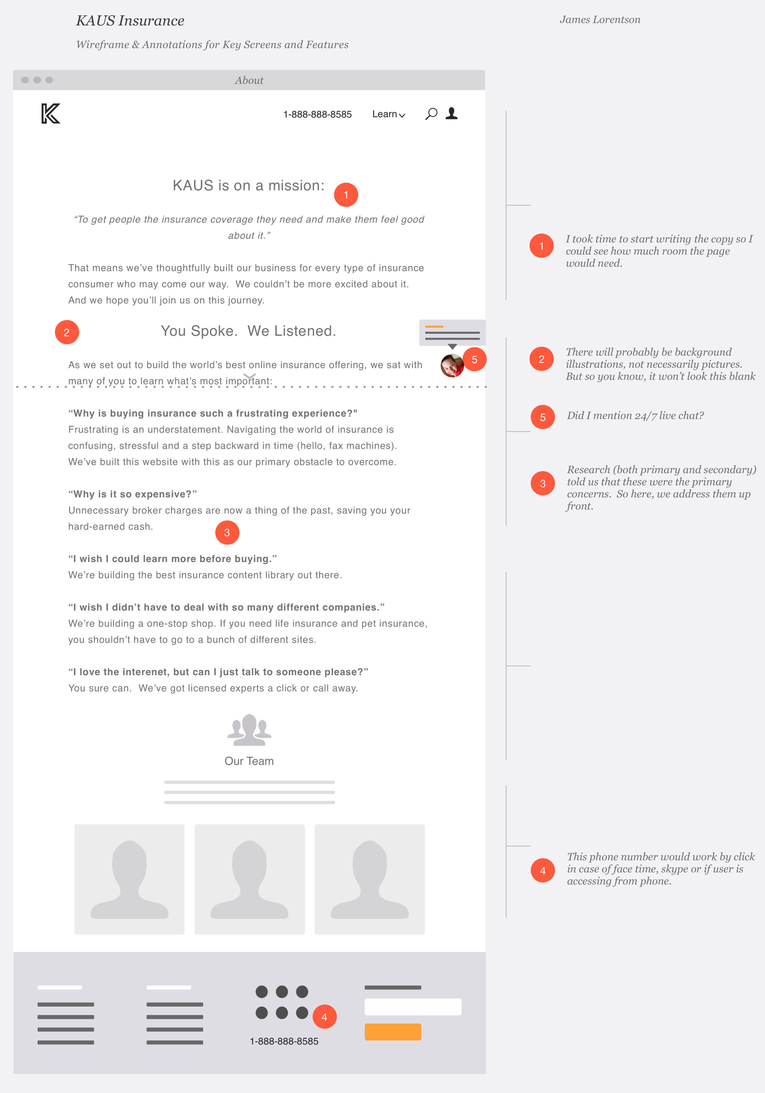
Annotated wireframe
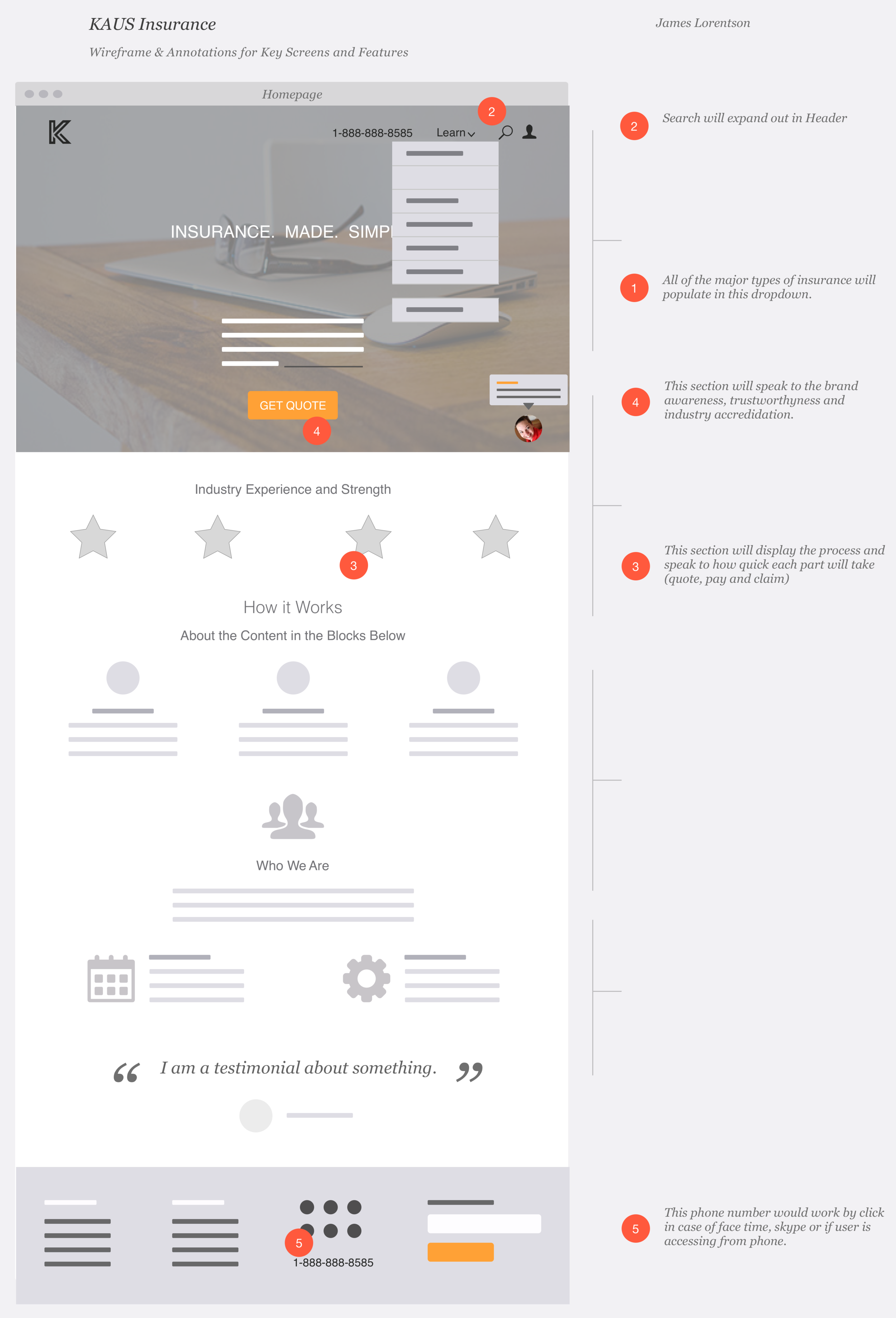
Annotated wireframe
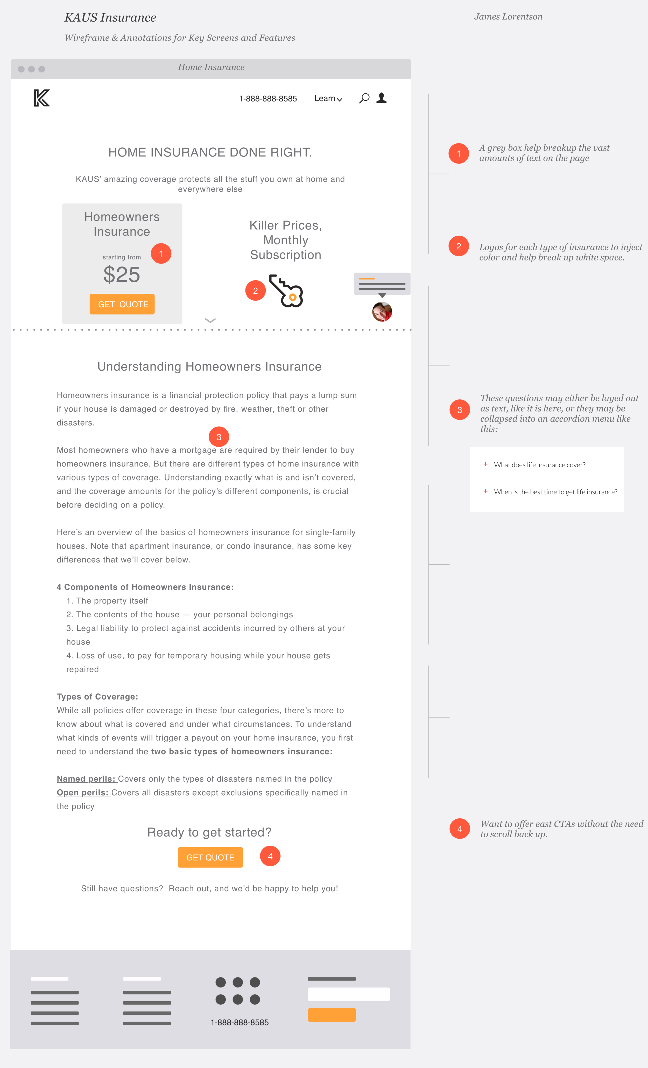
Annotated wireframe
Logo
For the logo, I first sketched out some ideas.
And then digitized the ones I liked best.
Brand & styles
Our brand needed to convey friendliness, approachability, trust and good value.
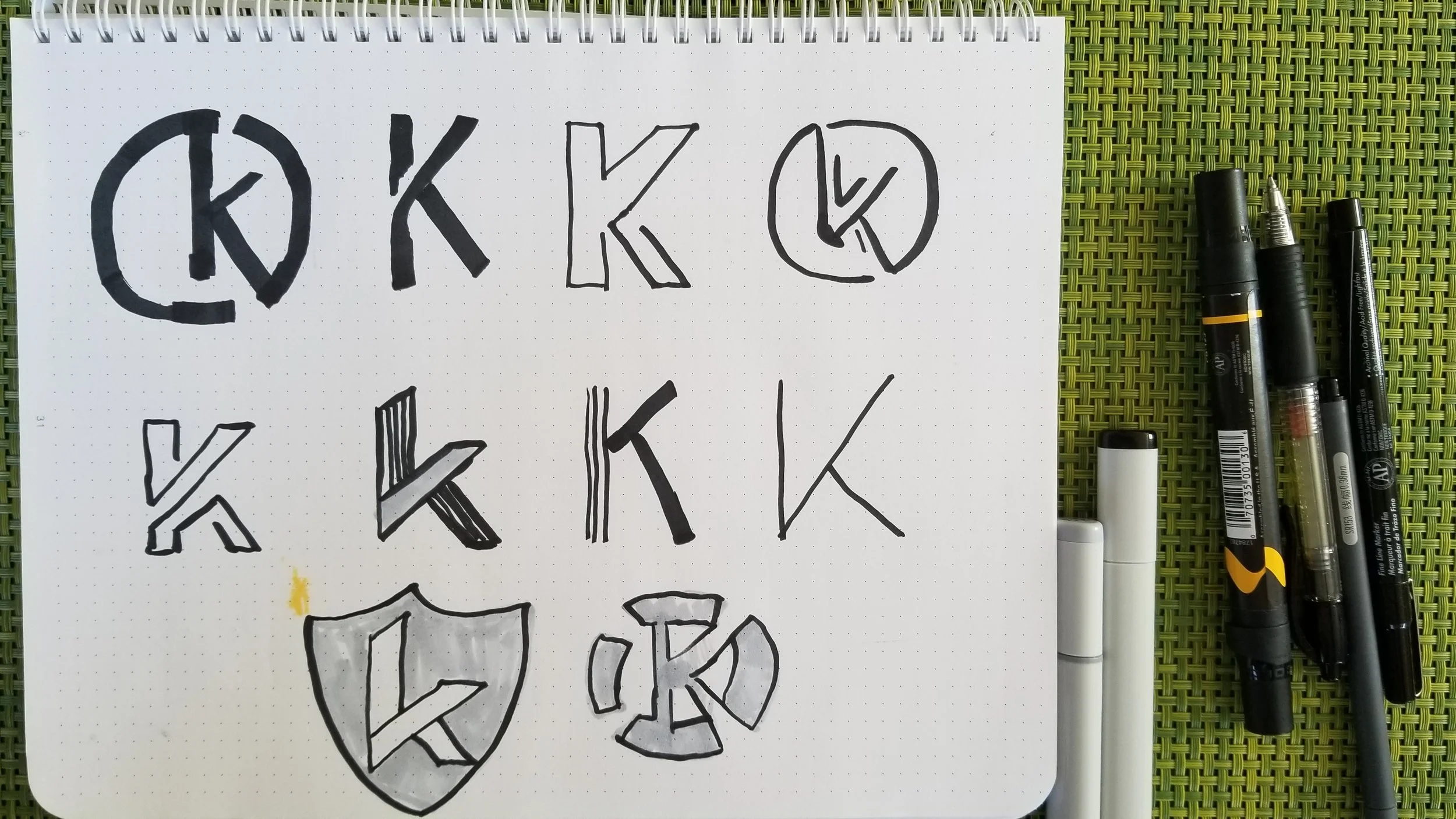
Logo sketches
Honing in on the logo
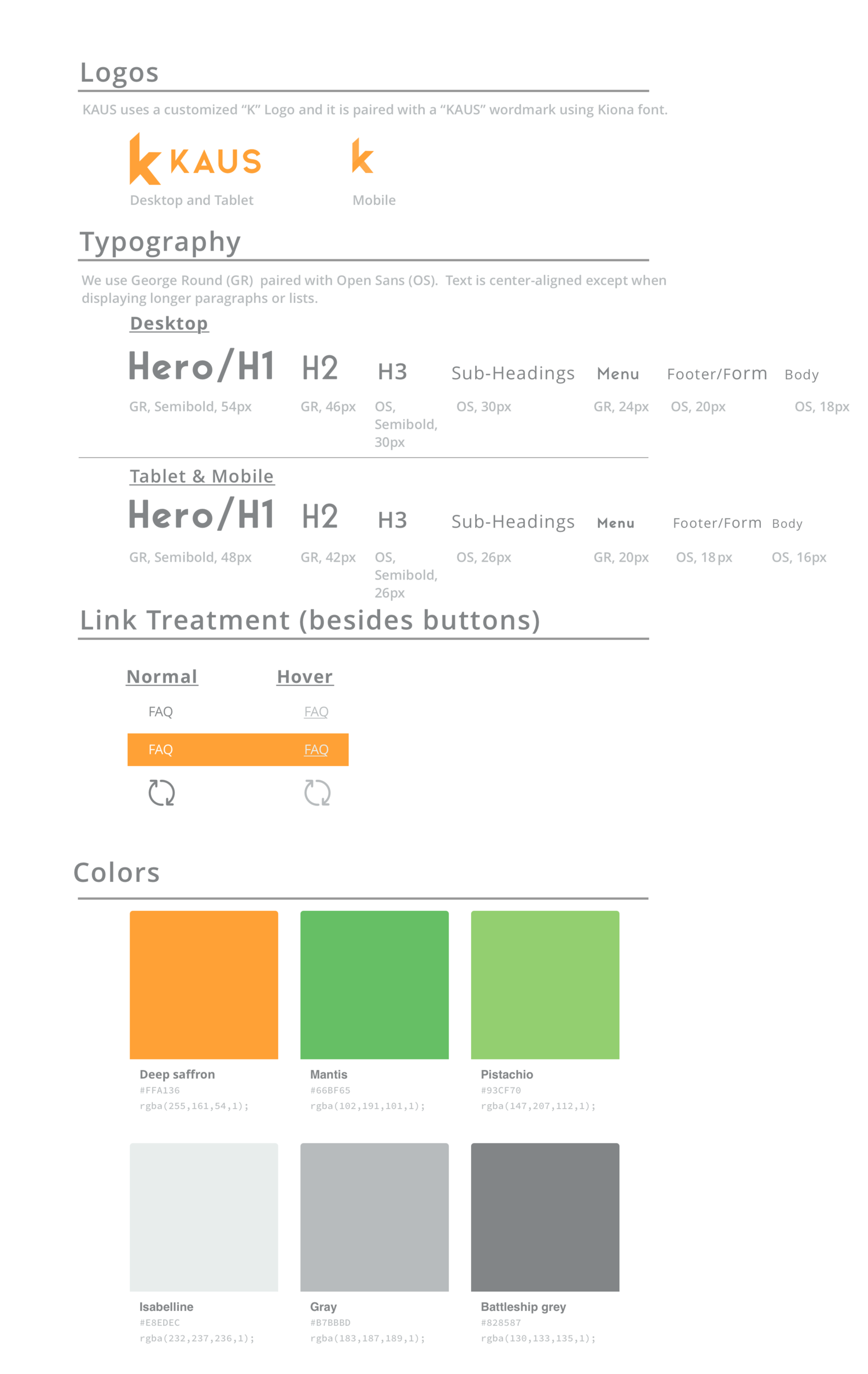
Styles
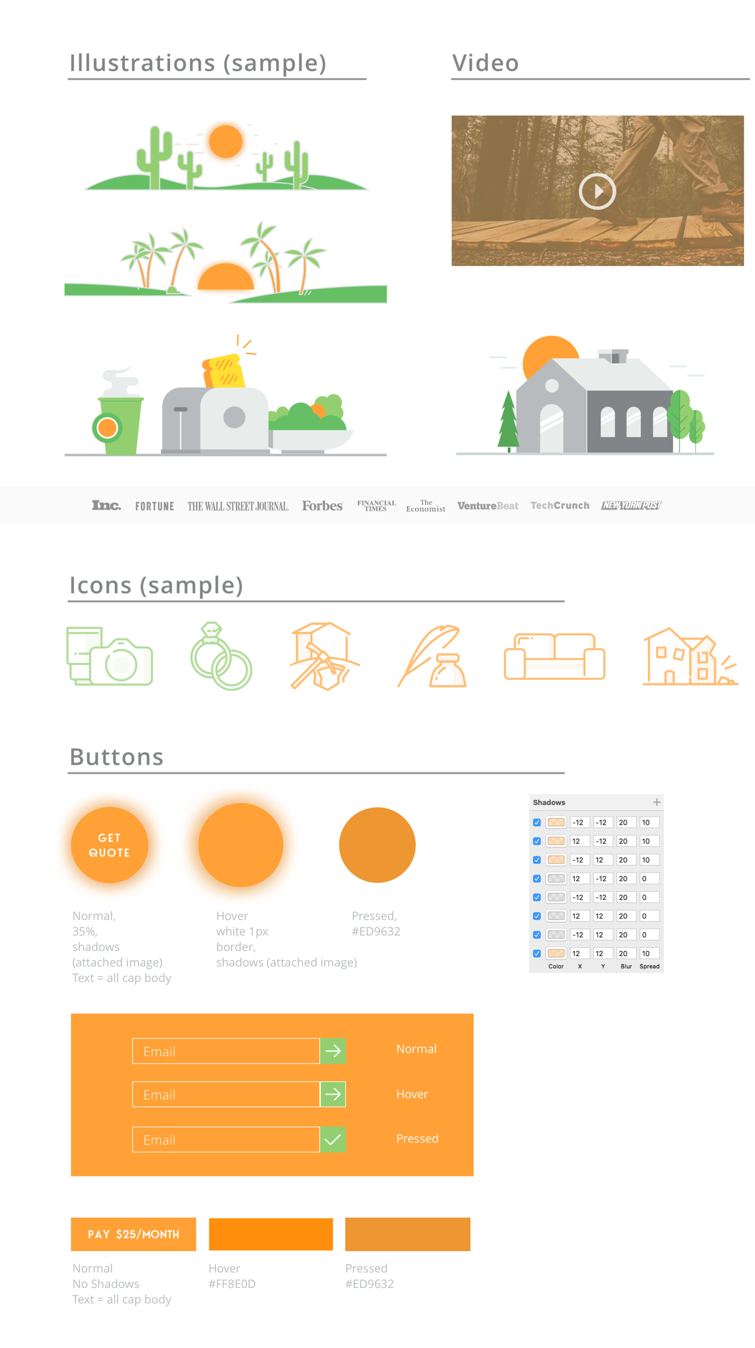
Styles
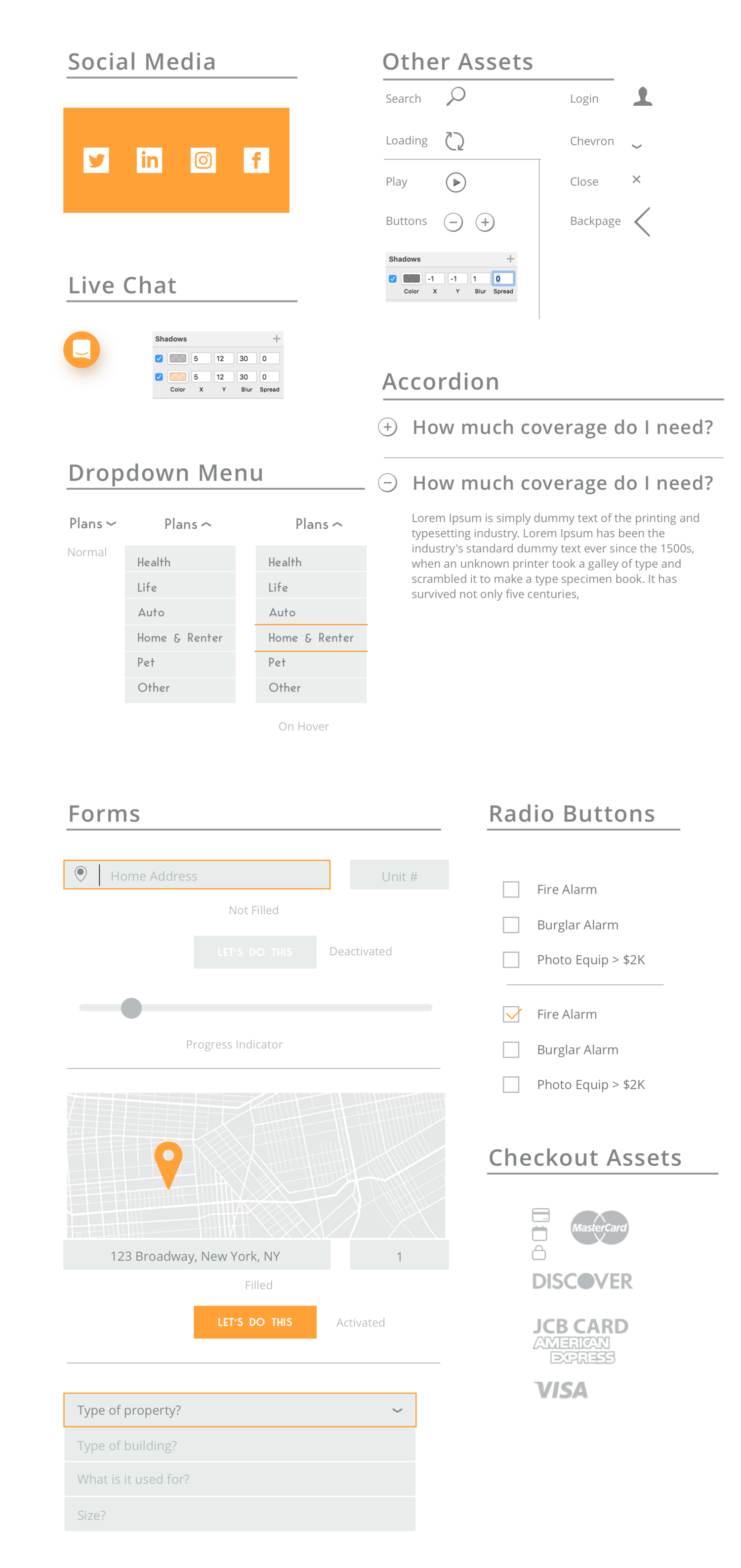
Styles
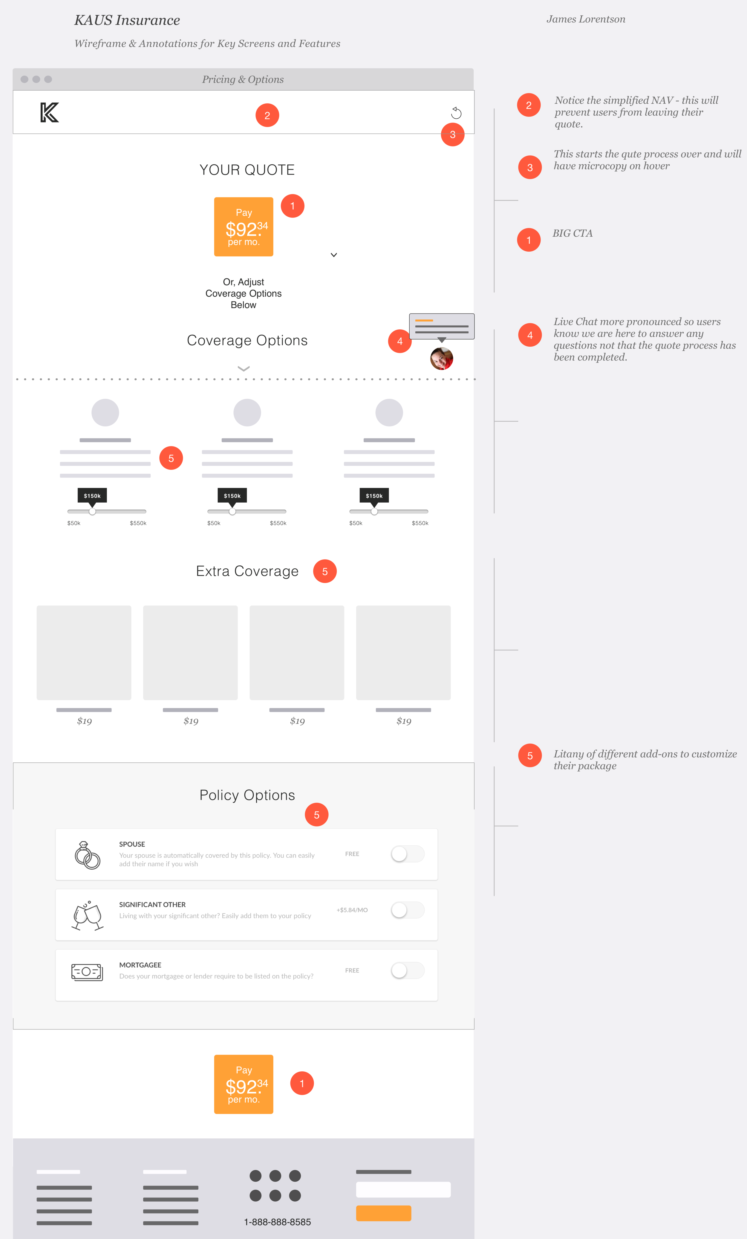
Responsive wireframes
I developed a high-fidelity wireframes using Sketch. And then added interaction in Invision.
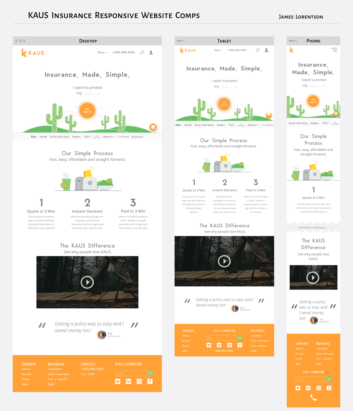
Responsive wireframes
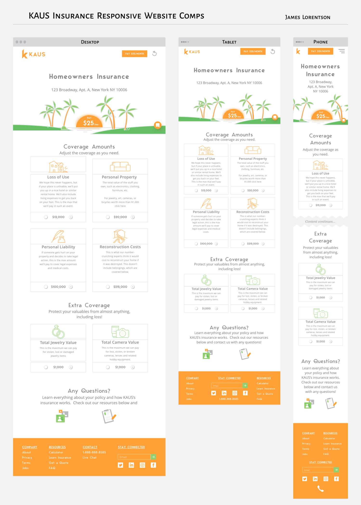
Responsive wireframes
Wireframes in Sketch
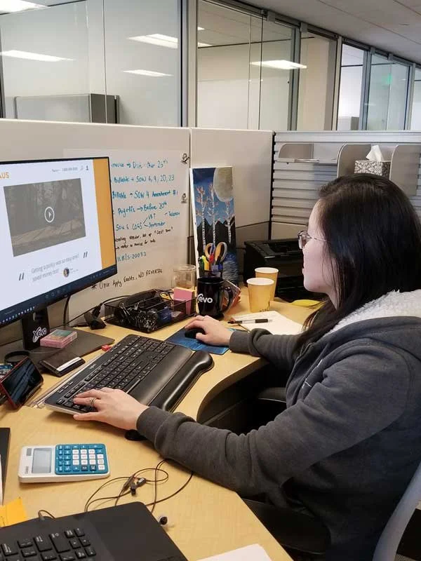
Usability testing
Usability tests were moderated in-person with 4 participants recruited based on criteria from the target user persona.
It was important to incorporate informal feedback at this stage to validate our assumptions and test whether participants could easily get a quote, navigate the homepage and purchase a policy.
The flow through the site went well considering most links weren’t clickable. However, the findings did highlight a few critical navigational issues.
Affinitize the findings
This findings from the user tests was synthesized using an affinity map. This feedback was critical and helped us improve the usability of the site!
Usability test
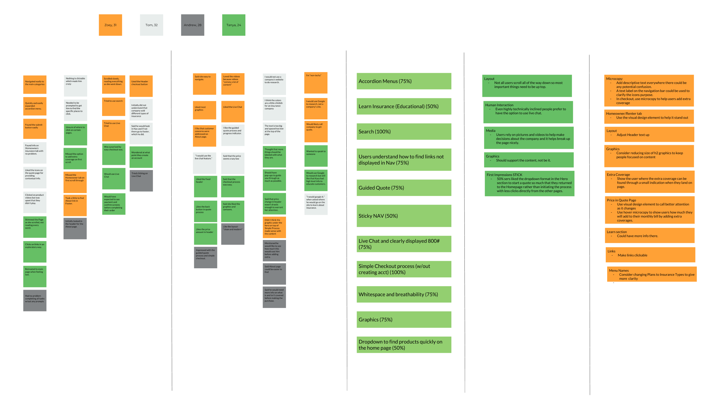
Affinity map
Usability findings
Add affordances
Consider adding descriptive labels to clarify icon purposes in the navigation bar. Use microcopy in checkout to help users add extra coverage and display hover microcopy to indicate the impact on monthly bills when adding extra coverages.
Improve Wayfinding
Show the user where the extra coverage can be found through a small indication when they land on page. Use visual design element to call better attention as price changes
Consider Live Chat
All testers indicated a desire to speak to someone even if just to confirm details.
“Exploring insurance options felt like navigating a maze with a broken compass—confusing and outdated. Discovering Kaus was like a breath of fresh air, transforming a typically tedious process into something I could manage from my phone with ease.”
— Tester
04/ Outcomes
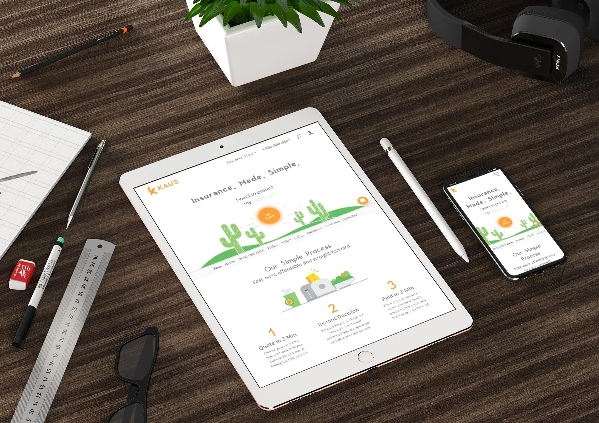
I iterated on the feedback, improved affordance, microcopy and wayfinding, and delivered a complete set of responsive screens,
Successes
End-to-end design from opportunity idea to tested designs. We received favorable feedback on the designs, both in usability and visual aesthetic.
Learnings
I learned a lot from this project. Primarily, the insurance industry is in desperate need of an update if they want to address the insurance needs of younger generations.
What’s next?
Our next steps would be to further build out the support, live chat and error handling for the quote wizard.